Classic Shell
http://www.classicshell.net/forum/

Modern (larger) context menu?
http://www.classicshell.net/forum/viewtopic.php?f=13&t=7486
Page 1 of 1

Author:  mrzzheng [ Mon Apr 10, 2017 8:07 pm ]
Post subject:  Modern (larger) context menu?

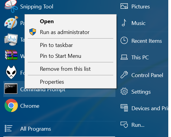
Could we switch between classic context menu or immersive/modern context menu just like Windows 10 desktop (explorer)? StartIsBack++ has the option to choose, and modern menu looks much better on high DPI screens.

Attachments:
Untitled.png
Untitled.png [ 78.46 KiB | Viewed 1473 times ]

Author:  Gaurav [ Tue Apr 11, 2017 6:19 am ]
Post subject:  Re: Modern (larger) context menu?

Do you mean the black background context menu that makes you feel that high contrast is turned on only for a part of the UI? :P The larger menu with bigger spacing will make it not fit the height of most screens so the menu will need to have pagers for scrolling at the top and bottom. The context menu for items is full of commands that barely fit the height of the screen with the current style.

Author:  mrzzheng [ Tue Apr 11, 2017 4:04 pm ]
Post subject:  Re: Modern (larger) context menu?

Gaurav wrote:
Do you mean the black background context menu that makes you feel that high contrast is turned on only for a part of the UI? :P The larger menu with bigger spacing will make it not fit the height of most screens so the menu will need to have pagers for scrolling at the top and bottom. The context menu for items is full of commands that barely fit the height of the screen with the current style.


Thanks for reply! Besides the black background context menu there is also a "light" version (as called in startisback++), which is just like the desktop context menu in Windows 10 -- not that big as the black one, but still has more spacing than "classic" that makes it look slightly better on high DPI (personal opinion). StartItBack++ gives an option to choose between classic/light/dark, for my setup, 150%, light really gives me the best balance. For comparison, you can tell the difference below. Classic version looks slightly a bit narrow, because I assume margins and line spacings are not adjusted for high DPIs.

Attachments:
Untitled.png [165.98 KiB]
Not downloaded yet

Author:  Gaurav [ Tue May 09, 2017 8:13 am ]
Post subject:  Re: Modern (larger) context menu?

It looks like it has slightly larger spacing but they changed the selection color from blue to grey which looks bad. In fact, Classic Shell's menu looks better for me because of the better selection color.

Page 1 of 1 All times are UTC - 8 hours [ DST ]
Powered by phpBB® Forum Software © phpBB Group
https://www.phpbb.com/