Classic Shell
http://www.classicshell.net/forum/

Experiment # 2 Handhelds
http://www.classicshell.net/forum/viewtopic.php?f=17&t=1948
Page 1 of 1

Author:  juniper7 [ Wed Jan 01, 2014 5:14 pm ]
Post subject:  Experiment # 2 Handhelds

Experiment # 2 Handhelds

Major tweaking of Xp skin.
Time to break out of flatland for awhile.
I see everyone thumbing through their phones and pads.
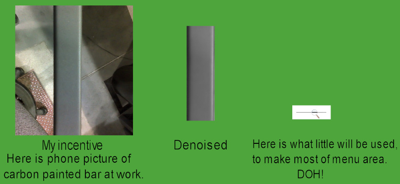
A spark went off in my brain, when I was holding a bar.
I wondered if I could make it into the menu columns,
and incorporate Windows colors to make them look like something?

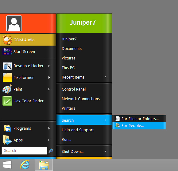
Behold. Handhelds, for desktop users.

The highlighted selection color looks like it wraps around the sides.
Gives it some depth.
At first the menu looked really bad.
All the noise in bitmap picture, would stretch and make vertical lines.
I really had to denoise it a lot.
Had to learn how not to stretch the corners, by adjusting the slices.
It's not a perfect illusion.
I'm sure graphic artists can improve on it with all their 3D plugins.

Tried with CSM 4.0.2 on Win7/8
Not compatible with most older versions of CSM. Will only partially work.
After downloading file, paste in skins folder. Exit CSM, restart CSM,
and go to "Start Menu Style" tab. Pick Classic or Classic two columns.
Pick "Handhelds" in Skin tab.

ps. Feel free to change anything in this skin, especially my errors, as it's just an experiment.
Upload a better one. Nothing is permanent, everything changes:)

Attachments:
Handhelds.skin [571 KiB]
Downloaded 641 times
Handhelds.jpg
Handhelds.jpg [ 105.52 KiB | Viewed 8342 times ]
Idea.jpg
Idea.jpg [ 80.06 KiB | Viewed 8343 times ]

Author:  Pipalou50 [ Fri Jan 03, 2014 6:15 am ]
Post subject:  Re: Experiment # 2 Handhelds

Bravo,

Magnifique, très gai.

il y avait longtemps que j'attendais ce genre de peau !

vous comptez en faire d'autres ?

merci :)

Author:  juniper7 [ Fri Jan 17, 2014 7:38 pm ]
Post subject:  Re: Experiment # 2 Handhelds

Google translate:

Bravo,

Beautiful, very gay.

there were long I was expecting this kind of skin!

you intend to do more?

thank you :)

Thanks. I really put a lot of effort into the select color,
to be as bright as possible and pop out.
About more skins.
The ideas come easily. Making them into something new, is a different story,
I don't want to just copy somebody else's good work.
Most go to dead ends and go extinct.
I just looked at the size of my "worked to death" folder. It is now 170 meg.
Occasionally, something will mutate into something else and live on.
I will try and release one more in a week.
Hint.
Beware, there might be Streaking at the beach! :)

Author:  Pipalou50 [ Sat Jan 18, 2014 3:03 am ]
Post subject:  Re: Experiment # 2 Handhelds

bonjour,

j'attends avec impatience vos nouvelles créations, mes expériences en matière de codage sont malheureusement très insuffisantes pour arriver à un tel résultat.

mais je ne désespère pas et je lis attentivement tous les nouveau topics.

ce skin ainsi que les 3 autres sont vraiment très agréables et devraient faire partie de ceux proposés lorsqu'on télécharge ClassicShell.

à bientôt

Author:  ZoNi [ Fri Mar 07, 2014 5:31 pm ]
Post subject:  Re: Experiment # 2 Handhelds

Add 20, 30, 50% transparency, please :)

Author:  Pipalou50 [ Wed Mar 26, 2014 4:33 pm ]
Post subject:  Re: Experiment # 2 Handhelds

@ZoNi
good evening
and if you try, you do?
I found that "please" is fairly short not to say "jumper" and well get the addition of a small formula of politeness of the kind: "thank you" or anything else that is looks.

good to you :roll:

Author:  juniper7 [ Sat Mar 29, 2014 7:01 pm ]
Post subject:  Re: Experiment # 2 Handhelds

Hello all. Have not been to forum for awhile. Busy.

Hello ZoNi. 20, 30, 50 % transparency!
I don't even know what the percentage relates to.
Is it log, exponential, or conversion of alpha ?/255 bits?
Which of the six types and is it for Win7 or 8?

This is what I did, I made the skin as a quick reference to what plain transparencies looks like.

Made a variation 1
I made the selectors and separators at 128/255 A
The main black part of menu at 216/255 A. I guess is around 15 %
The tops and bottoms at 235/255 A
A few edges at 250/255A.

Variation 2 has main menu at 128/255 A.

Variation 3 is 1/255 A.

I put a transparency selection group in skin options,
so you, me or anybody can see what each does.

Looks like alpha and glass, make the tops and bottom transparent, but not the main black menu.
Full alpha, and full glass make everything transparent.
Solid-transparent mixes to the background menu color. In this case white = grey.
Region seems to let the transparent edge dots show desktop, and block everything else, making a little darker.

Here is where it gets weird.
Win7
Fullalpha same
Fullglass same brightness as fullalpha, but with blur.

Win8
Fullalpha same
Fullglass darker, no blur.

I didn't give you exactly what you wanted.
Gave you the building blocks though.

Every body has different tastes for see through menus. Also, might need to adjust the font smoothing, in CSM.
I see you like extreme. Just remember, white on dark desktop background looks great,
until a white window appears = whiteout :shock:

ps. Skin file got kind of big. Over 1 meg. :)

Attachments:
Handhelds Transparency Test Reference.skin [1.12 MiB]
Downloaded 241 times

Author:  ZoNi [ Mon Mar 31, 2014 2:26 pm ]
Post subject:  Re: Experiment # 2 Handhelds

Nice :) I like this: 128/255 + Fullalpha :)

Only problem is that text is sometimes hard to read, but usually it is OK.

Tnx :)

Page 1 of 1 All times are UTC - 8 hours [ DST ]
Powered by phpBB® Forum Software © phpBB Group
https://www.phpbb.com/