Classic Shell http://www.classicshell.net/forum/ |
|
StartIsBack Plain10 skins http://www.classicshell.net/forum/viewtopic.php?f=17&t=6769 |
Page 1 of 1 |
Author: | shpkong [ Wed Aug 31, 2016 5:08 am ] | ||||
Post subject: | StartIsBack Plain10 skins | ||||
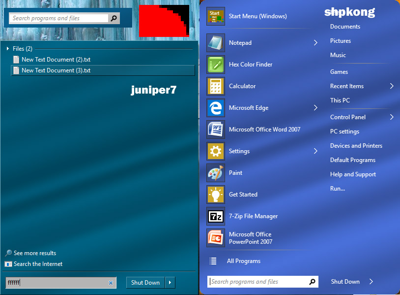
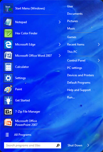
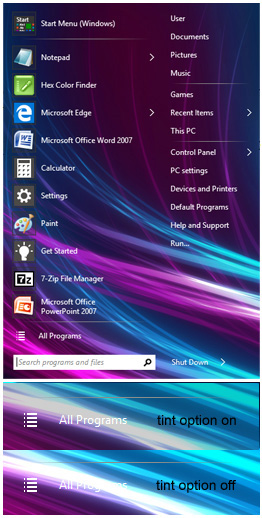
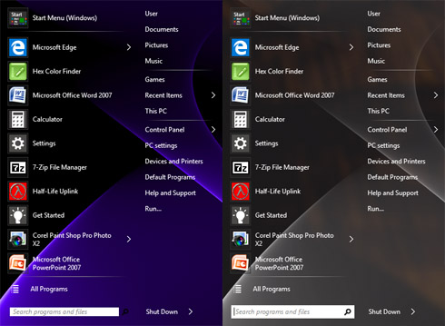
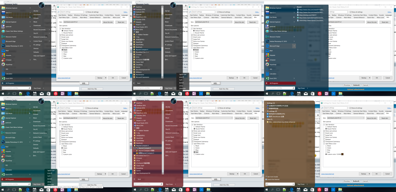
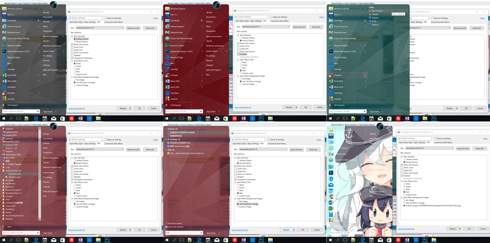
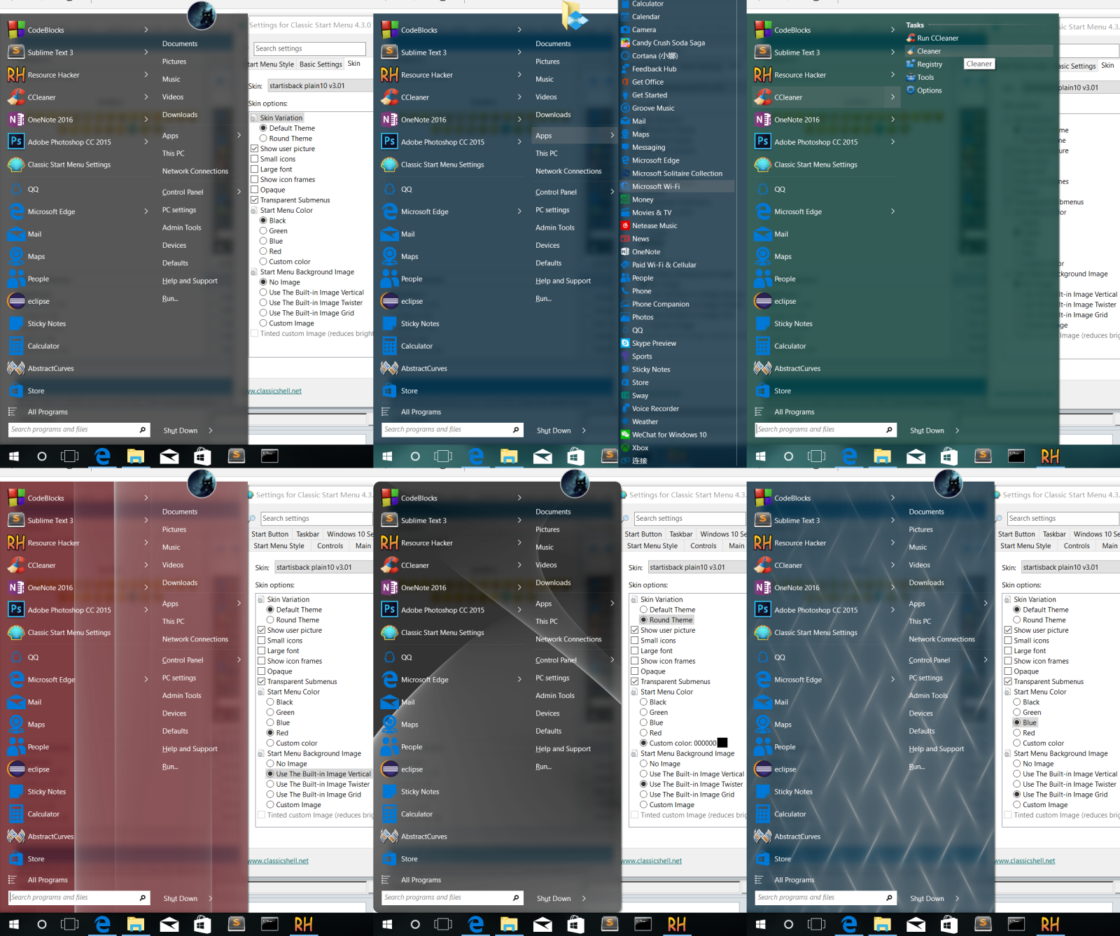
I launch a new topic and you can easily find and download the skins here. Just make the skin a little bit more like the startisback's plain10 style. Improved the separator lines, shutdown button, arrows. Made the folders' arrows in the main menu different from the programs' arrows. Together with the skin for classic 1&2 made by juniper7, it looks awesome with the metro icons made by Dave. (Sorry for my poor English). Here is the screenshot of the win7 style. Edit: version 2 is now out. Add a round theme, update the text in the about box. Also with various minor improvements. I recommend you to set the Glass Opacity to 0, override the glass color to 0A0A0A and set the taskbar color to 0A0A0A to fit with windows 10 OS. Edit2: version 3 is now out. Add an option for you to choose the background image for the start menu. There is a built-in abstract background image made by AbstractCurves. Of course, you can always choose your own background image. Here is the screenshots. Edit3: version 3.01 is now out. Add three built-in background image for you to three(The twister is made by juniper7). Add an tinted color option to reduce brightness for better text visibility together with various minor improvements such as selections, all program icons and so on. Thanks again Ivo and Juniper7, for your help and guidence. Here is another preview. P.S. All Plain10 skins in this topic do not work on win7 since it use some metro colors. P.P.S. The built-in background image works fine on my monitor, if it shows repeatedly on your monitor, you can simply make the image a little larger. P.P.P.S Your suggestions and advice are always highly welcome. Enjoy.
|
Author: | shpkong [ Wed Aug 31, 2016 5:35 am ] |
Post subject: | Re: StartIsBack Plain10 skins |
If you like the Plain10 style but does not like StartIsBack ( Often Crashes ), you have come to the right place. |
Author: | juniper7 [ Wed Aug 31, 2016 8:39 am ] |
Post subject: | Re: StartIsBack Plain10 skins |
It's too bad when programs crash. I'm sure Tihiy works very hard to fix them. I saw Tihiy's name in credits on an all in one Win98 boot install disk, on the weekend. I've tried Startisback several times, but for unknown reason, always come back to Classic Shell. About your Win7 transparent style. That's a good matching effect, with the shutdown button's first state being invisible. It can be done also with the opaque 24 bit bitmap 14. Just change it to 32 bit with alpha, and do your invisible trick. |
Author: | shpkong [ Wed Aug 31, 2016 5:55 pm ] |
Post subject: | Re: StartIsBack Plain10 skins |
Quote: It can be done also with the opaque 24 bit bitmap 14. Just change it to 32 bit with alpha, and do your invisible trick It works great and I have added it to the skin and change the attaches on #1. Tihiy? This may be the nickname of the StartIsBack author. The StartIsBack is signed as STANISLAV ZINUKHOV, so maybe this is the author's real name. StartIsBack is also a great start menu program, but I prefer Classic Shell to StartIsBack too. |
Author: | shpkong [ Sun Sep 04, 2016 7:57 pm ] | ||
Post subject: | Re: StartIsBack Plain10 skins | ||
Today, I am surprised to find out that the round edges are broken when I choose Round theme and Opacity. Go into the skin tutorials, it said: Region means the pixels with alpha=0 will be transparent, and the rest will be opaque. I just simply copy the alpha channel from bitmap 41 to bitmap 42 which cause some of the pixels that I want them to be invisible are not 0 but 1 or 2, this leads to the problem. Now I set all of them to 0 and this problem is fixed. I will try to learn how to use the new feature: Emblems next weekends. Thank you very much for your help, Ivo and Juniper7.
|
Author: | juniper7 [ Mon Sep 05, 2016 12:03 am ] |
Post subject: | Re: StartIsBack Plain10 skins |
Hmm. Must have been noise or got misaligned? Glad you figured it out. You are a quick learner to figure out how to make bitmaps and settings for round version. |
Author: | shpkong [ Tue Sep 13, 2016 8:42 pm ] | ||
Post subject: | Re: StartIsBack Plain10 skins | ||
It seems that every post can have up to 3 attaches. So, I removed the version 1 for version 3. However, If you do not like the new options. You can download version 1 here separately.
|
Author: | juniper7 [ Wed Sep 14, 2016 1:40 am ] | ||
Post subject: | Re: StartIsBack Plain10 skins | ||
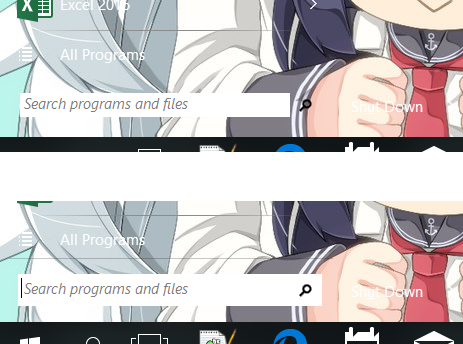
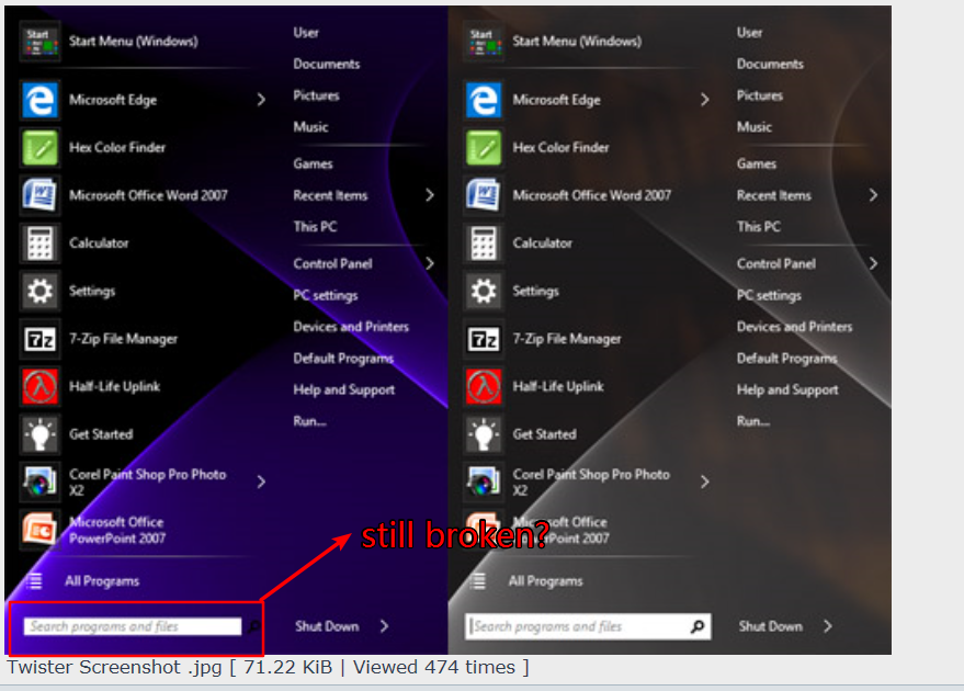
Wonderful shpkong. I have menu envy now. You beat me to it. Time for me to retire. I was working on a similar skin that would have Ivo's wavy ripple textured image, from his "metallic" skin' with transparency at same time. Got 3/4 there, was working ok on Win 10, then gave up when I tried on Win7.It was terrible. Colors were so weak. Using your skin, I can just add the same custom image, and it is so easy. You found the way to do it, by having the picture in the alpha channel of image. It looks like you got the same problem, as I got, with the search box not showing properly. Sometimes it looks ok, other times shows the grey part. See picture. I tried everything then went back to look at "Metallic" skin. It has something to do with using the Search_pattern_mask, Search_pattern_search_mask and Search_pattern_jump_mask You need to for sure add the first one Search_pattern_mask= Once that red/ black bitmap is added, along with the text, search box will be white 100% of the time. I did notice what you were talking about with the round corners, and pixels a different color. They are showing color bleed through. Only way to get rid of them is edit the red bitmap so red pixels are max on, or totaly off black. Excellent work shpkong.
|
Author: | shpkong [ Wed Sep 14, 2016 4:57 am ] | ||
Post subject: | Re: StartIsBack Plain10 skins | ||
Quote: You beat me to it. Time for me to retire. I think your skill is still far better than mine. I am still a freshman in making skins. I still do not figure out how to make the user image 1/2 out in Classic 1&2 style currently. I will trying to add an user image 1/2 out option for Start8 skin made by dJuL in my spare time. Maybe your skin is better than mine. Feel free to post it here. Quote: You need to for sure add the first one Search_pattern_mask= Once that red/ black bitmap is added, along with the text, search box will be white 100% of the time. Aye. The search box does not display correctly without Search_pattern_mask. Just do what you said and now the problem is fixed.
|
Author: | juniper7 [ Sat Sep 17, 2016 10:53 am ] | |||
Post subject: | Re: StartIsBack Plain10 skins | |||
That http://abstractcurves.com/ is a good program for making menu backgrounds. It reminds me of making lissajous sine wave shapes on an oscilloscope. They have taken it a lot further. Even just entering “abstract” in Google, can show a ton of images that can be used as a menu backgrounds. Example “Oil-On-Canvas-Abstract-Art” There might be one more option that could be included in the v3 skin, with custom image. That is, to have an extra tint option, that can be turned on or off. So when user inputs an image with lots of white areas, the tint option will darken the picture a little so white text is more visible.
|
Author: | juniper7 [ Mon Sep 19, 2016 2:00 pm ] | |||
Post subject: | Re: StartIsBack Plain10 skins | |||
Hi shpkong. Really wild designs on the net, that can be a custom menu image. Here is what I was talking about before. Picture is example about the white text on white menu background, with possible tint option on/off. It might not be the best way to get effect. Looks a bit muddy. You would need to make extra search pattern mask 47, with red at 200/255. I put this text in Skin 1 folder: OPTION TINTED="Tinted custom Image",0,CUSTOM_IMAGE_LEFT,0 [TINTED AND CUSTOM_IMAGE_LEFT AND COLOR_BLACK OR COLOR_GREEN OR COLOR_BLUE OR COLOR_RED OR COLOR_CUSTOM] Main_pattern_mask=#C80000 Main_pattern_search_mask=#C80000 Main_pattern_jump_mask=#C80000 Search_pattern_mask=47 For Skin 2 folder with the round corners, another main pattern mask 48, with 200/255 red, would need to be made as well: [TINTED AND CUSTOM_IMAGE_LEFT AND COLOR_BLACK OR COLOR_GREEN OR COLOR_BLUE OR COLOR_RED OR COLOR_CUSTOM] Main_pattern_mask=48 Main_pattern_search_mask=48 Main_pattern_jump_mask=48 Search_pattern_mask=47
|
Author: | juniper7 [ Fri Sep 23, 2016 8:36 pm ] | |||
Post subject: | Re: StartIsBack Plain10 skins | |||
Thanks again shpkong, for letting us know about the shareware "AbstractCurves". It's so easy to make backgrounds with that tool. Here is one I made, calling it "Twister" The first image is color on the rgb channels. It's stuck with that color, unless you want to change tint in a photo program first. The other image same thing, but the picture is on the transparent alpha channel, for using one of your preset colors, or with custom dark color. Out of the three custom image skins available at this point, Metallic, Asus K20, only this skin from shpkong can have desktop transparency.
|
Author: | shpkong [ Sat Oct 15, 2016 7:09 am ] |
Post subject: | Re: StartIsBack Plain10 skins |
Hi, juniper7 It seems that this text: [CUSTOM_IMAGE_LEFT AND COLOR_BLACK OR COLOR_GREEN OR COLOR_BLUE OR COLOR_RED OR COLOR_CUSTOM] only shows background image when I choose COLOR_BLACK, others: COLOR_GREEN OR COLOR_BLUE OR COLOR_RED OR COLOR_CUSTOM do not work, the menu is still plain with no background image. I do not know why. |
Author: | shpkong [ Sat Oct 15, 2016 7:26 am ] | ||
Post subject: | Re: StartIsBack Plain10 skins | ||
Hi, juniper7 It seems that the search box is still broken in your screenshot. This problem is still not fixed, is it?
|
Author: | shpkong [ Sat Oct 15, 2016 8:07 am ] | ||||
Post subject: | Re: StartIsBack Plain10 skins | ||||
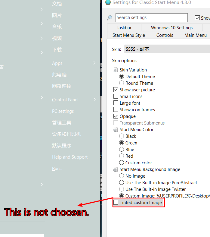
It seems that the logic of this text [TINTED AND CUSTOM_IMAGE_LEFT AND COLOR_BLACK OR COLOR_GREEN OR COLOR_BLUE OR COLOR_RED OR COLOR_CUSTOM] is also very strange. I use a png image which is totally white to test the tinted option. It seems that when I choose COLOR_GREEN and I do not choose the "Tinted custom Image" option. But the result is that the Tinted option is enabled.
|
Author: | juniper7 [ Sat Oct 15, 2016 8:28 am ] |
Post subject: | Re: StartIsBack Plain10 skins |
If I remember correctly, way back I was mentioning about the grey frame inside the white search box. That got fixed by you and me, so it's all one color. I don't recall if I used your updated skin, or just older skin for screenshot of twister. For the search box in Win7 style, one can have the classic look (with the magnifying glass outside of box), which is simple and easy to apply, or have the extended white box (with the magnifying glass inside the box). The extended box is more complicated to make work, but one can have say, an extra border separator line above( like in screenshot of my abandoned skin). It uses an extra bitmap. Which type do you want to use for all, in, or out? It's Saturday morning here. I need to go grocery shopping big time. Will get back to you in a few hours and look at your skin. |
Author: | juniper7 [ Sat Oct 15, 2016 12:26 pm ] | ||
Post subject: | Re: StartIsBack Plain10 skins | ||
Hello shpkong Using your v3 skin. There does seem to be a difference with the search box with a custom image. If custom png image is 32 bit variation alpha intensities, search box has magnifier inside. If custom png image is 24 or 32 bit alpha at 255, search box has magnifier outside. If I try my modded version of your V3 skin, all search boxes have magnifier inside. I will upload the modded version for you to look at. There will be extra redundant (repeated useless text) in there. Just hard to decipher what I did back then that fixes that problem. Now the other problem with the tint works even when turned off. It's weird how even when tint option is not checked, it still turns on. I think it is because it does not like the combined text header with all the colors in one. If I put separate, seems ok. If you have read some of my comments in other posts, it will be clear that I don't know what the heck I'm doing, when it comes to script logic. Sometimes when some text is defined above, similar text headers can be put together, and sometimes not. Or in the case of another skin I just finished. I had put just a little bit of text in second variation that was different than first variation. Then it screwed up other related text, so I had to copy and paste more text from first variation to make it work properly. One day I will learn the correct way. In this Startisback skin case, I think the different colors have to be made as separate entries. Did my modded version catch all the bugaboos, don't know.
|
Author: | juniper7 [ Sat Oct 15, 2016 1:03 pm ] |
Post subject: | Re: StartIsBack Plain10 skins |
Maybe the proper way is put everything in brackets like: [(TINTED AND CUSTOM_IMAGE_LEFT AND COLOR_BLACK) OR (TINTED AND CUSTOM_IMAGE_LEFT AND COLOR_GREEN) OR (TINTED AND CUSTOM_IMAGE_LEFT AND COLOR_BLUE) OR (TINTED AND CUSTOM_IMAGE_LEFT AND COLOR_RED) OR (TINTED AND CUSTOM_IMAGE_LEFT AND COLOR_CUSTOM)] Main_pattern_mask=#C80000 Main_pattern_search_mask=#C80000 Main_pattern_jump_mask=#C80000 Search_pattern_mask=47 |
Author: | shpkong [ Sat Oct 15, 2016 7:02 pm ] |
Post subject: | Re: StartIsBack Plain10 skins |
Quote: [(TINTED AND CUSTOM_IMAGE_LEFT AND COLOR_BLACK) OR (TINTED AND CUSTOM_IMAGE_LEFT AND COLOR_GREEN) OR (TINTED AND CUSTOM_IMAGE_LEFT AND COLOR_BLUE) OR (TINTED AND CUSTOM_IMAGE_LEFT AND COLOR_RED) OR (TINTED AND CUSTOM_IMAGE_LEFT AND COLOR_CUSTOM)] Great Juniper7. This complex text works on all the color variatations. Now I knew that () can be used to change the text's logic. Thank you. I will soon out a new version, with some minor tweaks. |
Author: | shpkong [ Sat Oct 15, 2016 10:52 pm ] |
Post subject: | Re: StartIsBack Plain10 skins |
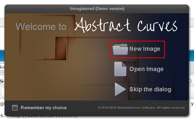
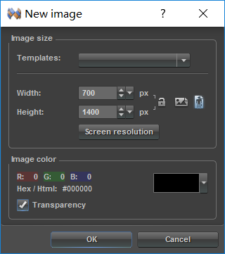
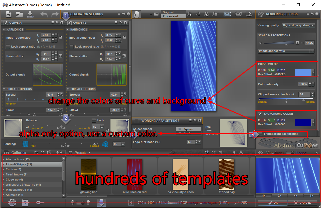
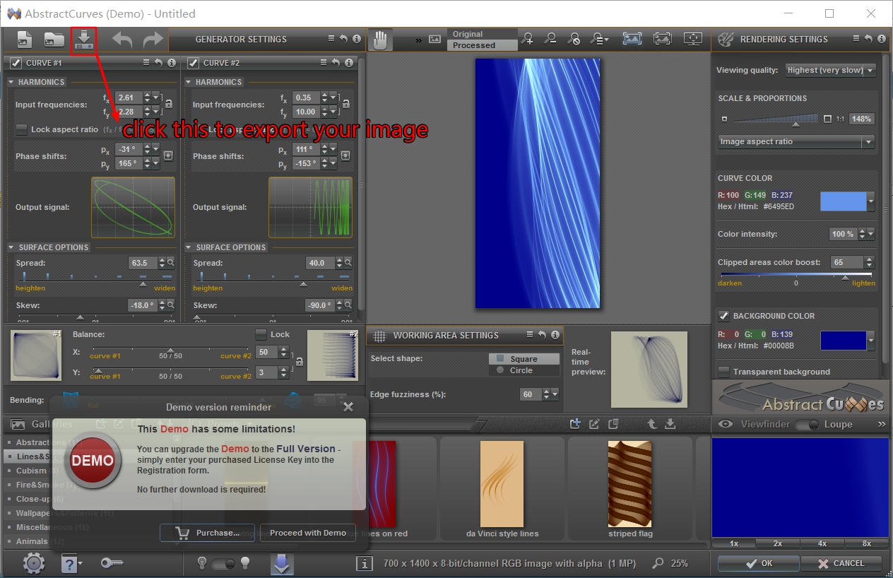
If you want more background images, you can simply make many beautiful background images by yourselves thanks to a great software abstractcurves. Whose offical website is: http://abstractcurves.com/ Here is a simply guidence on how to make a background images with a few clicks. First, launch abstractcurves and click new image. Then, a windows will pop out for you to choose size, transparecy and so on. The recommend background image size is 700*1400, but if you are using a high dpi monitor you should set the size a little lager so that the images will not show repeatedly. Here goes the main windows. Here is a very simple introduction of the basic features. If transparent background opion is enabled, the back ground image will behave like Twister alpha only. Use a custom dark color.png made by juniper7. |
Page 1 of 1 | All times are UTC - 8 hours [ DST ] |
Powered by phpBB® Forum Software © phpBB Group https://www.phpbb.com/ |