Classic Shell
http://www.classicshell.net/forum/

Experiment #4 Dark Cloud.
http://www.classicshell.net/forum/viewtopic.php?f=17&t=1950
Page 1 of 1

Author:  juniper7 [ Wed Jan 01, 2014 5:29 pm ]
Post subject:  Experiment #4 Dark Cloud.

Experiment #4 Dark Cloud.

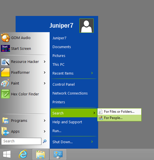
XP modified skin of CSM
I chopped a piece off, and menu instantly becomes two menu pages cascaded,
or menu 1 is a big dark cloud. It's ready to release a torrent of rain,
but just hangs there all day long, while menu 2 is the sky.

Little voice in head, says juniper7 has been spending too much time on making menus. :)

I really had trouble with this one.
My monitor could be part of problem.
I can't figure out working with 8 bit gradients. It makes visible banding.
Is there a way to use all 24 bits for a smooth greyscale and 8 bits for alpha?
Looking at default CSM skins, stepping bands are barely detectable.
Guess that is where expensive image editors pay off.

Tried with CSM 4.0.2 on Win7/8
Not compatible with most older versions of CSM. Will only partially work.
After downloading file, paste in skins folder. Exit CSM, restart CSM,
and go to "Start Menu Style" tab. Pick Classic or Classic two columns.
Pick "Dark Cloud" in Skin tab.

ps. Feel free to change anything in this skin, especially my errors,
as it's just an experiment.
Nothing is permanent, everything changes:)


Looks like I've run out of time.
At some point in future, I would like to try transparencies,
if only they could be less distracting, like in Win7.


:P HAPPY NEW YEAR :P :lol: 8-) :D :o :)

Attachments:
Dark Cloud.skin [653 KiB]
Downloaded 480 times
Dark Cloud.jpg
Dark Cloud.jpg [ 100.08 KiB | Viewed 10006 times ]

Author:  Jcee [ Sat Jan 04, 2014 4:05 pm ]
Post subject:  Re: Experiment #4 Dark Cloud.

This actually looks pretty cool :P

Author:  ZoNi [ Sat Feb 01, 2014 3:16 pm ]
Post subject:  Re: Experiment #4 Dark Cloud.

Nice... Can you add black submenus and blue highlights (this green color I hate) :)

And give us some transparency :)

Author:  juniper7 [ Sat Feb 08, 2014 7:22 pm ]
Post subject:  Re: Experiment #4 Dark Cloud.

OK. I added blue highlights option.
I had tried green, to escape from MS brainwashing blue :lol:
Put option for a matching black submenu.
Also an option for more of those dirty ugly dark clouds.
I may have gone too far on this option.

I have yet to fully explore and understand menu transparencies,
so I will skip for now.
If there was a way to fuzzy up the Win8 desktop, I would love to add it.

If you want to try. Use Resource Hacker to save a main bitmap, from the skin file.
Use Pixelformer to modify the alpha layer of that file. Put back in skin file.
Change the main opacity text in file to one of the six transparency types.
Good luck. :)

Attachments:
Dark Clouds.skin [842.5 KiB]
Downloaded 347 times

Author:  Pipalou50 [ Sun Feb 09, 2014 1:44 am ]
Post subject:  Re: Experiment #4 Dark Cloud.

bonjour,

j'aime beaucoup cette seconde version, plus complète dans les choix de couleur (et j'aime bien le bleu !)
cependant, je l'aurais aimée un peu plus large dans son ensemble, (sous menu exclu).

amicalement


Hello,

I like very much this second, more comprehensive version in color choices (and I like blue!)
However, I would have loved a little wider as a whole (under excluded menu).

Friendly

Author:  ZoNi [ Wed Feb 12, 2014 11:01 am ]
Post subject:  Re: Experiment #4 Dark Cloud.

Thanx, blue is much better :)

Page 1 of 1 All times are UTC - 8 hours [ DST ]
Powered by phpBB® Forum Software © phpBB Group
https://www.phpbb.com/