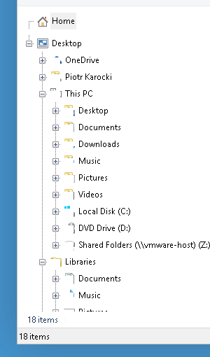
Lines which links nodes in tree view conflicts with items icons - see screenshot.
Win10 Build 9841, 32 bit, in VMware player 6.0.3 build-1895310
| Attachments: |
 win10classExp.png [ 12.86 KiB | Viewed 4802 times ] |
| Classic Shell http://www.classicshell.net/forum/ |
|
| Classic Expl, Win10, navigation panel classic XP - bad lines http://www.classicshell.net/forum/viewtopic.php?f=12&t=3304 |
Page 1 of 1 |
| Author: | pkar [ Mon Oct 27, 2014 9:20 am ] | ||
| Post subject: | Classic Expl, Win10, navigation panel classic XP - bad lines | ||
Lines which links nodes in tree view conflicts with items icons - see screenshot. Win10 Build 9841, 32 bit, in VMware player 6.0.3 build-1895310
|
|||
| Author: | Gaurav [ Sun Apr 12, 2015 10:11 pm ] |
| Post subject: | Re: Classic Expl, Win10, navigation panel classic XP - bad l |
This happens if you are using the 'Windows XP Classic' navigation pane style. It was not compatible with Windows 10 with the default tree item spacing so it was removed in the newest version. |
|
| Author: | pkar [ Mon Apr 13, 2015 1:53 am ] |
| Post subject: | Re: Classic Expl, Win10, navigation panel classic XP - bad l |
But these vertical lines are very good - it was easier to know which folder is under which folder... Folder icon could be drawn with greater distance from [+], or be "empty" (white square), but please, do not remove WinXP classic. |
|
| Author: | Tomaso [ Mon Apr 13, 2015 2:42 am ] |
| Post subject: | Re: Classic Expl, Win10, navigation panel classic XP - bad l |
'Windows XP Classic' is my favorite pane style too. Hope you'll be able to make this work for Win10. |
|
| Author: | Gaurav [ Mon Apr 13, 2015 4:53 am ] |
| Post subject: | Re: Classic Expl, Win10, navigation panel classic XP - bad l |
It worked only if you set the "tree item spacing" to 4 or higher. Otherwise, with tree spacing set to any value lower than 4, the icons got all corrupted in 'Windows XP Classic' nav pane style due to a Windows 10 bug. |
|
| Author: | Tomaso [ Mon Apr 13, 2015 7:19 am ] |
| Post subject: | Re: Classic Expl, Win10, navigation panel classic XP - bad l |
GauravK wrote: It worked only if you set the "tree item spacing" to 4 or higher. Otherwise, with tree spacing set to any value lower than 4, the icons got all corrupted in 'Windows XP Classic' nav pane style due to a Windows 10 bug. Should be an extremely simple fix then.. As a workaround, just make Classic shell change this value automatically when you choose 'Windows XP Classic' style! |
|
| Author: | Gaurav [ Mon Apr 13, 2015 8:14 am ] |
| Post subject: | Re: Classic Expl, Win10, navigation panel classic XP - bad l |
According to Ivo (the developer), "It is something that can't be depended on. The metrics in the tree depend on many external factors – DPI, text size, icon size. The root cause of the problem is that for some reason Windows 10 sets the line height to be 8 pixels and then uses 3 lines to represent each item. In that mode the tree control can’t correctly draw the icon, so Explorer draws it manually. However that interferes with the way the control draws its lines." |
|
| Author: | Tomaso [ Mon Apr 13, 2015 12:11 pm ] |
| Post subject: | Re: Classic Expl, Win10, navigation panel classic XP - bad l |
GauravK wrote: According to Ivo (the developer), "It is something that can't be depended on. The metrics in the tree depend on many external factors – DPI, text size, icon size. The root cause of the problem is that for some reason Windows 10 sets the line height to be 8 pixels and then uses 3 lines to represent each item. In that mode the tree control can’t correctly draw the icon, so Explorer draws it manually. However that interferes with the way the control draws its lines." That's too bad. Guess we'll have to settle for one of the other styles under Win10 then. The only thing I find really annoying with Classic Shell under Win8.1, is the strange behavior related to keyboard accelerators in the start menu: viewtopic.php?f=12&t=2429/ When scrolling through the start menu, accelerators only work for the current sub-menu, instead of the active one. I don't care what anyone says.. This is NOT consistent with the way accelerators has worked in M$'s start menus! I though that I would get used to it, but I can't.. Too many years of using the accelerators in M$'s start menus I guess. I'm not gonna bump that thread again though, since Ivo has clearly stated that the behaviour is by design. Still, it would be nice if we were able to change this behaviour from Classic Shell's settings. |
|
| Author: | pkar [ Sun Jun 28, 2015 1:09 pm ] |
| Post subject: | Re: Classic Expl, Win10, navigation panel classic XP - bad l |
But Classic Shell could allow to switch to 'Windows XP Classic', with warning: "could looks strange" |
|
| Page 1 of 1 | All times are UTC - 8 hours [ DST ] |
| Powered by phpBB® Forum Software © phpBB Group https://www.phpbb.com/ |
|