Classic Shell
http://www.classicshell.net/forum/

Crystal Haze (Classic style)
http://www.classicshell.net/forum/viewtopic.php?f=17&t=4658
Page 1 of 1

Author:  juniper7 [ Mon May 25, 2015 7:36 pm ]
Post subject:  Crystal Haze (Classic style)

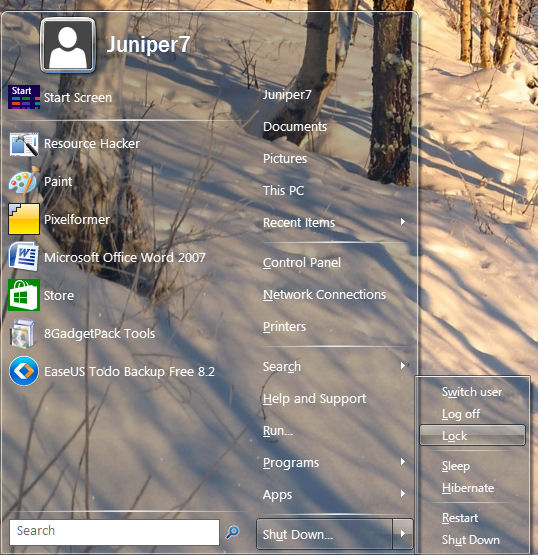
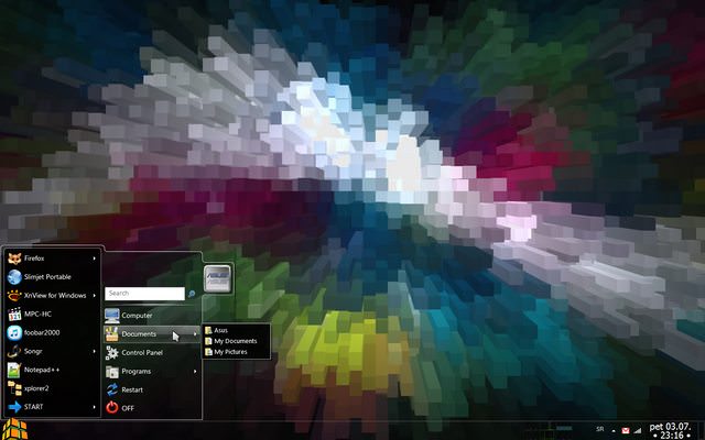
Crystal Haze revB (Classic style)
Semi transparent skin.

!Warning! This is not a fully functional skin, as it is difficult to read menu sometimes.
Skin may not be suitable when using a busy desktop.
More for visual fun.:)


Tried with CSM 4.2.1 Made for Win8.1
Win7 does not have auto color, and system color presets too dark. Need to boost color intensity a lot!
After downloading file, paste in skins folder. Usually C:\Program Files\Classic Shell\Skins
Exit CSM, restart CSM, and go to "Start Menu Style" tab. Pick Classic or Classic two columns.
Pick "Crystal Haze" in Skin tab.

Prepare for visual confusion, as there is no blur option.
I did not make 100% clear on purpose, as white text would have vanished, if on top of white background.
I usually just set to light, and have auto color on, and auto changing wallpaper on the Win8.1 desktop.

Found it best to move the "Programs", and "Apps" to the right main column. Do this in CSM settings.
This avoids clutter from one menu on top of the other.
Set submenus to single column scroll.
Turn off "jumplists" in CSM settings.
Turn on white submenu option, if brain gets too mixed up!

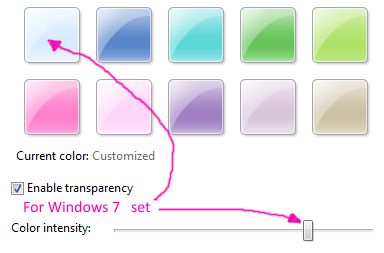
If using in Win7, not much one can do. Pick the light blue system color, and crank up the color intensity slider,
to get a bit of haze on the menu. See picture.


Edit. Fixed wrong bitmap selector reference.

Attachments:
Crystal Haze revB.skin [2.33 MiB]
Downloaded 878 times
Classic style.jpg
Classic style.jpg [ 80.88 KiB | Viewed 10788 times ]
Color setting Win7 OS.png
Color setting Win7 OS.png [ 27.99 KiB | Viewed 10788 times ]

Author:  Pipalou50 [ Tue May 26, 2015 5:58 am ]
Post subject:  Re: Crystal Haze (Classic style)

Juniper7
I dreamed about it and you made it!
Magnificent, bravo I believe that you are the most relentless and the best
thank you :P

Author:  juniper7 [ Wed May 27, 2015 9:48 am ]
Post subject:  Re: Crystal Haze (Classic style)

Pipalou50
Obviously not the best, just realized I made a boo boo.
Regular selector has a wrong size mask reference, where it should be no mask.

The best is Ivos' program, as it is smart enough to know, fix it, and carry on,
by ommitting it, without crashing.
I fixed it now.

Author:  NoahNicholsFourm [ Tue Jun 23, 2015 4:17 am ]
Post subject:  Setting for Win8 and 8.1

What is the setting for Win8 and 8.1? for both of the skins

Author:  juniper7 [ Tue Jun 23, 2015 11:32 am ]
Post subject:  Re: Crystal Haze (Classic style)

Anything you want. White, grey, blue, black preset. Depends if you like frosty, neutral, tinted or dark grey.
For me I get bored very easily,
so I just set to auto color and have tons of pictures cycle through.
It will pick the color from those.
On win8/8.1, the color intensity is roughly the same.

Win 7 color intensity, goes all over the place. Quite bizarre presets.
For Win7 there is a program, that GauravK recomended in another post, called "AeroBlend" for auto color in Win7.
It's ok, just a lot of grey, even set up for maximum color picking.


For awhile, I even put the striped watermark reflection bars diagonally. Just got irritating after awhile.
I chopped them out.

Author:  ZoNi [ Fri Jun 26, 2015 2:40 pm ]
Post subject:  Re: Crystal Haze (Classic style)

Can you add "Split Main Menu 2" (with black background instead of white)?

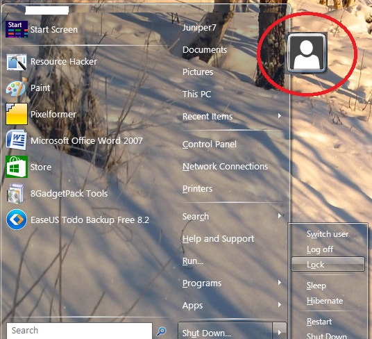
PLus... Is it possible to move user pic to the right side, something like this:


Author:  juniper7 [ Sat Jun 27, 2015 5:27 pm ]
Post subject:  Re: Crystal Haze (Classic style)

Hello ZoNi.
Summer heat is making me so lazy. Ahhooh...ZZZz.

It's not impossible to do this request, just very complex, with so many bitmaps.
I'm going to replace the white with black, and rename the skin.
A little easier that way.

It will have black 0/255 RGB, with a little transparency, 225/255 Alpha. I did a test on one bitmap, with glass color off.
With those settings, the left menu can be black 0/255 to max of 30/255, depending on what's on desktop.
You can use pixelformer to change the transparency bitmaps to your taste, if not black enough.

The only way to place picture like that, is to have a large invisible dead zone, on that side.
This means, if the menu is showing, and you click on a folder/shortcut on desktop, in that area, nothing happens.
Would you be prepared for that? Also menu shadow would have to be turned off in CSM settings.
I know it can be done, with picture on side. Just have to figure it out, with some time and cool weather.

Author:  juniper7 [ Sat Jun 27, 2015 10:20 pm ]
Post subject:  Re: Crystal Haze (Classic style)

Hello again ZoNi.
For adding the black change, probably will finish maybe in one day.
It's not that difficult, unless I'm forgetting something.3/4 done. Have to stop for bit. :)

As for the picture on the side, I can get it working. See picture.
Just one big problem. Just to put the picture in that place,
means 14 new menu bitmaps would have to be made, to accommodate it.
Will take too much time and the skin file could be 5 meg,
unless I spend more time shrinking down bitmaps to bare minimum.
If it was Win 7 style, would be very simple.
Only problem with Win7, is picture has to be in middle of second column.
I will have to pass on the picture option, unless skin can be simpler. :|

Attachments:
ZoNi black request.jpg
ZoNi black request.jpg [ 55.72 KiB | Viewed 8677 times ]

Author:  ZoNi [ Sun Jun 28, 2015 2:30 pm ]
Post subject:  Re: Crystal Haze (Classic style)

That looks so cool! No hurry :)

Author:  Splitwirez [ Sun Jun 28, 2015 7:21 pm ]
Post subject:  Re: Crystal Haze (Classic style)

I liked this skin so much, I made a button to go with it. I'm going to do a little bit of a Visual Style, too. Nothing too big, just a few Hazy alterations to Win7's regular Aero VS :3

Attachments:
File comment: Le Start Button :3
CrystalHazeButton.png
CrystalHazeButton.png [ 14.66 KiB | Viewed 9181 times ]

Author:  juniper7 [ Mon Jun 29, 2015 7:23 am ]
Post subject:  Re: Crystal Haze (Classic style)

Ran out of time. Kept changing it so much, as per background picture.
It can never look good for every background.
So I'll backtrack to what was planned originally.
Oh well, that's how experments go.:)
Next weekend for sure.

Splitwirez, I'm using your button-button . Thanks.
Have to come clean with you.
Notice the menu edges. I borrowed parts of it, from your plex menu.
That's the reason why skin is so big, cause of the top white line gradient,
which is hardly noticeable. I didn't want to shrink it. Thanks.

Author:  juniper7 [ Wed Jul 01, 2015 10:30 am ]
Post subject:  Re: Crystal Haze (Classic style)

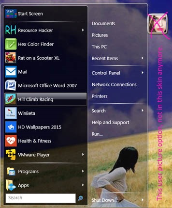
Crystal Black Haze. (Classic one/two column)

This does not have the user picture on the right edge.
Nor does it have the white split menu. I replaced with a blackish one.
To put every option in one skin, would amount to a couple hundred bitmaps.
Sorry, don't want to do. See a later post for a simpler skin, with user picture on side.

My fave is "light", with "black split", with "glass color" "enabled".

Due to skin size being around 5 meg, it's a lot easier to upload/download a lot smaller file.
Unzip the compressed file first, then paste it in the skin folder.

Attachments:
Crystal Black Haze .zip [104.65 KiB]
Downloaded 268 times

Author:  juniper7 [ Wed Jul 01, 2015 10:32 am ]
Post subject:  Re: Crystal Haze (Classic style)

Crystal Black Minimum. (Classic one/two column)

I made a simpler stripped down, neutral skin for you, ZoNi.
No name, No glass color haze.
The user picture is on the side, in a folder tab look, or bare.

Turn off menu shadow, and remember,
there will be anti mouse click dead zone,
all along the right side, when user picture turned on.

Unzip the compressed file, then paste it in the skin folder.

Attachments:
Crystal Black Mini.zip [87.43 KiB]
Downloaded 233 times

Author:  ZoNi [ Fri Jul 03, 2015 2:31 pm ]
Post subject:  Re: Crystal Haze (Classic style)

Crystal Black Mini looks very nice, only thing that I don't like is that visible menu shadows ;)


Author:  Jcee [ Sat Jul 04, 2015 12:40 am ]
Post subject:  Re: Crystal Haze (Classic style)

type 'shadow' into classic shells settings searchbox and uncheck 'enable menu shadow'

Author:  ZoNi [ Sat Jul 04, 2015 1:41 am ]
Post subject:  Re: Crystal Haze (Classic style)

Done that, it is great now :) Thank you.

I thought I have to disable Windows-wide "shadow" option, didn't know Classic Shell has its own setting for that.

Page 1 of 1 All times are UTC - 8 hours [ DST ]
Powered by phpBB® Forum Software © phpBB Group
https://www.phpbb.com/