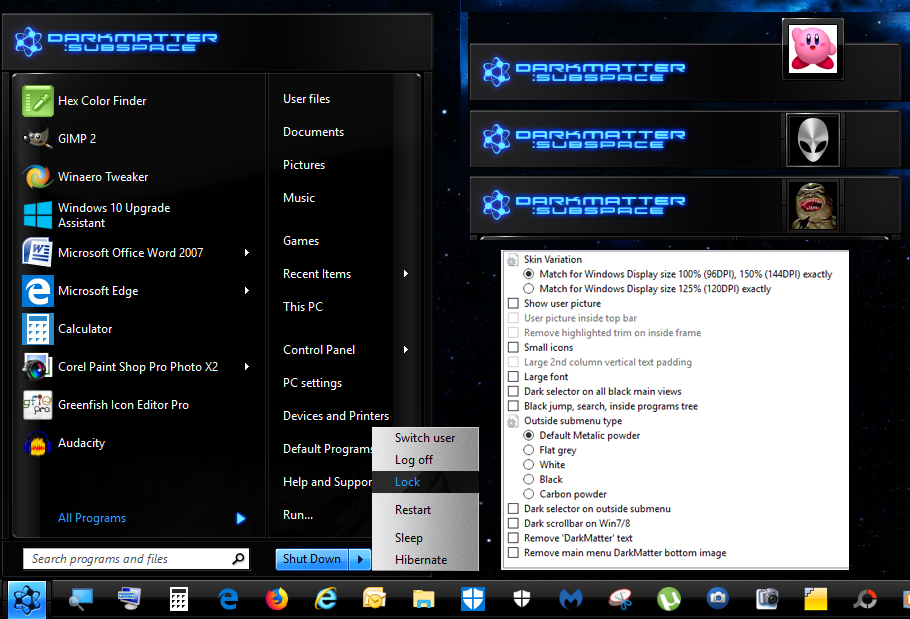
DARKMATTER-SUBSPACE Revived [7 style] opaque for CSM 4.3.0
Exactly for 96dpi/100%, 120dpi/125%, 144dpi/150% sizes.
This is a ported start menu from a theme by Hyperdesk "The Skins Factory". Only the black version, not the alloy one.
I never knew about this until somebody tried and failed to port to Classic Shell a few years ago.
His Resource Hacker file went corrupt.
My turn to try. Looking on the internet, Hyperdesk made XP, Vista, Win7 versions. I picked Win 7 version, for use on Win10.
The two biggest effects that can't be reproduced are there is no text glow available in later Windows OS,
and CSM does not use menu image pasting to build up the size of a submenu.
Example; The intentional noise texture of original submenu will just stretch and distort in CSM submenu.
I used a technique by making the submenu image gigantic to fake the look. That's one of the reasons why skin file is so big.
That default submenu is only good for displays up to 1080 vertical though, so I guess only good for 100%/96 dpi.
I don't have a Hidpi display to know what it would really look like.
The menu never had user picture, but I put in option anyway.
Oh yeah, CSM can't have a jump view with white text, and search view with black text, as in the original menu.
Has to be both matching, as the text color is shared for both views.
If only I knew more of undocumented text from Ivo.
Example: an arrow in search view, uses text as "List arrow", but if the arrow is a bitmap, the text changes to "Search arrow".
There does not appear to be any way to have correct search arrow size when using classic styles with 125% size.
No point crying over spilled milk.
Anyway, I had to make an all white, or all dark jump/search view option.
I added a black button selector, and submenu brightness options made from the explorer part of the theme.
There's one thing about the original menu. Wow, so much wicked color banding at the top bar.
I had to spend time dithering to smooth out those brightness steps. Mostly gone now.
That's about it.
Crossing fingers for no big text errors.
Probably my last black ported menu skin.
They always look great, to begin with, but never fit in with the rest of Windows,
as most of Windows is based on white.
I added a start button, taskbar, and wallpaper in the zip.
Thank you to
the people at "The Skins Factory" that have made very impressive themes. Superb artists.
Looking at their site, they don't specifically make Windows themes anymore?
Note:
If you want the first column a little skinnier, go to the "Main Menu" tab in CSM settings.
Adjust the "Programs pane width" & "Jumplist pane width" to 30
To get the flyout cascading submenu, there is an "All Programs style" setting under the same tab.
Final note: If you want icons on the second column,
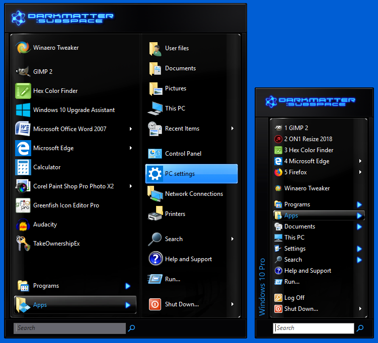
I added extra skin file to get basic Classic 1/2 styles.
It is not like the original XP menu, for I reused same 7 style bitmaps
User picture will always be inside.
Warning
EDIT: Changed picture to show 100% size
| Attachments: |
|
Downloaded 119 times |
 DarkMatter-Subspace.png [ 350.26 KiB | Viewed 1429 times ] |
 DarkMatter Classic styles.png [ 164.07 KiB | Viewed 1429 times ] |