|
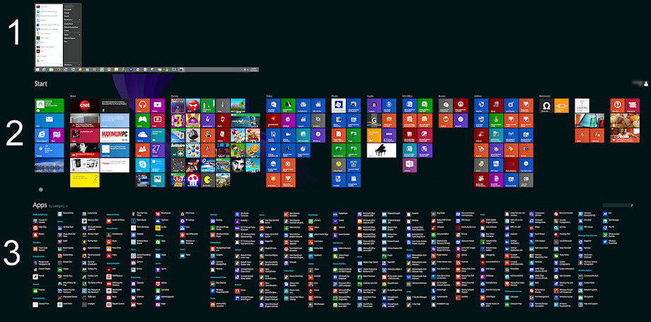
Just out of curiosity, I made a comparison picture,
of how different the Win 8.1 menus are to Classic Start Menu.
1 Is CSM. It has structure and ease of use.
2 Is regular Start Screen, that one chooses which programs get put there.
It's not that bad for a new concept, as one can set in order.
3 Is the alternate "everything" menu. It wasn't that bad at beginning,
but once all regular programs are installed, it's just too much junk to read.
Categories lose meaning at this stage, and don't help.
The only way to find something fast, is having to type a search.
I'm just a regular home computer user, with not much installed. 2 1/2 screens worth of menu.
I'd hate to think what a work computer looks like.
What was MS thinking?
| Attachments: |

Compare.jpg [ 171.53 KiB | Viewed 2311 times ]
|
|


