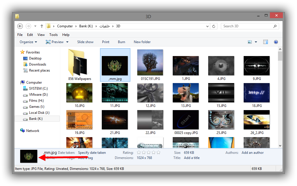
Is there an option to bring old file image preview like the old on, i'm using Win8.1 64Bit
If not can you add it to the next version?, i used "OldNewExplorer" program to do it
Thanks

| Classic Shell http://www.classicshell.net/forum/ |
|
| Move Details pane to bottom instead of side? http://www.classicshell.net/forum/viewtopic.php?f=8&t=3451 |
Page 1 of 1 |
| Author: | BALTAGY [ Sat Dec 13, 2014 4:02 pm ] |
| Post subject: | Move Details pane to bottom instead of side? |
Is there an option to bring old file image preview like the old on, i'm using Win8.1 64Bit If not can you add it to the next version?, i used "OldNewExplorer" program to do it Thanks 
|
|
| Author: | Ivo [ Sat Dec 13, 2014 5:14 pm ] |
| Post subject: | Re: file Image Preview like old explorer |
The details pane in Windows 8 and newer versions of Windows is on the side, not at the bottom. I suspect that "OldNewExplorer" simply run the old Windows 7 version of Explorer.exe. Classic Shell works with the existing Explorer and can't change it that much. |
|
| Author: | BALTAGY [ Sat Dec 13, 2014 5:17 pm ] |
| Post subject: | Re: file Image Preview like old explorer |
I will use both yours and "OldNewExplorer" then Thanks for your great work |
|
| Author: | Jcee [ Sat Dec 13, 2014 8:55 pm ] |
| Post subject: | Re: file Image Preview like old explorer |
Ive never understood the UI decision for the image pane anyways... the smart developer would have made it overlay the bottom of the navigation pane, and slide down when the mouse/focus is given to the navigation pane. This way most images could be as tall as they need to be (just reserve a small chunk for the navigation pane with a tall image) and is only competing for horizontal space with the primary field instead of how the preview pane is currently competing with both navigation pane, and primary field |
|
| Author: | Gaurav [ Thu Apr 02, 2015 7:11 pm ] |
| Post subject: | Re: file Image Preview like old explorer |
OldNewExplorer doesn't simply run Windows 7 Explorer to move the Details pane to the bottom. It does some clever in-memory patching of the code. |
|
| Author: | Krawk [ Thu Jun 23, 2016 5:29 pm ] |
| Post subject: | Re: Move Details pane to bottom instead of side? |
Bumping an old topic as this is the reason I just signed up for this site. Detailspane which I found on my own but when it's there it's on the right. I can live with that but I prefer it at the bottom. And this "File Availability: Offline" couldn't care less about that, I don't "cloud" compute so I would love to see that detail gone. So far am loving Classic Shell and will give the donation shortly. That's assuming I stick with Windows 10, which so far my fears of old programs (games mostly) not working have passed. |
|
| Author: | Manelus [ Mon Jun 27, 2016 5:05 pm ] |
| Post subject: | Re: Move Details pane to bottom instead of side? |
There is a lot of people that would very happy with that option. No chance? |
|
| Page 1 of 1 | All times are UTC - 8 hours [ DST ] |
| Powered by phpBB® Forum Software © phpBB Group https://www.phpbb.com/ |
|