Classic Shell
http://www.classicshell.net/forum/

Two Tone (Windows 7 style) and (Classic 1 & 2 column)
http://www.classicshell.net/forum/viewtopic.php?f=17&t=5264
Page 1 of 1

Author:  juniper7 [ Thu Oct 15, 2015 10:20 pm ]
Post subject:  Two Tone (Windows 7 style) and (Classic 1 & 2 column)

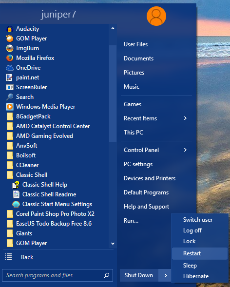
Two Tone (Windows 7 style)

Works with version CSM 4.2.4 Made for Windows 10.
Can work somewhat same on Windows 7, using Win 7 settings below.
After downloading file, paste in skins folder. Usually C:\Program Files\Classic Shell\Skins
Then go to "Start Menu Style" tab. Pick "Windows 7 style".
Pick "Two Tone" in Skin tab.

Win 7 settings.
In my opinion, Windows 7 has a better blur. Just enough to blur text, and is powerfully transparent.
To get this skin a little closer to Windows 10 looks, do the following:
Open the "Menu Look" tab. Crank up the "Menu glass intensity" to 100.
Set the "menu blending color" to 25.


A different kind of beast.
As stated in the skinning tutorial,
can't have full glass on the left side, only partial, when using Windows 7 style.
So it's a bit difficult to keep the left and right columns in balance.
Depending on what's on desktop behind menu, the left will be stable,
and the right will fluctuate wildly between light and dark,
even matching sometimes.

I decided to use right main column to resemble original 10 menu,
and the left column with mild light, or mild dark color.
Just cannibalized parts from Metro, America RWB, and Two tone classic.
I recycle, you know! :lol:

If you don't want transparency, or blur, go into menu look tab.
Make sure "Enable menu glass" is checked, then set "Glass opacity" to 100.
Then either use the "Override glass color" boxes,
or use Windows Personalization Color settings to set the type of color/grey you want.

Well that's about a good as I can make it, with my limited abilities.
Feel free to change the skin for the better, or use parts for your own menu skin.


This has been quite the adventure, thanks to the mask man, (Ivo).
Thank you, Ivo. :)
Ivo has created so many different ways of using masks,
(the text, or bitmap pictures, that instruct where to apply steady, or changing color).
Difficult to keep up with it all. I see even text, can now have a mask applied to it!
I have only tried a few of the masking techniques, in skins that I have made, or modified.
Never even tried the (start screen colors, or tint colors). As it's a bit of a guessing game, as to what Win 8/10 colors will look like, even though Ivo has provided a great Color palette utility. Some change tint, others stay the same.

Too-da-loo

Attachments:
Two Tone.skin7 [577.5 KiB]
Downloaded 2509 times
Two Tone Win7 style.png
Two Tone Win7 style.png [ 130.8 KiB | Viewed 9807 times ]

Author:  Pipalou50 [ Fri Oct 16, 2015 3:07 am ]
Post subject:  Re: Two Tone (Windows 7 style)

hello juniper7
Big theme for w7 but for my part I use the classic version "two tone for Windows 10" and I am very jealous of the menu " to user_image " which you propose in your version w7. :evil:
Would be it possible to propose it with the classic version?
I always look forward to your themes and I am never disappointed!

Thank you my friend :P

Author:  juniper7 [ Fri Oct 16, 2015 9:52 am ]
Post subject:  Re: Two Tone (Windows 7 style)

Hi Pipalou50
About the user picture types, asking to be put in the classic Two Tone.
I promised to help other people in other of life's duties in the next while.
It will have to wait. Sorry. :(

Can I persuade you to use Win 7 style? You can adjust in CSM settings, to have fly out programs submenu.
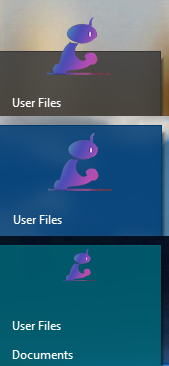
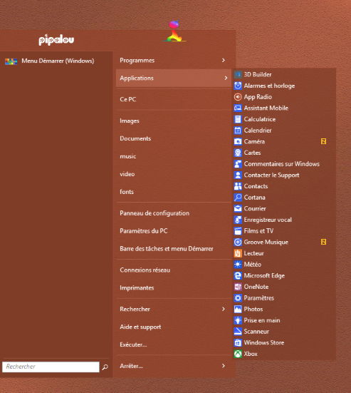
I have copied over your avatar, and made as a borderless picture.
Your very own personalized 7 style menu. Viva la Pipalou50!

Maybe it could start a new trendy feature?
It would need to be easy to add, and to auto fuzzy the edges.
It has some possibilities. :P

You , and others can study what I did, by looking at the text script, and the related bitmaps,
and make your own avatar to fit the same proportion sizes.
Have fun. Got to go. :D

EDIT: I did it the hard way! :lol:
Ivo has easier way for transparent png icon/pictures, on some skins.

viewtopic.php?f=13&t=5274

Attachments:
Avatar Pipalou50.zip [86.9 KiB]
Downloaded 243 times
Avatar Pipalou50.png
Avatar Pipalou50.png [ 33.15 KiB | Viewed 9769 times ]

Author:  Pipalou50 [ Sat Oct 17, 2015 1:51 pm ]
Post subject:  Re: Two Tone (Windows 7 style)

Thank you my friend I shall make with what I have, little..... :)

Author:  JohnBurns [ Tue Oct 20, 2015 6:05 am ]
Post subject:  Re: Two Tone (Windows 7 style)

Thank you, juniper 7 Nice job!

Author:  juniper7 [ Wed Oct 28, 2015 12:03 pm ]
Post subject:  Re: Two Tone (Windows 7 style)

I didn't forget about you, Pipalou50.
The agony of brain pain menu logic, has got the best of me.

Hoping to finish by end of weekend, or the next weekend after. Need lots of time, with so many options.
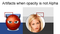
It can't have outside picture in Classic style glass blur. Gets some nasty artifacts. See picture. That's what it looks like in Classic style, with glass text in skin, with glass feature turned on and off in CSM. Even Asian devil put on a sour puss. :lol:

I commend Ivo for having an opacity setting in CSM, that reduces the residual glass color.
But in this case, will have to be alpha for that option.

Who knows if Ivo has more tricks in his magic bag,
that can make it work better, without a separate user image window?

Funny. I didn't need to add all the picture masks in the personal skin for you, as Ivo showed me how easy,
it can be done, with some of the newer metro skins, including this one. It was there all the time. :lol:

I will have to put in a simple option on this Win7 style skin, to remove the small picture frame,
so it can be used with a transparent png picture,
using the "user picture" override setting in "General Behavior" tab.

I have to stay focused on one skin at a time.

Later, I promise.

Attachments:
Artifacts.png
Artifacts.png [ 16.04 KiB | Viewed 9340 times ]

Author:  juniper7 [ Sun Nov 01, 2015 12:25 pm ]
Post subject:  Re: Two Tone (Windows 7 style) and (Classic 1 & 2 column)

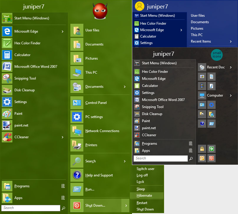
2 Tone Convert (Classic style)

Hi Pipalou50.
I skipped working on the original Two Tone (Classic style).
Instead, did a slightly faster way, by renaming the file Two Tone "skin.7" to "skin".
Then just fixed a number of things to make it work in classic style.
Until I realized I forgot all the one column Classic info needed too. :lol: Took a long time.
I think most of the bugs have been squished.

Some things can't be carried over properly, like search box. The inside box color can transfer, but as far as I know,
can't make the frame white. So, chop-chop.

About the user picture outside. From what Ivo writes about, the user picture in Win 7 style,
is a separate window and will have nice smooth corners.
But in Classic style, not the case. A bigger main menu, with a transparent top has to be used, which follows the opacity of main menu. If it is alpha, then user picture 1/2 outside corners will look smooth,
just have to turn off the menu shadow in csm settings.

But if skin instructs CSM to use glass, artifacts (dark edge pixels, residual glass color breakthrough), appear around the user picture. See the picture from earlier post. As well as top menu flashing, when animated menu opened.
So I turned off glass, when the picture 1/2 outside, switches to alpha mode. More chop chop!

So compromises were made here and there, and the color tones are different from original Two Tone classic,
as well as separator lines put back in. As one of my past work bosses said, "Nothing sits, everything changes".

Ooh yeah, If you want to have a transparent surrounding user picture, Ivo mentioned a simple way, as what is in his "Metro" skin.
Instead of using the default Windows user picture,
one can override that picture with one of your own transparent background 32 bit.bmp, .png image.
Go to "General Behavior" User Picture.
It works best picking the square option in the skin, as it's picture won't get cut off at the corners.


I am sorry, I made so many words to translate back into French. Hope you understand some of it. :)

Attachments:
2 Tone Convert.skin [468 KiB]
Downloaded 393 times
2Tone.jpg
2Tone.jpg [ 151.01 KiB | Viewed 9237 times ]

Author:  Pipalou50 [ Sun Nov 01, 2015 3:00 pm ]
Post subject:  Re: Two Tone (Windows 7 style) and (Classic 1 & 2 column)

Thank you juniper, it is very kind to have taken time to make him : that was worth waiting! :P
+ for the .png image returns the quite magnificent.
thank you
See you soon

ps : And I believe that I understood everything! ;)


Author:  AcroGen [ Tue Jan 10, 2017 7:16 pm ]
Post subject:  Re: Two Tone (Windows 7 style) and (Classic 1 & 2 column)

How did you get that logo when the username is supposed to be there? Is it a command?

Author:  juniper7 [ Tue Jan 10, 2017 8:38 pm ]
Post subject:  Re: Two Tone (Windows 7 style) and (Classic 1 & 2 column)

I don't think they had image emblem feature back then.

Pipalou50 would have changed the font for the user name.
That's done by opening up the skin file with Resource Hacker.

User_font="Segoe UI",normal,22 to whatever font you have in your system.
The type of font, and size can put the name placement out of bounds, (get cut off, or sit on top of user picture).

Use this help font topic for more info.

viewtopic.php?f=7&t=2051


Some newer menus allow a user picture area to become invisible using transparent png image.
Picture is inputted under the General Behavior tab. Look for User picture text.

Page 1 of 1 All times are UTC - 8 hours [ DST ]
Powered by phpBB® Forum Software © phpBB Group
https://www.phpbb.com/