Classic Shell http://www.classicshell.net/forum/ |
|
Dark Injection 9.r Start Menu http://www.classicshell.net/forum/viewtopic.php?f=17&t=5293 |
Page 1 of 2 |
Author: | Splitwirez [ Fri Oct 23, 2015 6:20 am ] |
Post subject: | Dark Injection 9.r Start Menu |
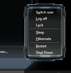
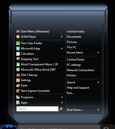
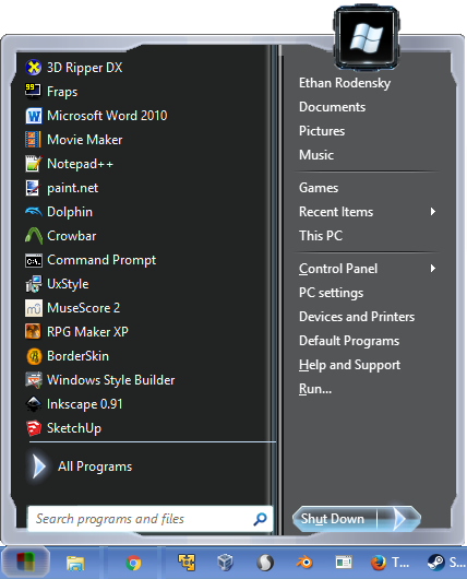
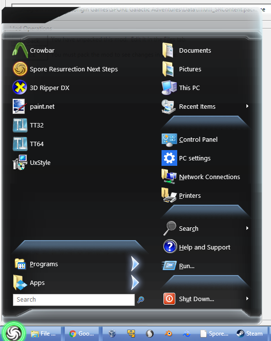
Need I say more? Actually, I probably do. This skin is based on the user interface design from a mod for a game called Spore. The mod ports the UI, among many other things, from another slightly related game, Darkspore. The mod is called "Dark Injection" and the UI is new to version 9.r , so that's where the name came from. I've been working on this for months. I officially have no idea how to clean it up any further. If anyone wants to develop it further, PLEASE DO! I can provide unflattened PSDs and resource images as necessary. DOWNLOAD HERE |
Author: | Jcee [ Fri Oct 23, 2015 7:00 am ] |
Post subject: | Re: Dark Injection 9.r Start Menu |
Quite nice overall, I really like the silver bars on top/bottom, but if your looking for ideas to clean this up: The new programs color is yellow (making it something darker, would make the text more legible) The top bar feels kinda out of place, (maybe its just to transparent for my taste?) Also the username text on it is a little hard to read (I believe you can add a border to text, but im not positive. This would solve the issue nicely. Also there is about 1 line of clear pixels on the bottom. It would look a little more clean/attached to the task-bar if that were removed And lastly the submenu background color kinda clashes I really like the big Arrows(though I think they may be a little too big, at-least for this theme), Maybe make them smaller, and use them on the right side as well All this said, I'm not asking you to do any of it, just noting what I feel could be improved Actually it has given me a few ideas, for a skin I've been considering , so I would like a copy of your resources, incase I end up working on it. |
Author: | Splitwirez [ Fri Oct 23, 2015 9:42 am ] |
Post subject: | Re: Dark Injection 9.r Start Menu |
Jcee wrote: Quite nice overall, I really like the silver bars on top/bottom, but if your looking for ideas to clean this up: The new programs color is yellow (making it something darker, would make the text more legible) The top bar feels kinda out of place, (maybe its just to transparent for my taste?) Also the username text on it is a little hard to read (I believe you can add a border to text, but im not positive. This would solve the issue nicely. Also there is about 1 line of clear pixels on the bottom. It would look a little more clean/attached to the task-bar if that were removed And lastly the submenu background color kinda clashes I really like the big Arrows(though I think they may be a little too big, at-least for this theme), Maybe make them smaller, and use them on the right side as well All this said, I'm not asking you to do any of it, just noting what I feel could be improved Actually it has given me a few ideas, for a skin I've been considering , so I would like a copy of your resources, incase I end up working on it. Yeah...I can see that helping... ...also here are the resource images (most of which weren't used, ofc): pie_menu~ folder from Darkspore. Can't wait to see what you do with them |
Author: | juniper7 [ Fri Oct 23, 2015 3:38 pm ] | ||
Post subject: | Re: Dark Injection 9.r Start Menu | ||
Another way for the new programs. I remember from a post way back. Just change the new text to black: "Submenu_new_text_color=#000000,#FFFFFF,#7F7F7F,#7F7F7F" I'd like to help you out as well. No time though.
|
Author: | juniper7 [ Fri Nov 06, 2015 5:00 pm ] | |||
Post subject: | Re: Dark Injection 9.r Start Menu | |||
Wow, Splitwirez. I just opened that pie_menu folder. You hit the motherlode. There is potential to make all kinds of menu skins. Edit: Removed off color picture. Sorry about that. Here is a better picture, the submenu.
|
Author: | Splitwirez [ Sat Nov 07, 2015 12:59 pm ] |
Post subject: | Re: Dark Injection 9.r Start Menu |
juniper7 wrote: Wow, Splitwirez. I just opened that pie_menu folder. You hit the motherlode. There is potential to make all kinds of menu skins. Edit: Removed off color picture. Sorry about that. Here is a better picture, the submenu. Well then, I sure am glad I uploaded that folder ...uh...are you going to post the skin itself? Also does anyone want the resources from Spore, Darkspore's (rounder, much less holographic) predecessor? ._. EDIT: I should probably note that unlike Darkspore, Spore uses a series of UI atlases sprayed across a bunch of different folders, so there's going to be some slicing needed, and I'd literally die before doing it all myself (AKA it'd take forever and a day. Not saying I'd choose to die, just that the human lifespan isn't long enough.) |
Author: | juniper7 [ Sat Nov 07, 2015 2:41 pm ] |
Post subject: | Re: Dark Injection 9.r Start Menu |
It's your treasure chest. All yours for the making. I never made a skin. Just put those two bitmaps together, to see what it looked like. I can help out, when you get stuck with something. |
Author: | Splitwirez [ Sat Nov 07, 2015 2:58 pm ] |
Post subject: | Re: Dark Injection 9.r Start Menu |
juniper7 wrote: It's your treasure chest. All yours for the making. I never made a skin. Just put those two bitmaps together, to see what it looked like. I can help out, when you get stuck with something. ...oh... ... ._______________. well I'm that one guy who'd choose to share the stuff, if anyone's interested, so... :Y |
Author: | juniper7 [ Sat Nov 07, 2015 7:47 pm ] |
Post subject: | Re: Dark Injection 9.r Start Menu |
I'll wait for a week to see if others are interested. If no one up to challenge, we can dual it out, and complete one each? Got a feeling Windows 10 users are becoming tolerant of original menu. I don't know. Are menu skinning days over for most? Sure wish I had been interested in skinning 5 to 10 years ago. It's like everything's been done already. We are just copying. |
Author: | Splitwirez [ Sat Nov 07, 2015 7:58 pm ] |
Post subject: | Re: Dark Injection 9.r Start Menu |
juniper7 wrote: I'll wait for a week to see if others are interested. If no one up to challenge, we can dual it out, and complete one each? Got a feeling Windows 10 users are becoming tolerant of original menu. I don't know. Are menu skinning days over for most? Sure wish I had been interested in skinning 5 to 10 years ago. It's like everything's been done already. We are just copying. O mai gawd...a CSM skinning duel?? :O That'd be awesome Just remember, Windows 10 users may tolerate the Windows 10 Start Menu, but that doesn't mean they wouldn't be interested in a better alternative. Heck, after my computer imploded back in April, I had to put up with the Windows 8 Start Screen for a little while, before finding out that CSM works in memory. I could've gotten by with the Modern UI, but the instant CSM became an option, I reinstalled it. K, so if there is interest within 7 days, then that's that, and if not, then we duel it out? Also, who'd be the judge? ._. I am getting way too excited about this .-. |
Author: | juniper7 [ Sat Nov 07, 2015 8:44 pm ] |
Post subject: | Re: Dark Injection 9.r Start Menu |
Jcee I guess. I will keep one arm behind my back, while making it. What are the rules? Only use what is in pie folder? You gonna win anyway, as you have the advantage, as to what it all looks like in the game. I might not have all the time in the world for it. Ok. Enough excuses. 7 days to sundown and then showdown reveal day, what day? Is this crazy. |
Author: | juniper7 [ Sat Nov 07, 2015 8:51 pm ] |
Post subject: | Re: Dark Injection 9.r Start Menu |
CSM is still superior to regular Windows menu, for all it's functions. Not knocking CSM. Just the skinning for Windows, in general. Its' time has past. |
Author: | Splitwirez [ Sat Nov 07, 2015 8:54 pm ] |
Post subject: | Re: Dark Injection 9.r Start Menu |
juniper7 wrote: Jcee I guess. I will keep one arm behind my back, while making it. What are the rules? Only use what is in pie folder? You gonna win anyway, as you have the advantage, as to what it all looks like in the game. I might not have all the time in the world for it. Ok. Enough excuses. 7 days to sundown and then showdown reveal day, what day? Is this crazy. Alright, Jcee is the judge. Now we just need a buy-in :V I see no reason for which you should handicap yourself. I may have the edge of knowing what the game looks like, but a simple google search could easily level the playing field in that regard ._. If your schedule doesn't permit you sufficient time in 7 days, I'd be okay if we extended it to something longer. Your call as to if that's needed. And yes, this is completely bats**t insane. That's why I love it so much |
Author: | juniper7 [ Sat Nov 07, 2015 8:59 pm ] |
Post subject: | Re: Dark Injection 9.r Start Menu |
I only use one arm anyway, to hold the mouse. Then copy & paste, copy and paste. Gotta go. |
Author: | Jcee [ Sat Nov 07, 2015 10:50 pm ] |
Post subject: | Re: Dark Injection 9.r Start Menu |
I would agree, there is no point in limiting anything . I would put more weight on overall aesthetics than sticking with a specific theme, so I would say any resources should be fair game. (if they look good in the skin) So lets just say best skin wins (regardless of theme) As for a prize, I've got a few duplicate Steam keys laying around. (that I've acquired from humble bundles) So First place gets: Abyss Odyssey and Contagion keys Second place (If 3 or more participate): gets a Contagion key *This said, anyone else who wants to make a skin for entry is eligible for those keys* The only requirement is that it hasn't already been created/posted The deadline will be Nov 14 @8PM Central US time, and Ill announce on the 15th |
Author: | Splitwirez [ Sun Nov 08, 2015 5:56 am ] |
Post subject: | Re: Dark Injection 9.r Start Menu |
Jcee wrote: I would agree, there is no point in limiting anything . I would put more weight on overall aesthetics than sticking with a specific theme, so I would say any resources should be fair game. (if they look good in the skin) So lets just say best skin wins (regardless of theme) As for a prize, I've got a few duplicate Steam keys laying around. (that I've acquired from humble bundles) So First place gets: Abyss Odyssey and Contagion keys Second place (If 3 or more participate): gets a Contagion key *This said, anyone else who wants to make a skin for entry is eligible for those keys* The only requirement is that it hasn't already been created/posted The deadline will be Nov 14 @8PM Central US time, and Ill announce on the 15th |
Author: | juniper7 [ Mon Nov 09, 2015 1:19 pm ] |
Post subject: | Re: Dark Injection 9.r Start Menu |
Thanks Jcee. I'm up for the challenge. As for me, if I slap a menu together in a couple of hours, it's gonna look like #rap. I want to spend more time on it, so it looks one step above #rap. I have been working on the main menu. It's totally different looking now. Never know where it's going! Taking very long to figure out what works. Didn't even pick the selector buttons yet. Before I die, it will be finished. More interested if others will try. Definitely simple, and complicated menus for all to play with. |
Author: | Splitwirez [ Mon Nov 09, 2015 6:48 pm ] |
Post subject: | Re: Dark Injection 9.r Start Menu |
juniper7 wrote: Thanks Jcee. I'm up for the challenge. As for me, if I slap a menu together in a couple of hours, it's gonna look like #rap. I want to spend more time on it, so it looks one step above #rap. I have been working on the main menu. It's totally different looking now. Never know where it's going! Taking very long to figure out what works. Didn't even pick the selector buttons yet. Before I die, it will be finished. More interested if others will try. Definitely simple, and complicated menus for all to play with. Alright, can't wait to see it ^-^ |
Author: | juniper7 [ Mon Nov 09, 2015 9:49 pm ] |
Post subject: | Re: Dark Injection 9.r Start Menu |
Well I don't think it's going to be the greatest thing on earth. It's only one step above, not a high jump. It's kind of like this. A great chef made a fabulous meal for a man. It could not be eaten fully, so he put it in the fridge, and forgot about it for a week. Now he tastes the food. It lost something. All he can do is throw some other food with it, along with large amounts of spice. Now I feel like I'm playing with the leftovers. I put the main menu in the blender, and out came Franken skin. Is everybody going to post at last minute like me? Anybody? |
Author: | juniper7 [ Tue Nov 10, 2015 11:32 am ] |
Post subject: | Re: Dark Injection 9.r Start Menu |
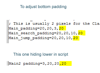
Looking at the pie folder. I count more than 13 images that can be used as main/sub menus. Basically ready made. Anybody else want to try? We can all help new skinners, with the script text. Namely the splices and the padding. The splices dimension measurement, that says where to stretch, and not to stretch the bitmap picture. And the padding. It tells where to begin and end the text. Plus if menu text is to be black, or white. By adding these changes to a standard already made skin in the Classic Shell skin folder, almost anyone can make one. |
Author: | Splitwirez [ Tue Nov 10, 2015 12:09 pm ] |
Post subject: | Re: Dark Injection 9.r Start Menu |
juniper7 wrote: Looking at the pie folder. I count more than 13 images that can be used as main/sub menus. Basically ready made. Anybody else want to try? We can all help new skinners, with the script text. Namely the splices and the padding. The splices dimension measurement, that says where to stretch, and not to stretch the bitmap picture. And the padding. It tells where to begin and end the text. Plus if menu text is to be black, or white. By adding these changes to a standard already made skin in the Classic Shell skin folder, almost anyone can make one. ...hm? Are you suggesting a new skin to ship with the next version of Classic Shell? :O Also...I thought it was "slicing", not "splicing". I need to learn to read >.< "slicuniper7", "Clauniper7", "Sheluniper7". Are you sure the "j" isn't a variable? |
Author: | juniper7 [ Tue Nov 10, 2015 3:20 pm ] |
Post subject: | Re: Dark Injection 9.r Start Menu |
I just got home. Just to modify a skin, that is included in the CSM download, as per instructions from Ivo. Like we all do. Whatever you do, don't use the basic "Classic Skin". From what I recall, there is no 2 column bitmap to replace. Had me stumped for a long time. It uses a system built one. Yeah, it's slicing in this skinning madness. Was thinking of past, making movies. I don't know. Shows my ignorance to the subject. The way I see it, all it is, is a boundary line, that it does not cut, or join, but rather what happens on one side of the line, and what happens on the other side of the line. No real slicing, dicing, or splicing involved. No Band-Aids required. |
Author: | Splitwirez [ Fri Nov 13, 2015 4:56 pm ] |
Post subject: | Re: Dark Injection 9.r Start Menu |
DOWNLOAD Let me know when I win (or don't) |
Author: | juniper7 [ Fri Nov 13, 2015 6:31 pm ] |
Post subject: | Re: Dark Injection 9.r Start Menu |
Suffering Succotash Splitwirez, looks like you will win by default, as I have failed to have a finished skin materialize. Could be others still. Mine looks like a dogs breakfast. Passing art in high school, did not help with this skin. Ran into problems with the main menu. It has those old tv type aliasing lines, which look neat, but create havoc, when stretching any amount. When I used the blend technique for only the 2 stretch pixels, it worked, but the menu won't shrink. All the text and buttons go towards top of menu, leaving a big space at bottom for single style. Even the "Column Padding" in "Customize Start Menu" for single, does not push the shutdown buttons & text down to bottom of menu. It does for two column though. Maybe it's a bug? I have shrunk the main menu three times now, wasting many, many hours, as well as losing more of the aliasing lines effect. Still not enough. Arrrrggghhh. I don't even want to show what I have so far. I will get back to it, just not this weekend. Just need more time for creative solving sparks to happen in my brain. To leave on a good note. That submenu, that I used, and that you also made into a picture frame, is the easiest to adapt. That is a great graphic artist, who made the original. Addition. Right now I'm looking at my main menu, and it is totally transparent, because the bitmap number is wrong. There is just a tiny little dot on the left. Hay, maybe ZoNi is still interested in full 100% transparent menu. Sure is hard to see text. Gonna call it a happy mistake. |
Author: | Jcee [ Fri Nov 13, 2015 7:37 pm ] |
Post subject: | Re: Dark Injection 9.r Start Menu |
Ouch. well if you 2 are up for it, I'm good with extending the deadline another week or so. from the look of splitwirez skin, it could use a little polish too. (though it does look quite nice, there are plenty of missing elements like a custom submenu bitmap) and several alignments. Otherwise Ill make my 'decision' and message the keys on the 15th. |
Author: | Ivo [ Fri Nov 13, 2015 8:39 pm ] |
Post subject: | Re: Dark Injection 9.r Start Menu |
Hey, guys. If you are considering making new skins, I would suggest you wait till tomorrow. There will be a new release with some new skin features. |
Author: | juniper7 [ Fri Nov 13, 2015 9:08 pm ] | ||
Post subject: | Re: Dark Injection 9.r Start Menu | ||
I don't mind helping out compeditors. I'm still using the submenu in the picture above. We can both use it. Here are the stats to use. Submenu_bitmap_slices_X=63,1,64 Submenu_bitmap_slices_Y=63,1,64 Submenu_padding=20,20,20,20 As for finishing, I require time away for other things. I will finish it, some day in future. My happy transparent accident looks better. I am interested in what Ivo has said.
|
Author: | Splitwirez [ Sat Nov 14, 2015 4:28 am ] |
Post subject: | Re: Dark Injection 9.r Start Menu |
juniper7 wrote: I'm still using the submenu in the picture above. We can both use it. But...it looks the same as my userframe... D: Ivo wrote: Hey, guys. If you are considering making new skins, I would suggest you wait till tomorrow. There will be a new release with some new skin features. :DDDDDDDDDDDDDDDDDDDDDDDDDDDDDDDDDDDDDDDDDDDDDDDDDDDDDDDDDDDDDDDDDDDDDDDDDDDDDDDDDDDDDDDDDDDDDDDDDDDDDDDDDDD Jcee wrote: Ouch. well if you 2 are up for it, I'm good with extending the deadline another week or so. from the look of splitwirez skin, it could use a little polish too. (though it does look quite nice, there are plenty of missing elements like a custom submenu bitmap) and several alignments. Otherwise Ill make my 'decision' and message the keys on the 15th. Couldn't figure out how to add a submenu bitmap. Also CSM flips out if I add any more padding below the shutdown button >.< |
Author: | juniper7 [ Sat Nov 14, 2015 9:05 am ] | ||
Post subject: | Re: Dark Injection 9.r Start Menu | ||
It can be confusing
|
Author: | juniper7 [ Sat Nov 14, 2015 9:30 am ] |
Post subject: | Re: Dark Injection 9.r Start Menu |
Help #2 I did not figure this out for awhile on other skins. Even though the jump list bitmap, has half of it on column two, it is really just an extension of Main, not Main2. I'm afraid the Bitmap 1 will need to be all without transparency. |
Author: | juniper7 [ Sat Nov 14, 2015 10:28 am ] | ||
Post subject: | Re: Dark Injection 9.r Start Menu | ||
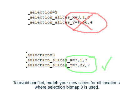
Help#3 To make the selector button 3 draw properly, change the stats, as in picture. The padding just requires a bit more tweaking, here and there. Leave it to you. And lastly, you will probably need to make a matching split button. You could copy #3 bitmap, and paste four times on a bigger blank transparent bitmap, so it's two high, and two across. The slicing is by far the hardest to work out. Every pixel has to add up to the correct total width. The vertical measurement has to add up to half of total height. Good luck. The second column looks grand.
|
Author: | juniper7 [ Sat Nov 14, 2015 11:23 am ] | |||
Post subject: | Re: Dark Injection 9.r Start Menu | |||
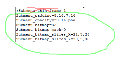
I forgot about the submenu. If you don't want that sub bitmap that I'm using, how about this one attached? It looks more like your main menu, just simpler. You need to transfer text from another skin file, and then adjust the settings. CSM auto draws a bitmap, unless you tell it to make a different one. Add the bitmap with #32 designation in RS. Copy over the text in picture. You would still need to change the text color, and make your own artistic look. Once you try it once, you will never forget. Please try it.
|
Author: | Ivo [ Sat Nov 14, 2015 11:59 am ] |
Post subject: | Re: Dark Injection 9.r Start Menu |
Version 4.2.5 is released. Now you can have full transparency in the Windows 7 style. You need to set Main_opacity to fullglass/fullalpha. The bitmap must be transparent on the left side. Also the Programs_background color supports alpha in case you want the program tree to be transparent. Take a look at the Metro and Midnight skins for examples. |
Author: | juniper7 [ Sat Nov 14, 2015 12:06 pm ] |
Post subject: | Re: Dark Injection 9.r Start Menu |
That's great about the programs background as well. Thank you Ivo. Ok Splitwirez , scrap what I said earlier about the bitmap has to be no transparency. The world is your oyster. |
Author: | juniper7 [ Sat Nov 14, 2015 12:34 pm ] | ||
Post subject: | Re: Dark Injection 9.r Start Menu | ||
I don't know if you want these Splitwirez? I was going to use one of these fonts in my skin, changed my mind. The Space & Nasal looked ok. Just makes the menu super wide. Even a Spore font, a little ragged around the edges though. The font name would need to be put in skin file, as well as putting font file in windows font folder.
|
Author: | Splitwirez [ Sat Nov 14, 2015 1:23 pm ] |
Post subject: | Re: Dark Injection 9.r Start Menu |
juniper7 wrote: I don't know if you want these Splitwirez? I was going to use one of these fonts in my skin, changed my mind. The Space & Nasal looked ok. Just makes the menu super wide. Even a Spore font, a little ragged around the edges though. The font name would need to be put in skin file, as well as putting font file in windows font folder. ._. Darkspore actually uses this font: |
Author: | juniper7 [ Sat Nov 14, 2015 2:51 pm ] |
Post subject: | Re: Dark Injection 9.r Start Menu |
Ah, better. But even if I put to -6 size, it all looks too squishy on a menu. Is there an ttf editor that can resize to a better proportion, all at once, quickly? |
Author: | Splitwirez [ Sat Nov 14, 2015 9:07 pm ] |
Post subject: | Re: Dark Injection 9.r Start Menu |
juniper7 wrote: Ah, better. But even if I put to -6 size, it all looks too squishy on a menu. Is there an ttf editor that can resize to a better proportion, all at once, quickly? Yes. Forgot the name, but it's ridiculously expensive, and the free version lacks only one feature: saving .__________. |
Author: | Jcee [ Sun Nov 15, 2015 8:41 pm ] |
Post subject: | Re: Dark Injection 9.r Start Menu |
Well the contest is officially over, and no other submissions have been made. So congratulations splitwirez Your the winner, and the game codes have been sent in a PM. |
Author: | juniper7 [ Fri Nov 20, 2015 2:24 pm ] | ||||
Post subject: | Re: Dark Injection 9.r Start Menu | ||||
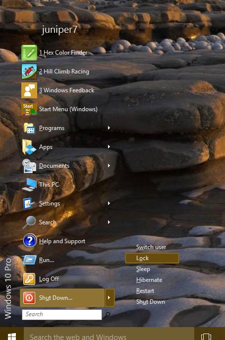
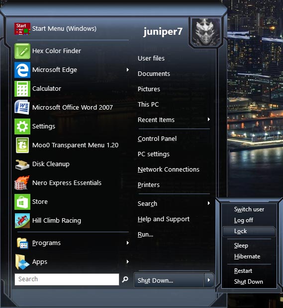
DarkSpore Pie1 (Classic Style) Win7/10 Here is a finished version of the one I started. A simpler earlier mutation. Will probably need to disable menu shadow in CSM settings. To make the submenu, and user picture frame, I copied bits from images in the pie folder, and joined them together. This was the smoked glass skin, that has glass color available in options. I left it in. Because I did not make a grey bitmap, the blue tint in the bitmap clashes with some weird glass colors. Mostly it's ok I think, cause it looks like smoke. The other skin that turned into a dogs breakfast, is still in shambles. That one is more complicated, but complexity does not mean better looking. It might take weeks for that one, or maybe it deserves on back burner forever? Time will tell. Edit: Changed the new programs button from yellow to blueish.
|
Author: | Jcee [ Fri Nov 20, 2015 4:43 pm ] |
Post subject: | Re: Dark Injection 9.r Start Menu |
This is quite nice, shame you didn't finish in-time or you would have won with it Since its somewhat Polished, Ill offer a few suggestions: newly installed highlight color, it might be nice if it were some shade of blue (neon maybe) rather than yellow) 'small icons' is really a misnomer and could be labeled 'no Icons' The rounded corners on the user-image are REALLY a nice touch. Also, since you did such a great job, i do have an extra contagion key if its something you'll play (its a decent zombie shooter) |
Author: | juniper7 [ Fri Nov 20, 2015 5:33 pm ] |
Post subject: | Re: Dark Injection 9.r Start Menu |
Ok, I toned down the new programs button. I used "Gaussian Blur" with a dark blue around the edge. I thought it was an unwritten law that a new button had to look as vomity as possible. MS sure does plaster the menu with almost daily updates! Don't understand about the small icon/no icon. It's Ivo's code labels. Can the skin use text to turn off icons in both column now? Zombie. Sure I'll take anything free. |
Author: | Jcee [ Fri Nov 20, 2015 8:59 pm ] |
Post subject: | Re: Dark Injection 9.r Start Menu |
It should grab attention, it doesnt have to be ugly which is why I suggested neon, or light blue (to match with the theme) and yes, when you check the 'use small icons' setting the icons completely dissapear, its this way on a number of skins. However if you are using Ivo's code(which allows proper translation) then you might aswell keep it how it is, because they can just see what it does after checking it XD) |
Author: | juniper7 [ Sat Nov 21, 2015 12:37 am ] |
Post subject: | Re: Dark Injection 9.r Start Menu |
I'm sorry. I still don't quite understand the missing icon issue. Do the 16 or 32 size icons disappear on the menu itself, or is it the localization # to local language, that is missing? I don't know how to solve it, as I don't see problem on Win10 or Win7. I have computer set to English. All works fine. Reading the skin tutorial, it says it looks up the string number in the DLL. Does that mean the skin file got corrupt, or is that DLL in the operating system? On the next pie skin, I will put an option to have the subtle little "N" as a choice. No matter what color is used with glass color skin, there will always be color clash, unless of course, if the new programs color could be a Metro tracking color. That's a thought. |
Author: | Jcee [ Sat Nov 21, 2015 2:15 am ] |
Post subject: | Re: Dark Injection 9.r Start Menu |
Actually, I apologize, I had the setting 'Small Icon size' set to 0 in classic shells settings |
Author: | Splitwirez [ Sat Nov 21, 2015 11:43 am ] |
Post subject: | Re: Dark Injection 9.r Start Menu |
...whoa whoa whoa, what happened to extending the deadline? ._. I haven't redeemed those keys yet, and probably wouldn't have for a while yet, so...um...wait, what was I saying again? |
Author: | Jcee [ Sat Nov 21, 2015 7:28 pm ] |
Post subject: | Re: Dark Injection 9.r Start Menu |
There was no agreement from the other 2 participating members, so i made a 'decision' Since you haven't redeemed, I'm ok with reopening the contest. (pending both participants approval) Do you have an updated submission? |
Author: | Splitwirez [ Sun Nov 22, 2015 3:04 pm ] |
Post subject: | Re: Dark Injection 9.r Start Menu |
Jcee wrote: There was no agreement from the other 2 participating members, so i made a 'decision' Since you haven't redeemed, I'm ok with reopening the contest. (pending both participants approval) Do you have an updated submission? ...working on it ._. |
Author: | Jcee [ Sun Nov 22, 2015 4:11 pm ] |
Post subject: | Re: Dark Injection 9.r Start Menu |
Ok |
Author: | Splitwirez [ Wed Nov 25, 2015 2:43 am ] |
Post subject: | Re: Dark Injection 9.r Start Menu |
Jcee wrote: Ok Scratch that, I might not have time to finish my entry this week - lotta stuff going on in the Spore scene ._. |
Page 1 of 2 | All times are UTC - 8 hours [ DST ] |
Powered by phpBB® Forum Software © phpBB Group https://www.phpbb.com/ |