Classic Shell http://www.classicshell.net/forum/ |
|
Starcraft Zerg - Skin http://www.classicshell.net/forum/viewtopic.php?f=17&t=3215 |
Page 1 of 2 |
Author: | Jcee [ Wed Oct 01, 2014 2:24 pm ] | ||||
Post subject: | Starcraft Zerg - Skin | ||||
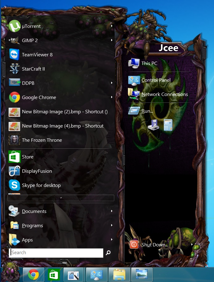
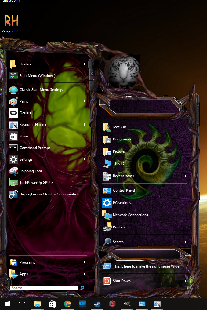
I've wanted to make a zerg theme, and start button for a while, since starcraft is my favorite game. So anyways here it is. Zerg V1.1 its hasn't been completely cleaned yet, and I have a few kinks to work out, and features to add.. but it doesnt look bad Id say. So ill probably be updating it soon. EDIT: attached the .XCF (in the zip file) if you want to manually edit the skin (IE to your specific menu lengths to prevent stretching)
|
Author: | juniper7 [ Tue Oct 07, 2014 6:57 pm ] |
Post subject: | Re: Starcraft Zerg - Skin |
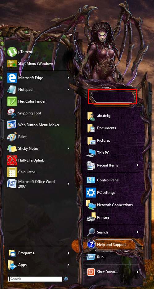
Oh My. Oh My. The master has risen. Terrific. I had to download a demo to figure out what the menu is about. Very high definition. Even a built in shadow. Like those winding snakey worm creatures. Looks like many days of hard work, doing layers as well. Good to see alternate menu skins, being made:) I gather .xcf is a Gimp file? I wonder if it's a good idea to upload a CSM backup XML configuration file? That way we can have it set up the way you have it. Can the XML file be used on another computer? The only big kinks that I see to be ironed out, are the submenu bottom padding or slices is wrong amount. Looking at submenu bitmap 400 by 412. Slices add up to 430, instead of 412. That's an easy fix. The name text location is a bit off as well. Something odd with the cutting off of the center rod. I'm sure you know these anyway. Got to say, hope this gets more skinners to come forward with their own. Does take patience and time though, as I'm guilty of lack of those, these days. Bye |
Author: | Jcee [ Tue Oct 07, 2014 8:48 pm ] |
Post subject: | Re: Starcraft Zerg - Skin |
Yep .xcf is a gimp file, but im sure theres an easy way to convert if you need photoshop file (its probably in gimp actually) and it would have been many days, if I had to draw anything, but 90% of the parts are cut n paste from websearches , with a bit of recolouring, and a few small edits The button took 3~ hrs (because I was being a perfectionist, and tried several different things), and the skin probably 6-8 (but I may pour more) as far as my .xml I didnt actually fit it to my dimensions. (Honestly I dont like using fancy themes and such) I usually stick to solid colour/minimalistic/functionalist style. Ive just always wanted to make a nice sc2 button, and then I liked it so much I made a skin to go with Not sure what you mean by cutting the center rod? And thanks for the tip on the submenu. I threw the .skin file together in like 20 mins so i figured there would be some errors to iron out. |
Author: | juniper7 [ Tue Oct 07, 2014 9:41 pm ] | ||
Post subject: | Re: Starcraft Zerg - Skin | ||
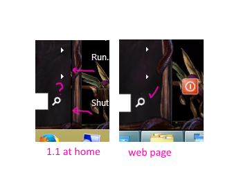
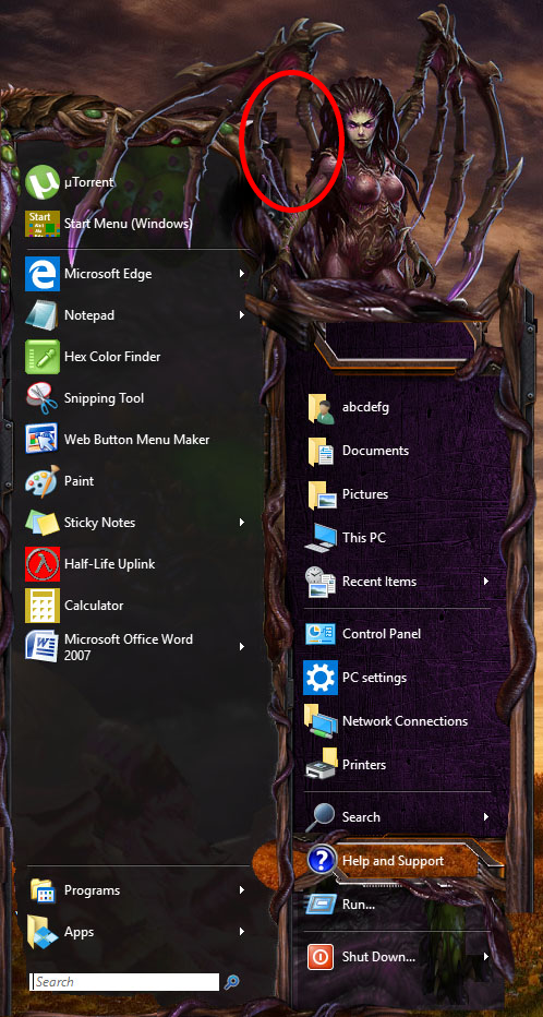
Hi Jcee. First I thought it was the slices that's off for Mr. wormy in the middle column. Comparing the screenshot and picture in web page, there is a difference. I think what has happened, is a layer in Gimp was moved slightly, making a dark transparent line. That may be your intent, I don't know. Good job with the buttons. I should have zoomed in closer for the picture. Sorry. Use the Ctrl and the mouse wheel to zoom in the web page.
|
Author: | Jcee [ Wed Oct 08, 2014 12:40 am ] |
Post subject: | Re: Starcraft Zerg - Skin |
Ah, that was just something I missed, while hastily resizing (I cut the width by about 30% from the origional version) Ill fix that in the next revision, along with possibly fixing some stretching issues, and the submenus bug you mentioned |
Author: | Weboh [ Tue Dec 16, 2014 8:44 am ] |
Post subject: | Re: Starcraft Zerg - Skin |
Nice! Have you made the changes yet? You also need to be churning out new themes! You're one of the few people here that knows how to make these, and you make them well! I'd like a Star Trek Voyager or TNG skin in this vein if you'd like to make it. |
Author: | Jcee [ Wed Dec 17, 2014 7:25 am ] |
Post subject: | Re: Starcraft Zerg - Skin |
I think I made a few of the changes on my local copy though I havnt done most of them, and I kind of abandoned it due to time/effort required. I may eventually pick it back up or even include terran/protoss variations, but I doubt its worth the effort. As for new skins: there are a few reasons I havnt been 'churning' them out. I havnt had much free time lately, they take quite a bit of time to perfect. and they are likely not worth the effort, especially for niche skins like this (I would estimate no more than 5 people are actively using this skin) The main reason I did it was to see how it would turn out. As for a star trek skin; if you can supply the texture I would be willing to add it to a skin and adjust the padding to make it fit. (assuming you have photoshop skills) This offer goes out to anyone who wants a skin and is willing to make the resources, but simply lacks the knowledge on .skin files |
Author: | Weboh [ Thu Jan 22, 2015 9:00 pm ] |
Post subject: | Re: Starcraft Zerg - Skin |
Well I'm afraid I can't do that. I don't have the imagination/skills required to do that. But I do have another project here that contains most of the files you would need. Does it look too daunting? |
Author: | Jcee [ Sun Jul 24, 2016 11:48 pm ] | ||
Post subject: | Re: Starcraft Zerg - Skin | ||
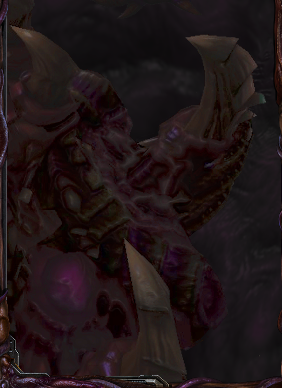
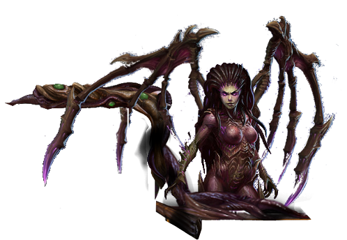
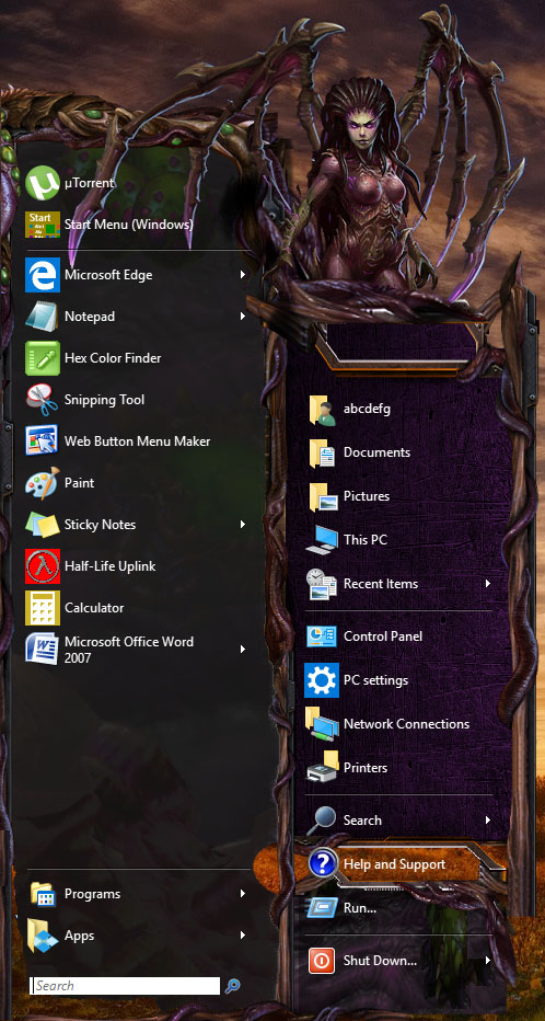
I've decided to update my Zerg skin; and am working on re-mastering the main bitmap (attached) However I have lost the program I was using to format the bitmaps properly for classic shell . Ill keep looking for that, and until then; heres the current design Notes: Increased space for usernames that are more than 5 characters long Adding a portrait option/location Replaced the Zerg queen, with the more Iconic Queen of Blades in the top right Trying something with the UI to allow for a visual separation between shutdown, and everything else in the right column (something I tried to implement last time, but due to a busy schedule just dropped from the skin) Adjusted coloring of the left columns insides (to make things prettier) I am looking for any ideas and layout suggestions. Aswell as any features you would like to see added. Ill try to make use of some of the new features to allow a less stretched look, but I may have to re-make some of the resources from scratch for that. (which Ill probably make a terran variation If I do)
|
Author: | juniper7 [ Mon Jul 25, 2016 9:29 pm ] | ||
Post subject: | Re: Starcraft Zerg - Skin | ||
Va va Voom. What a queen. Some of those additions elsewhere sure give menu image, a moist wet look. The big part on left bottom looks dryer. I tried a plastic filter (exaggerated) on part of it, to see if it gets shiny. Now it looks like wet internal organics. The middle column border looks better now. The "STARCRAFT" text can be a floating emblem, so it won't stretch. Another new feature is png can be used instead of bitmap. No need to convert image. It might reduce the size of skin.
|
Author: | Jcee [ Tue Jul 26, 2016 1:30 am ] |
Post subject: | Re: Starcraft Zerg - Skin |
Yea I tried to do what I could to the main area in the left column, but the original file doesn't have enough undo points to go back and get it before I made it so dark (thus I cant really up its brightness much without major artifacting, or re-making that layer) I did up the color and contrast a bit though and Yes your changes do make the bottom boarder look more slimy and organic.. There is actually alot I really could do for this skin to remove almost all stretching... Ideally, kerrigan, the spiral, the baneling, the logo, and the creep tumor(bottom left), along with every single corner would be emblems. with the innards as tiles (drawn large enough not to repeat) Then the only thing that stretches are the sides... Ofc thats prettymuch re-making the entire skin and I might as well do a terran variation instead (it would probably get more use as it would go well with any generic metallic or space theme outside of the starcraft universe) |
Author: | juniper7 [ Tue Jul 26, 2016 8:41 am ] |
Post subject: | Re: Starcraft Zerg - Skin |
About the second column, if non stretching background custom image used. It's not a cure all. It would be difficult to stay in registration. Only thinking, not trying. As far as I know, there is not a separate starting point for drawing a 2nd column custom image. The mask for second column would be used, but image would still start out in top left corner of first column. Would have to add extra mirrored texture to the left, to fill in space. It won't keep alignment with fluctuating text width first column. |
Author: | Jcee [ Tue Jul 26, 2016 12:16 pm ] |
Post subject: | Re: Starcraft Zerg - Skin |
Yup. though stretching on the second column isnt a big deal, if the spiral, and the zergling were converted to emblems Though I assume the first column couldnt use a custom image either (lest it stretch over the second column too) which means converting the hive, and spawning pool to emblems aswell I think I might try it just to do it; though IMO the stretching is pretty minimal for everything with a reasonably dimension-ed start menu.. |
Author: | juniper7 [ Tue Jul 26, 2016 2:31 pm ] |
Post subject: | Re: Starcraft Zerg - Skin |
Have red image pattern mask for 1st, green image for 2nd, blue for ? Each image will only show where its mask is, but all will start from top corner. But yeah, even if background is normal stretch, there is nothing in bakground image that tells ones mind of a wrong proportion. It's all alien. Brain just accepts, does not compare to anything else from brains memory. Only the spiral, zergling looks better with unstretching emblems. Your menu skin has got to be the most complicated looking skin out there, anywhere. |
Author: | Jcee [ Thu Jul 28, 2016 2:16 am ] | ||
Post subject: | Re: Starcraft Zerg - Skin | ||
Welp; Just hit a roadblock Emblems can be aligned left/right and top/bottom I would need to align Kerigan top-center for it to work properly. Ive sent a PM to Ivo, and ill put this skin on hold for the time being. Heres the WIP with a buncha stuff missing (no sense doing the rest if I cant finish)
|
Author: | juniper7 [ Thu Jul 28, 2016 9:06 am ] |
Post subject: | Re: Starcraft Zerg - Skin |
I don't know enough about emblems, when they are large size. Do they extend past menu, or get cut off, or start to shrink limit? She might be centered and working properly, except image is off centered itself with all her barbed appendages, and can't move any more from large size. Did quick test. I changed text to center, and played with padding. Hardly any difference. I think the image has to be smaller to work. What a sight though. So commanding. Or, do you mean the center has to be exactly at the splice between column 1 and column 2, and not move when columns expand, and contract? I've made some mistakes in past with wrong bitmaps used as separators. It might work if the middle and bottom separator slices are invisible? Scratch that. Forgot about the padding. |
Author: | Jcee [ Thu Jul 28, 2016 1:19 pm ] | ||
Post subject: | Re: Starcraft Zerg - Skin | ||
Yup; this is the emblem I'm using; unless I can align it based on the stick dividing the 2 columns; itl never align properly. Though Ivo did mention center1 & center2 variables for emblems that align to the center of the stretchy parts (what i needed for the spiral) Im still prodding to see if there is a way to attach to the right side of the left column. But padding does help, and I might actually be able to make it 'close enough' without an absolute center so-long as users use a standardish width for the right column (anything from 200 to 350 pixels should look fine; after i make the tweaks, but bigger or smaller will look funny)
|
Author: | juniper7 [ Thu Jul 28, 2016 2:51 pm ] | ||
Post subject: | Re: Starcraft Zerg - Skin | ||
The queens size is quite awesome. Yes. Smaller would not be as powerfull looking. Looks ok offcenter in screenshot. If an emblem touches another emblem, does one go behind the other, like a layer in photo program? That would be great if it does, then the two tops of columns could be separate. The left behind zergling, and one on right in front, with the queen sliding horizontally behind the top right emblem. Could even intergrate a user picture frame with horizontal environment clouds, or something to blend with the theme.
|
Author: | Jcee [ Thu Jul 28, 2016 6:06 pm ] |
Post subject: | Re: Starcraft Zerg - Skin |
Yes, emblems are layered; and I am resuming work, because Ivo has given me the verbs necessary (they just weren't documented in any example) They are right1 or left2. |
Author: | whiskey_river [ Sun Jul 31, 2016 12:45 pm ] |
Post subject: | Re: Starcraft Zerg - Skin |
just dropped by and wanted to say you guys are doing inspirational work. i've heard skins are possible for the desktop … but never thought it would go to this extreme. you guys are writing whole new chapter. well done … and gotta' say love that goth-queen or bat-queen. |
Author: | Splitwirez [ Sun Jul 31, 2016 1:02 pm ] |
Post subject: | Re: Starcraft Zerg - Skin |
whiskey_river wrote: just dropped by and wanted to say you guys are doing inspirational work. i've heard skins are possible for the desktop … but never thought it would go to this extreme. you guys are writing whole new chapter. well done … and gotta' say love that goth-queen or bat-queen. Queen of Blades -_- |
Author: | Jcee [ Sat Aug 20, 2016 3:04 am ] | ||
Post subject: | Re: Starcraft Zerg - Skin | ||
Heres an update; still very messy, but I think ive just about gotten all the emblems and background added/aligned none of the skin options have even been touched from the base (metalic skin) Though I am brainstorming ideas I briefly thought about imposing the user-picture upon the queen of blades face (like those corny *insert face here* billboards at tourist traps) Currently however, i think it might be best to have the user-image skewered by either one of Kerrigans blades, or the post on the far right neversoft style http://www.deviantart.com/art/Neversoft-153259981 Also playing with the idea of using the second logo area for a windows version (or just removing it like I ended up doing with v 1.1)
|
Author: | Splitwirez [ Sat Aug 20, 2016 3:39 am ] |
Post subject: | Re: Starcraft Zerg - Skin |
Jcee wrote: Currently however, i think it might be best to have the user-image skewered by either one of Kerrigans blades, or the post on the far right neversoft style http://www.deviantart.com/art/Neversoft-153259981 orly? |
Author: | Jcee [ Sat Aug 20, 2016 3:57 am ] |
Post subject: | Re: Starcraft Zerg - Skin |
? Thats where the user Name goes. Are you suggesting I put the image next to the name, and make that area bigger? because that could work too Also I'm sure your aware; but that's the old skin (the new one looks pretty close to the finished product, except without any options working) |
Author: | redblade8 [ Sat Aug 20, 2016 3:21 pm ] |
Post subject: | Re: Starcraft Zerg - Skin |
Hi, this looks amazing. I remember that I had trouble adding icons to a .ini file, and now look what you can do with a start menu. This is pretty cool. StarCraft is a very fun game, I used to love playing it. I was always Terran in StarCraft 2. I laughed at you saying neversoft because I used to play Tony Hawks pro skater 3, it was one of my favorite games back then as well. Is it supposed to be a .skin file? Or a .skin7 file? I changed the file extension, and it seemed to display properly on both. The skin text was black though. You can add icons to both the left and right side? I didn't know that. I also didn't know of the emblem aligning options , like left1 or left2. Awesome work! ^-^ |
Author: | juniper7 [ Sat Aug 20, 2016 5:03 pm ] |
Post subject: | Re: Starcraft Zerg - Skin |
Jcee wrote: I briefly thought about imposing the user-picture upon the queen of blades face (like those corny *insert face here* billboards at tourist traps) I've thought about that myself. The user would have to crop their image just right to work though. |
Author: | Jcee [ Sat Aug 20, 2016 5:34 pm ] |
Post subject: | Re: Starcraft Zerg - Skin |
@.skin7 well the base skin is the metallic so it should have everything needed to work as a .skin7 however I am working on it as a .skin because thats the menu I use. I may attach a .skin7 varriant once i get all the features perfected for the .skin mode @juniper7 it was just a comedic idea, that would imo detract from the aestetics and seriousness of this particular skin maybe if someone made a carnival based skin or something, it would fit right in. |
Author: | juniper7 [ Sat Aug 20, 2016 7:09 pm ] |
Post subject: | Re: Starcraft Zerg - Skin |
Oh definitely. I think it's time to do a massive cleaning of my computer for people I know little about. Deleting uploaded image as well-gone. |
Author: | Splitwirez [ Sun Aug 21, 2016 6:29 am ] |
Post subject: | Re: Starcraft Zerg - Skin |
Here's another idea...what if you stuck a Zerg Cocoon in here: or somewhere when the user image was enabled, and have the user image be mostly-visible through the translucent green membrane? |
Author: | Jcee [ Sun Aug 21, 2016 4:22 pm ] |
Post subject: | Re: Starcraft Zerg - Skin |
>Put cocoon up here To what end? a user-picture? Im not sure if it would be aesthetically sound to do so. Also cocoons are gray and dull and IMO break from the skins design elements. |
Author: | juniper7 [ Sun Aug 21, 2016 8:47 pm ] | ||
Post subject: | Re: Starcraft Zerg - Skin | ||
Maybe menu does not need a user picture at all? Will be hard to fit in well with the theme. My turn again. What about down at bottom of menu? Or If it is in the invisible top part of menu, she needs her free space. Would have to be subtle, not stand out, say on left. It would really depend on the desktop background picture as well, for it to blend with everything. Made a mockup. The picture frame (user bitmap) is a planet, that only lets 10 % of user picture (user mask) show through frame. Wonder what it would look like with some semitransparent horizontal ether clouds?
|
Author: | Jcee [ Sun Aug 21, 2016 9:41 pm ] | ||
Post subject: | Re: Starcraft Zerg - Skin | ||
Thats an interesting idea, but a floating planet is a loose element. I think I might just go with the idea mentioned previously beside the nameplate (looking at it there is enough room actually) I still need to make a zergish frame though
|
Author: | redblade8 [ Fri Aug 26, 2016 7:49 pm ] |
Post subject: | Re: Starcraft Zerg - Skin |
Hi, I agree with the nameplate idea. Also, the idea about the queen of blades wielding a sword that skewers the nameplate I think is a very cool idea as well. If you did a .skin7, there's a bug with the jump list, and search pane. When you do a search, or hover over an item for recent programs/files in the 1st column, emblems disappear on you, and the column 1 stretches to accomodate your jump list or search query items. Column 2 seems to be missing, along with your emblems you made. Should I make a bug report? At first I thought that the 'help and support' button 2 images up had a custom mouse hover select image for when its selected by the mouse. So I thought, you can make custom selector images for the start menu? But I'm not sure if that's possible. |
Author: | Jcee [ Sun Aug 28, 2016 7:09 pm ] |
Post subject: | Re: Starcraft Zerg - Skin |
Yea it sounds like an issue with classic shell, rather than my skin; though its odd that the issue would be with .skin7 because the only official skin to even use emblems is a .skin7 file so one would think it would have received more testing than .skin. The stretching sounds intentional. and is part of why I designed the skin with emblems, and patterns so it can better support stretching. but emblems disapearing when certain menu items are activated doesn't sound normal at all; you can create a bug report if you would like, otherwise ill probably make one myself once i get to that stage |
Author: | Ivo [ Sun Aug 28, 2016 7:16 pm ] |
Post subject: | Re: Starcraft Zerg - Skin |
If an emblem is tied to the second column (using left2, center2 or right2), then it will disappear if there is no second column, like during search. You can specify a secondary alignment for such cases. For example: left2|right This will make it left-aligned to the second column, or right-aligned if there is no second column. This is a 4.3.0 feature. |
Author: | Jcee [ Sun Aug 28, 2016 10:46 pm ] |
Post subject: | Re: Starcraft Zerg - Skin |
Ok; yea I hadn't thought of the dynamics of windows 7 style when search is used.. it needs to be visually appealing in single column mode (something I was not planning on supporting) though since you specified secondary alignment; and i kinda want to break into the windows 7 style, i guess ill have to make it work I'm assuming secondary alignments work with classic(1 column) in a similar manner as windows 7 style with search (so transition work should be minimal) either way this iteration will probably focus entirely on getting everything working with classic+2 column only. and ill probably take a long(possibly indefinite) break between it and the skin7 style. |
Author: | Weboh [ Sat Oct 22, 2016 8:22 pm ] |
Post subject: | Re: Starcraft Zerg - Skin |
Looking good. Can't wait to see the finished product! |
Author: | Jcee [ Sun Oct 23, 2016 12:49 am ] |
Post subject: | Re: Starcraft Zerg - Skin |
Gah, just reminded me @.@ I've been so busy lately. that I forgot all about this. I might work on it some more this week |
Author: | Winterplains [ Sun Feb 19, 2017 8:28 pm ] |
Post subject: | Re: Starcraft Zerg - Skin |
Please can you make a Zerg task bar Or Could you PLEASE make a winter themed start menu! |
Author: | Jcee [ Mon Feb 20, 2017 12:18 am ] | ||
Post subject: | Re: Starcraft Zerg - Skin | ||
Its quite hard to do a themed taskbar that looks halfway decent @.@ (so little vertical space to work with) Anyways heres what I ended up with
|
Author: | redblade8 [ Thu Oct 12, 2017 5:32 pm ] |
Post subject: | Re: Starcraft Zerg - Skin |
What ever happened to this skin? I'm just wondering. =) |
Author: | Jcee [ Thu Oct 12, 2017 5:43 pm ] | ||||
Post subject: | Re: Starcraft Zerg - Skin | ||||
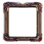
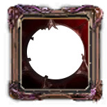
I just kinda stopped working on it (Im not a personal fan of themed start menu's, I did this to test the limits of CSM) the latest version (zergmetal3.skin) should be attached to one of the post. Though I've had quite a bit of free time lately.. I might fix a few of the odd bugs like the user-image. [Update: heres a few potential portrait borders; Im probably going with the plain square (images2), However If you agree that this would make a good kerrigan replacement I might go that route, because it looks cool] [Update2: This looks quite awsome, but I'd have to remove kerrigan (atleast when the user picture is present)]
|
Author: | Jcee [ Fri Oct 13, 2017 3:49 pm ] | ||
Post subject: | Re: Starcraft Zerg - Skin | ||
Update: with user-image implemented 2 issues: 1. Don't know how to align user image to the left side of the second column (so for now its just 'aligned' to the current width of my menu) 2. Having issue with the user-image mask (to make the user image round)
|
Author: | redblade8 [ Fri Oct 13, 2017 5:30 pm ] |
Post subject: | Re: Starcraft Zerg - Skin |
Cool updates. It's cool to see progress. =) I think I do like Kerrigan though too. Both are good. |
Author: | Jcee [ Fri Oct 13, 2017 5:55 pm ] |
Post subject: | Re: Starcraft Zerg - Skin |
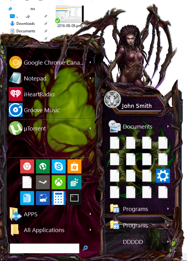
Both will be available; to see kerrigan you just gotta disable the user image. If someone really wants both, I might have to just add a 3rd option that is similar to the mockup i did (with 'john smith' as username) |
Author: | juniper7 [ Fri Oct 13, 2017 10:01 pm ] |
Post subject: | Re: Starcraft Zerg - Skin |
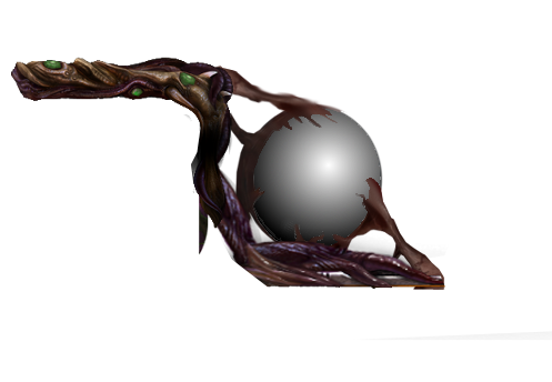
Good to see new creative ways happening. Good incentive for me to try again with the old flat Start trekkie skin. When you showed me the orb picture partially encapsulated with the organics, it got me thinking of the lady creature hanging it from her right hand, like her latest trophy. |
Author: | redblade8 [ Fri Nov 03, 2017 3:42 pm ] |
Post subject: | Re: Starcraft Zerg - Skin |
The John Smith one was a mockup? I thought it was the real thing. Yeah, I liked that one. Lol Juniper, it's like your saying she's holding a cut off head. xD |
Author: | Jcee [ Fri Nov 03, 2017 5:28 pm ] |
Post subject: | Re: Starcraft Zerg - Skin |
No it was a quick throw together in photoshop (I wasnt ready at that time to do the changes I needed, and still cant) The last image only 'works' because the width of the right column is fixed. so you like the 'john smith' one best? I think i might too actually (I don't wanna get rid of kerrigan), but it needs a more zerg-like border (a shiny chrome ring hardly fits this theme) but maybe that doesn't matter because its just a transitional element? It might be possible for me to include a 'fake' user-image by adding a setting that allows the user to include an image. The user however would have to format it properly to fit (IE round the edges, and make it the exact resolution needed) but this wont be clickable. |
Author: | AlexkuziTheJapanFan [ Sat Nov 04, 2017 4:30 pm ] |
Post subject: | Re: Starcraft Zerg - Skin |
How Do You Make Start Menus?? Jcee. |
Author: | Jcee [ Sat Nov 04, 2017 5:44 pm ] |
Post subject: | Re: Starcraft Zerg - Skin |
One step at a time Personally I started by just downloading reshacker 3.6, (I wouldnt recommend the new version as it has several sever bugs )and diving into a .skin that i wanted a few small changes done to: viewtopic.php?f=17&t=25 (which is actually the skin I still use on the daily) This is my only other skin (and I just did it to see what the menu was capable of) |
Page 1 of 2 | All times are UTC - 8 hours [ DST ] |
Powered by phpBB® Forum Software © phpBB Group https://www.phpbb.com/ |