It is currently Thu Jun 07, 2018 8:36 pm

All times are UTC - 8 hours [ DST ]


Post new topic Reply to topic  [ 6 posts ] 
Author Message
PostPosted: Wed Jun 18, 2014 1:32 am 
Offline

Joined: Mon Jun 16, 2014 10:38 am
Posts: 5
A combination of my longing to create a customized button and my excitement for the forthcoming game Star Citizen inspired me to make these 12 buttons. I took the frames of the logo from a video, edited them and used the morph function of the GAP plugin for GIMP to create additional transitional frames. First, the static buttons.
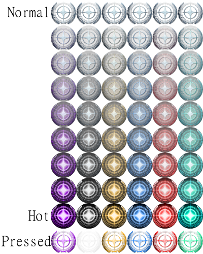
Purple White Gold Blue
Red Green
These are simpler than the other 6 in that they only light up. They do have a unique pressed state, as the spinning ones below use the hot frame for pressed.


This gif is an example of sorts of the spinning effect of the final 6 buttons. Since it's a gif, it looks really rough and to save time, I only rendered the spin effect twice. The actual buttons look much better. They spin 7 times before settling on the hot state. If I had my way, it would loop forever, but since that's not possible, I used as many frames as I could without the speed going faster than 24 frames per second.
Purple White Gold Blue Red Green

These examples are all 50x50 pixels and I think that's the size of the original and Shell buttons. For flexibility and detail, I made them at 256x256. I think it looks pretty nice on my three row taskbar with the size set to 85, but play with it to get it to your liking. I worked hard on these, so I hope you find them to your liking.


Top
 Profile  
Reply with quote  
PostPosted: Wed Jun 18, 2014 8:03 am 
Offline
Site Admin
User avatar

Joined: Wed Jan 02, 2013 11:38 pm
Posts: 5331
Not bad, not bad at all :)


Top
 Profile  
Reply with quote  
PostPosted: Tue Jul 15, 2014 6:45 am 
Offline
User avatar

Joined: Sun Jul 13, 2014 12:04 pm
Posts: 177
Location: Coolidge, AZ USA
Very well done! Love it! Now using the animated gold one. :D

_________________
"A book is a mirror. If an ass peers into it, it doesn't expect an apostle to peer out." - E.M. Forster


Top
 Profile  
Reply with quote  
PostPosted: Sun Apr 05, 2015 10:10 am 
Offline
User avatar

Joined: Thu Jan 03, 2013 12:38 am
Posts: 5341
Yeah the gold one is so awesome. :P

_________________
Links to some general topics:

Compare Start Menus

Read the Search box usage guide.

I am a Windows enthusiast and did Classic Shell's testing and usability/UX feedback.


Top
 Profile  
Reply with quote  
PostPosted: Sun Apr 19, 2015 8:24 pm 
Offline

Joined: Sun Apr 19, 2015 8:22 pm
Posts: 1
The logo appears huge when I select it for use as my start button. Anyone else experiencing this?


Top
 Profile  
Reply with quote  
PostPosted: Sun Apr 19, 2015 8:30 pm 
Offline
Site Admin
User avatar

Joined: Wed Jan 02, 2013 11:38 pm
Posts: 5331
You can change the size of the button from the Start Button tab in the settings. By default it is "0", which means to use the actual size of the PNG file. Often times the button creators make a large image to preserve the quality at various sizes. In that case it is up to you to specify the size that works best for your taskbar. Try something like 40 or 50.


Top
 Profile  
Reply with quote  
Display posts from previous:  Sort by  
Post new topic Reply to topic  [ 6 posts ] 

All times are UTC - 8 hours [ DST ]


Who is online

Users browsing this forum: No registered users and 6 guests


You cannot post new topics in this forum
You cannot reply to topics in this forum
You cannot edit your posts in this forum
You cannot delete your posts in this forum
You cannot post attachments in this forum

Search for:
Jump to:  
Powered by phpBB® Forum Software © phpBB Group, Almsamim WYSIWYG Classic Shell © 2010-2016, Ivo Beltchev.
All right reserved.