Hi Ivo,
Sorry if I wasn't clear.
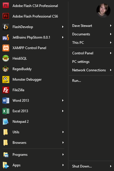
The effect I was getting was this, with a border around each icon:

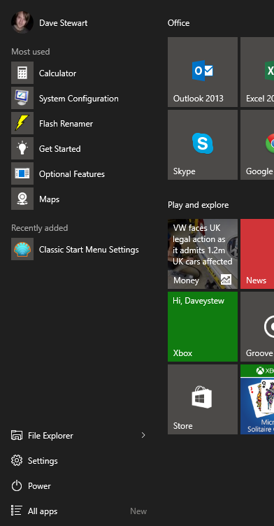
The effect I thought I was going to get was either a solid grey background with margin, or a bit more padding, like in Windows 10:

However, I just accidentally turned off "Skin > Disable glass transparency" and the frames disappeared, giving me (pretty much) the effect I was looking for:

Is that a the desired effect of "Disable glass transparency" ?
Either way, it works for me, for now (though I suspect this is just a happy accident).
As for "what I was suggesting to change" it was really just more control over the Windows 10 look for the icons in general really.
Ideally (though this is probably a conversation for another thread) there would be a Windows 10 specific version of Classic Start Menu which would emulate as closely as possible the native setup but with better options for things like hierarchical All Programs.
Cheers,
Dave


