Classic Shell http://www.classicshell.net/forum/ |
|
[SKINPACK]Start Menu History, my greatest endeavor yet!!! http://www.classicshell.net/forum/viewtopic.php?f=17&t=4560 |
Page 1 of 2 |
Author: | Splitwirez [ Fri Apr 24, 2015 11:52 am ] |
Post subject: | [SKINPACK]Start Menu History, my greatest endeavor yet!!! |
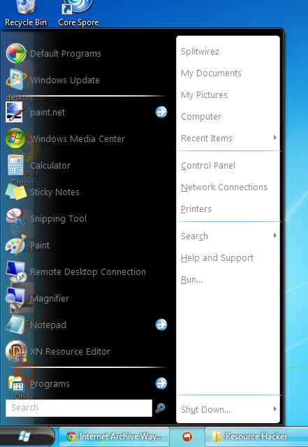
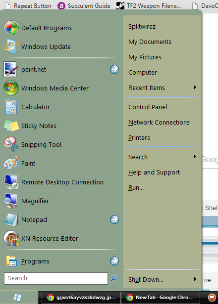
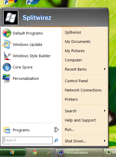
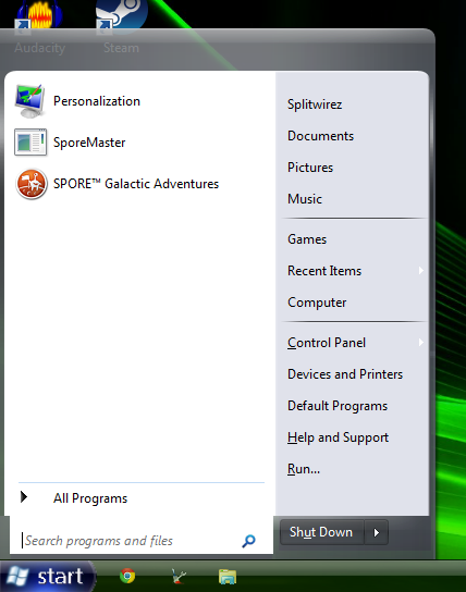
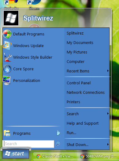
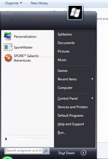
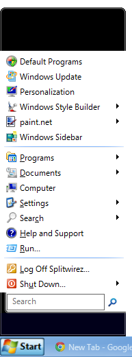
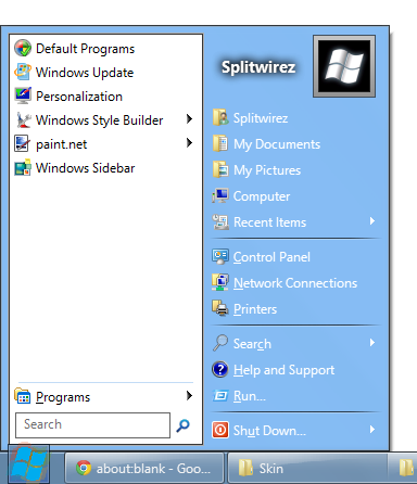
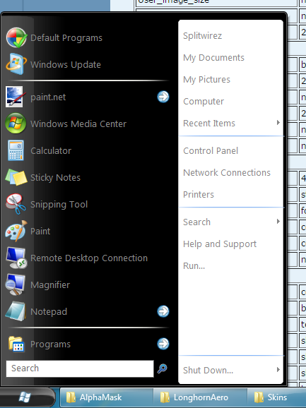
Okay, I'm just announcing a Skinpack I've begun to develop, intending to port every known variant of the Start Menu to Classic Shell, bar the ones that are already available. Here, have some progress screenies: Yes, that is Windows 7, and I'm still not running Windows 7...I have it in a VM, because I'm no longer allowed to use Classic Shell on my 8.1 host At this point, I regret to announce that I will no longer be able to benefit from Classic Shell. However, that does not by any means indicate that I will cease to create skins and buttons for it, quite the opposite, in fact - I'm just getting started Here's a list of every Start Menu I'm going to port: -Whistler "hidden" Beta Watercolour Start Menu -Whistler Watercolour Start Menu -Longhorn Plex Start Menu -Longhorn Plex Glass Start Menu -Longhorn Slate Start Menu -Longhorn Jade Start Menu -Longhorn DWM Start Menu -Longhorn Diamond Start Menu -Longhorn 4074 Aero Start Menu -Longhorn 5048 Aero Start Menu -Windows XPIn7 Aero Start Menu -Windows 8 RC Aero Start Menu (.SKIN) -Windows 8 RC Aero Start Menu (.SKIN7) -Any others I may have missed (Please tell me if I missed any) Legend: - = Real - = Hypothetical Red Text = Not started Yellow Text = In progress Green Text = Finished Pink Text = I need some help with this Skin Downloads: Plex Glass: http://www.mediafire.com/download/cxil7y708bj7hi7/Windows+Longhorn+Plex+Glass.skin Plex Glass v2: http://www.mediafire.com/download/9mrsrzsirjea8o4/Windows+Longhorn+Plex+Glass_v2.skin Slate: https://www.mediafire.com/?xzgjw7f4i4mpwbc Jade: https://www.mediafire.com/?pu1ecmbs6owlj8p DWM: http://www.mediafire.com/download/1en3ao823xv1tab/Windows+Longhorn+DWM.skin Aero: http://www.mediafire.com/download/5ww9xvdtwfwrh6d/Windows+Longhorn+Aero.skin Diamond: http://www.mediafire.com/download/q27hvi4vahu7pua/Windows+Longhorn+Diamond.skin7 Diamond v2: http://www.mediafire.com/download/z8hlm6as2k9sg8r/Windows+Longhorn+Diamond+v2.skin7 Whistler Hidden: http://www.mediafire.com/download/rv8ca8amhesb9c8/Windows+Whistler+Hidden.skin XPin7 Aero: http://www.mediafire.com/download/ib95kcmprdyem5c/Windows+XPin7+Aero.skin 8 RC Aero .SKIN : http://www.mediafire.com/download/svoqdfr3jcpvaz1/Windows+8+RC.skin Buttons: Plex Glass: http://www.mediafire.com/download/ycy8ubitm0dwzfy/PlexGlassButtons.zip Slate: http://www.mediafire.com/download/8uqg4ooj37q3q8j/SlateButtons.zip DWM: http://www.mediafire.com/download/20837thc5il03wx/DWMButtons.zip Jade/Aero: http://www.mediafire.com/download/8tt9t4a0cnv0qqc/4074AeroButtons.zip XPin7 Aero: http://www.mediafire.com/download/euk4we54b13xs99/XPin7_StartButton.png XPin7 Aero, Large Taskbar: http://www.mediafire.com/download/iaqvrmpxqm2vmns/XPin7_StartButton_LargeTaskbar.png Diamond: http://www.mediafire.com/download/6x8qi95jfxy9yfd/DiamondStartButton.png 8 RC Aero: http://www.mediafire.com/download/69450i647qoa3hd/Win8RCButton_SmallTaskbar.png 8 RC Aero, Large Taskbar: http://www.mediafire.com/download/2iryr02mzpod0o5/Win8RCButton.png |
Author: | Splitwirez [ Tue Apr 28, 2015 6:33 am ] |
Post subject: | Re: [SKINPACK]Start Menu History, my greatest endeavor yet!! |
Er...has anyone actually seen this? Please let me know what you think, it doesn't have to be constructive, even just a simple "Looks good" or something, I just want to know if people are actually noticing this. I'm not begging for approval, so even if all you have to say is negative stuff, I'd still rather hear that than nothing. |
Author: | Jcee [ Tue Apr 28, 2015 12:39 pm ] |
Post subject: | Re: [SKINPACK]Start Menu History, my greatest endeavor yet!! |
I've seen it, Personally i'm all about function and don't care if something looks exactly like it did on a different OS. But i know quite a few people who post on the forums do strive for 'exactly how it looked in X' to the extent of custom themes and such, who will likely love some of your skins. Ill definitely at-least try em out though if-only to gather ideas for my own developments (which I should probably start working on, except I've been busy with school) |
Author: | Splitwirez [ Tue Apr 28, 2015 2:08 pm ] |
Post subject: | Re: [SKINPACK]Start Menu History, my greatest endeavor yet!! |
Jcee wrote: I've seen it, Personally i'm all about function and don't care if something looks exactly like it did on a different OS. But i know quite a few people who post on the forums do strive for 'exactly how it looked in X' to the extent of custom themes and such, who will likely love some of your skins. Ill definitely at-least try em out though if-only to gather ideas for my own developments (which I should probably start working on, except I've been busy with school) Okay, I completely understand the "function over form" thing, logically that's the best move, but some people are nuts about aesthetics...such as myself, obviously enough. Ironically, that means you'll probably strongly dislike the skin I just finished (will add to OP after typing this): Hypothetical Plex Glass. By the way, if you ever need resource images from any particular Longhorn Build/Visual Style, I'd be more than happy to send you the files if I have them, and (by extension) save you the work of digging it out or installing the OS (Ironically, I've only managed to get build 4039 working on real hardware, which allowed me to experience the full power of its DWM, which inspired me to create the Plex Glass skin for this pack, though the build itself features no such alternate Start Menu, sadly) |
Author: | juniper7 [ Tue Apr 28, 2015 6:46 pm ] |
Post subject: | Re: [SKINPACK]Start Menu History, my greatest endeavor yet!! |
Hi Splitwirez. If anything, the last one is the one that appeals to me, as I'm somewhat biased to anything blue. And it doesn't have the original dirty top bar. Looks clean and fresh. Just need to push the padding a bit on the left and right edges. |
Author: | Splitwirez [ Wed Apr 29, 2015 3:49 am ] |
Post subject: | Re: [SKINPACK]Start Menu History, my greatest endeavor yet!! |
juniper7 wrote: Hi Splitwirez. If anything, the last one is the one that appeals to me, as I'm somewhat biased to anything blue. And it doesn't have the original dirty top bar. Looks clean and fresh. Just need to push the padding a bit on the left and right edges. One word: :3 Also...push the padding? Could you explain a little further as to what you mean by that? Also, does anyone here know of a way to make the columns of a skin7 sized more like a regular skin relative to each other? |
Author: | juniper7 [ Wed Apr 29, 2015 8:49 pm ] | ||
Post subject: | Re: [SKINPACK]Start Menu History, my greatest endeavor yet!! | ||
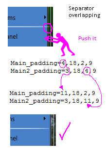
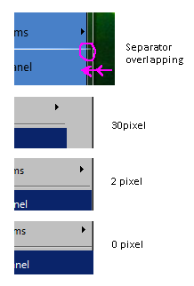
Hi Splitwirez. I just googled "push the padding". Hilarious. No, not that. I mean increase the number value of the padding, in the skin. Padding is the invisible area in between, say the edge of the menu, or column, to where the text, icons, and separators, and selector buttons, start and end. Even the icons, text, and selector buttons, etc., can have even more padding added, as well. Some with text, and others with modified bitmaps. The text padding has separate pixel values for the left side, top, right side, and bottom. Some people like menus that have almost no pixel invisible area. Others like a bit a space, so menu is not so cramped. So it can be a personal taste, unless all those elements are way off, and overlap other parts of menu, where you may not want it. See picture for examples. If you want to adjust the left and right padding on a two column menu, the text will look something like this example: Main_padding=4,18,2,9 Main2_padding=3,18,4,9 Probably adding an extra 7 pixels will line up the left starting of first column, and right ending of second column, to look like this: Main_padding=11,18,2,9 Main2_padding=3,18,11,9 Column size. Yes, would be great if there was a " Two columns width are same size" check box. XP type menus tend be very rigid, and long names get cut off. CSM will expand and contract each column depending on the text, and icons. Good and not so good, if matching older system look. Only things one can do that I know of, are reducing the Main menu width from 60 to around 20 to 25, and setting the minimum width by adding spaces to a text name in each column. This is done in CSM settings. Bye.
|
Author: | juniper7 [ Wed Apr 29, 2015 8:54 pm ] |
Post subject: | Re: [SKINPACK]Start Menu History, my greatest endeavor yet!! |
Scrap the comment about the column size. Woops. I was thinking classic 2, not Win7 |
Author: | NoahNicholsFourm [ Thu Apr 30, 2015 12:04 pm ] |
Post subject: | Download links |
Where are the download links for the ones your finished with? |
Author: | Splitwirez [ Thu Apr 30, 2015 1:15 pm ] |
Post subject: | Re: Download links |
NoahNicholsFourm wrote: Where are the download links for the ones your finished with? None yet, I wasn't going to post any links until they were all finished (because that way the excitement wouldn't be spread thin), however I suppose that if anyone would prefer them to be released individually, than I shall release accordingly. Evidently you feel that way, so...what the heck, I'll upload them right now |
Author: | TheClock [ Thu Apr 30, 2015 2:52 pm ] |
Post subject: | Re: Download links |
Splitwirez wrote: NoahNicholsFourm wrote: Where are the download links for the ones your finished with? None yet, I wasn't going to post any links until they were all finished (because that way the excitement wouldn't be spread thin), however I suppose that if anyone would prefer them to be released individually, than I shall release accordingly. Evidently you feel that way, so...what the heck, I'll upload them right now Awesome! Thanks again, Splitwirez! |
Author: | Splitwirez [ Fri May 01, 2015 3:07 am ] |
Post subject: | Re: Download links |
TheClock wrote: Splitwirez wrote: NoahNicholsFourm wrote: Where are the download links for the ones your finished with? None yet, I wasn't going to post any links until they were all finished (because that way the excitement wouldn't be spread thin), however I suppose that if anyone would prefer them to be released individually, than I shall release accordingly. Evidently you feel that way, so...what the heck, I'll upload them right now Awesome! Thanks again, Splitwirez! Sorry I haven't already got the skins up, a bunch of stuff just...happened .-. I should have them up by the end of today, though |
Author: | Splitwirez [ Fri May 01, 2015 7:05 am ] |
Post subject: | Re: [SKINPACK]Start Menu History, my greatest endeavor yet!! |
Okay everyone, downloads are up for the finished skins! (Please check back for more updates, I added another skin to the to-do list) EDIT: Woops, seems I screwed up a few of the links. Regardless, it's fixed now |
Author: | Jcee [ Fri May 01, 2015 5:39 pm ] |
Post subject: | Re: [SKINPACK]Start Menu History, my greatest endeavor yet!! |
Why mediafire you could just upload them directly to the forums if you wanted |
Author: | juniper7 [ Fri May 01, 2015 6:21 pm ] |
Post subject: | Re: [SKINPACK]Start Menu History, my greatest endeavor yet!! |
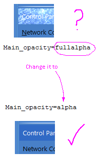
Hi Splitwirez. Just downloaded the plex glass version. Still requires a bit of fine tuning. I'm using W8.1 When you change to full alpha, or full glass, the environment changes. So 32 bit bitmaps are usually required for selectors, new selector, and split selectors, or else one gets them looking very see through and over exposed, as the hex color you picked, will add brightness on top of what's there already. You would need to install small 32 bit bitmaps, say 3 pixels by 3 pixels, along with x/y points, and with the color of your choosing, in the bitmap. Or take a simpler way, and change the text from "Main_opacity=fullalpha" to "Main_opacity=alpha". Then the selectors will look normal again. You can even change to "Main_opacity=region" for a dark stormy border, without transparency. If you take my earlier advice for the padding to be: Main_padding=11,18,2,9 Main2_padding=3,18,11,9 Then selectors will line up better too. Might have to change the values in multiple places in the skin text, for it to work. Am only telling you this, because everyone, including me, did the same thing at the start of skinning. Happy skinning. |
Author: | juniper7 [ Sun May 03, 2015 12:14 am ] |
Post subject: | Re: [SKINPACK]Start Menu History, my greatest endeavor yet!! |
Splitwirez wrote: Also, does anyone here know of a way to make the columns of a skin7 sized more like a regular skin relative to each other? Hi Splitwirez. I just looked around Win7 style CSM settings. There is a "Programs pane width setting" If I change from 40 to 31, and add spaces, after a name,( Name& spaces here &), in second column, using edit feature, it can make each column, same size. Is that what you were looking for? I don't know anything in skin that can do it. |
Author: | Splitwirez [ Sun May 03, 2015 6:36 am ] |
Post subject: | Re: [SKINPACK]Start Menu History, my greatest endeavor yet!! |
juniper7 wrote: Splitwirez wrote: Also, does anyone here know of a way to make the columns of a skin7 sized more like a regular skin relative to each other? Hi Splitwirez. I just looked around Win7 style CSM settings. There is a "Programs pane width setting" If I change from 40 to 31, and add spaces, after a name,( Name& spaces here &), in second column, using edit feature, it can make each column, same size. Is that what you were looking for? I don't know anything in skin that can do it. Eh...what? Sorry, I'm terrible at following written instructions in paragraphs :/ Same problem with the other suggestion .-. EDIT: Also, is there a way to change the names of the skin variants? |
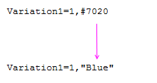
Author: | juniper7 [ Sun May 03, 2015 10:50 am ] | ||||
Post subject: | Re: [SKINPACK]Start Menu History, my greatest endeavor yet!! | ||||
I want pizza.
|
Author: | Splitwirez [ Sun May 03, 2015 5:51 pm ] |
Post subject: | Re: [SKINPACK]Start Menu History, my greatest endeavor yet!! |
juniper7 wrote: I want pizza. That makes a lot more sense. The accompanying text in the quote would have me at a complete loss of understanding, but the indicates some form of humor, which makes...slightly more sense. Also, changing the Main_opacity to alpha results in hideous black edges, due to the borders seemingly being thicker than CSM expects...is there a way around that? |
Author: | juniper7 [ Sun May 03, 2015 10:50 pm ] |
Post subject: | Re: [SKINPACK]Start Menu History, my greatest endeavor yet!! |
Hi Splitwirez. I don't know about the edges. Tried alpha, fullalpha, the outside glass part looks ok on Win8. Tried on Win7, still ok. Alpha makes the smoothest transition, but there will be an odd looking shadow at bottom right corner, if shadow enabled. Just make that corner square like most menus. If glass, or fullglass is used on Win8, without 3rd party Aero glass, there will be dark ugly pixelated top corners. They can be cut out with image editor. Other than a few dark spots here and there from the artist, it's ok. Maybe you have different setup? PS. Took a while preparing pictures for you, and I got hungry. Couldn't submit post without text. There you go. |
Author: | Splitwirez [ Mon May 04, 2015 3:42 am ] |
Post subject: | Re: [SKINPACK]Start Menu History, my greatest endeavor yet!! |
juniper7 wrote: Hi Splitwirez. I don't know about the edges. Tried alpha, fullalpha, the outside glass part looks ok on Win8. Tried on Win7, still ok. Alpha makes the smoothest transition, but there will be an odd looking shadow at bottom right corner, if shadow enabled. Just make that corner square like most menus. If glass, or fullglass is used on Win8, without 3rd party Aero glass, there will be dark ugly pixelated top corners. They can be cut out with image editor. Other than a few dark spots here and there from the artist, it's ok. Maybe you have different setup? PS. Took a while preparing pictures for you, and I got hungry. Couldn't submit post without text. There you go. Hmm...makes sense. If by "a different setup" you mean "a Virtual Machine", then yes, I do have a different setup .-. Thanks for all the help, and that post-script explains the text too ._____. |
Author: | juniper7 [ Tue May 05, 2015 9:29 pm ] |
Post subject: | Re: [SKINPACK]Start Menu History, my greatest endeavor yet!! |
Oh Splitwirez, I think I know what you are talking about, with a dark line on edge. I do see it on the submenu only. Change "Submenu_opacity=solid" to "Submenu_opacity=region" Solid makes auto border. Bye. |
Author: | Splitwirez [ Wed May 06, 2015 3:51 am ] |
Post subject: | Re: [SKINPACK]Start Menu History, my greatest endeavor yet!! |
juniper7 wrote: Oh Splitwirez, I think I know what you are talking about, with a dark line on edge. I do see it on the submenu only. Change "Submenu_opacity=solid" to "Submenu_opacity=region" Solid makes auto border. Bye. Hmm...I think we're talking about 2 separate problems, the borders I was referring to are on the main bitmap. Also, some of my phone's suggested "words" while I was typing this: thinkuniper7, separuniper7, probluniper7, bordeuniper7, referriuniper7, aruniper7, bitmauniper7 Samsung Galaxy SIII is like that sometimes .-. |
Author: | Splitwirez [ Thu May 14, 2015 5:06 am ] |
Post subject: | Re: [SKINPACK]Start Menu History, my greatest endeavor yet!! |
Sorry for the long wait everyone, I'm hoping to get the Start Buttons and Plex Glass v2 out by the end of tomorrow! |
Author: | Splitwirez [ Fri May 15, 2015 9:06 am ] |
Post subject: | Re: [SKINPACK]Start Menu History, my greatest endeavor yet!! |
Okay everyone, I'm about 12 hours late, but Plex Glass v2 and all the buttons are up!! Check the OP for links |
Author: | juniper7 [ Fri May 15, 2015 6:03 pm ] |
Post subject: | Re: [SKINPACK]Start Menu History, my greatest endeavor yet!! |
Hi Splitwirez. Longhorn plexy glass V2 much better. Ah! Neat idea. The start button is a shrinky of its former self. Would be good to have alternate download from Classic Shell as well, to cut all the advertising garbage. |
Author: | Splitwirez [ Sat May 16, 2015 3:32 am ] |
Post subject: | Re: [SKINPACK]Start Menu History, my greatest endeavor yet!! |
juniper7 wrote: Hi Splitwirez. Longhorn plexy glass V2 much better. Ah! Neat idea. The start button is a shrinky of its former self. Would be good to have alternate download from Classic Shell as well, to cut all the advertising garbage. Er...isn't there a limit of 3 attachments? Otherwise I'd absolutely use the forum's uploader... |
Author: | Jcee [ Sat May 16, 2015 5:43 am ] |
Post subject: | Re: [SKINPACK]Start Menu History, my greatest endeavor yet!! |
you can always zip the files up, or attach to another post (im not sure about the attachment limit myself though) |
Author: | Splitwirez [ Sat May 16, 2015 6:11 am ] |
Post subject: | Re: [SKINPACK]Start Menu History, my greatest endeavor yet!! |
Jcee wrote: you can always zip the files up, or attach to another post (im not sure about the attachment limit myself though) Okay then, once all the skins and buttons are done, I'll compress and attach them. |
Author: | Splitwirez [ Wed May 20, 2015 5:10 am ] |
Post subject: | Re: [SKINPACK]Start Menu History, my greatest endeavor yet!! |
Okay everyone, I have some bad news. My Windows 7 VM needs to be activated in 3 days, and the product key I was given is for the wrong version D: Hopefully I'll be able to find another way to finish this skinpack... |
Author: | Splitwirez [ Thu May 28, 2015 4:58 am ] |
Post subject: | Re: [SKINPACK]Start Menu History, my greatest endeavor yet!! |
Miraculously, my VM still lets me use it! I can finish this I'll try to have the Diamond Start Menu ready soon! |
Author: | Splitwirez [ Mon Jun 01, 2015 3:32 pm ] |
Post subject: | Re: [SKINPACK]Start Menu History, my greatest endeavor yet!! |
Geez, I completely forgot to upload and post the screeny. I had it ready last friday, but I forgot to post it here. Sorry about that |
Author: | juniper7 [ Fri Jun 05, 2015 12:30 am ] |
Post subject: | Re: [SKINPACK]Start Menu History, my greatest endeavor yet!! |
I see the build 5112 is looking good. You must have found a secret way, of having the Shut Down icon on the right. Gather it's a big transparent button with the icon, replacing the arrow? |
Author: | Splitwirez [ Fri Jun 05, 2015 2:55 am ] |
Post subject: | Re: [SKINPACK]Start Menu History, my greatest endeavor yet!! |
juniper7 wrote: I see the build 5112 is looking good. You must have found a secret way, of having the Shut Down icon on the right. Gather it's a big transparent button with the icon, replacing the arrow? Yeah, it certaintly isn't a perfect replica, but hey, nothing is perfect. The laws of physics prohibit it. EDIT: I'm having an odd problem with the "All Programs" text...it randomly turned white, even though the colour set for it is #000000 '~' How can I fix that? |
Author: | juniper7 [ Fri Jun 05, 2015 8:26 am ] |
Post subject: | Re: [SKINPACK]Start Menu History, my greatest endeavor yet!! |
Looks like you got the same problem that I got on another Win7 style skin. Bug, or was never designed to have left column, as fullalpha/fullglass. That text will be transparent to what ever is behind menu. Can happen on the search menu as well. In this case, a white background, shows through. Would need to have it like this: Main_opacity=glass Main2_opacity=fullglass or Main_opacity=alpha Main2_opacity=fullalpha or Main_opacity=alpha Main2_opacity=alpha |
Author: | Splitwirez [ Fri Jun 05, 2015 8:51 am ] |
Post subject: | Re: [SKINPACK]Start Menu History, my greatest endeavor yet!! |
juniper7 wrote: Looks like you got the same problem that I got on another Win7 style skin. Bug, or was never designed to have left column, as fullalpha/fullglass. That text will be transparent to what ever is behind menu. Can happen on the search menu as well. In this case, a white background, shows through. Would need to have it like this: Main_opacity=glass Main2_opacity=fullglass or Main_opacity=alpha Main2_opacity=fullalpha or Main_opacity=alpha Main2_opacity=alpha Oh, alright. That's annoying, but atleast I can fix it now EDIT: Alright, the Diamond skin is done |
Author: | juniper7 [ Fri Jun 05, 2015 10:17 am ] |
Post subject: | Re: [SKINPACK]Start Menu History, my greatest endeavor yet!! |
The Diamond one is the most beautiful one of them all. Followed by Plex glass, and Slate. Diamond is at 97 % great. To bring it to 99% : Adjust Main_padding=10,69,7,4 This puts the search box lower. Clone out the two shadows on the white portion of main_bitmap=1, or take it further, and clone out the ones in the second column too. Probably got artifacts when image was resized in image editor. |
Author: | Splitwirez [ Fri Jun 05, 2015 11:17 am ] |
Post subject: | Re: [SKINPACK]Start Menu History, my greatest endeavor yet!! |
juniper7 wrote: The Diamond one is the most beautiful one of them all. Followed by Plex glass, and Slate. Diamond is at 97 % great. To bring it to 99% : Adjust Main_padding=10,69,7,4 This puts the search box lower. Clone out the two shadows on the white portion of main_bitmap=1, or take it further, and clone out the ones in the second column too. Probably got artifacts when image was resized in image editor. :O Wow...I guess that means I'm doing it semi-right...? I was wondering about moving the search bar. Thanks! What exactly do you mean by "clone out"? And...what shadows? |
Author: | juniper7 [ Fri Jun 05, 2015 12:31 pm ] | ||
Post subject: | Re: [SKINPACK]Start Menu History, my greatest endeavor yet!! | ||
Copy a pixel or two from area close by (with Adobe), and paste or brush the center area to blend it in. I exaggerated the bitmap picture. The pixels will stretch them horizontally. Most people won't even notice it. My eyes suck, sometimes I see things though. This skin has the potential to be super. I just made a color mask for my one at home. Made the bottom power arrow with a little bit of red. You are great Splitwirez.
|
Author: | Splitwirez [ Fri Jun 05, 2015 2:20 pm ] |
Post subject: | Re: [SKINPACK]Start Menu History, my greatest endeavor yet!! |
juniper7 wrote: Copy a pixel or two from area close by (with Adobe), and paste or brush the center area to blend it in. I exaggerated the bitmap picture. The pixels will stretch them horizontally. Most people won't even notice it. My eyes suck, sometimes I see things though. This skin has the potential to be super. I just made a color mask for my one at home. Made the bottom power arrow with a little bit of red. You are great Splitwirez. Alright, that explains it. Done, and done. v2 is up! I'd like to see your version. I did initially consider adding a glass mask, but ultimately I had previously decided against it, in the interest of accuracy. Huh. Well, I'd imagine that skins can get substantially better than this, somehow... Now, if you'll excuse me, I'll be off to try and find a way to get the Diamond Start button. I hate deriving skins from screenies |
Author: | Splitwirez [ Fri Jun 05, 2015 2:56 pm ] |
Post subject: | Re: [SKINPACK]Start Menu History, my greatest endeavor yet!! |
Alright, the Whistler Hidden skin is up! |
Author: | Splitwirez [ Mon Jun 08, 2015 9:05 am ] |
Post subject: | Re: [SKINPACK]Start Menu History, my greatest endeavor yet!! |
And the XPin7 skin is up too! I had this one finished a while ago, but it seems I forgot to upload it >.< |
Author: | Gaurav [ Mon Jun 08, 2015 8:08 pm ] |
Post subject: | Re: [SKINPACK]Start Menu History, my greatest endeavor yet!! |
I haven't tried all of the skins but do the screenshots need to be updated as you are finishing new skins or are they already up-to-date? |
Author: | Splitwirez [ Tue Jun 09, 2015 3:12 am ] |
Post subject: | Re: [SKINPACK]Start Menu History, my greatest endeavor yet!! |
GauravK wrote: I haven't tried all of the skins but do the screenshots need to be updated as you are finishing new skins or are they already up-to-date? Um...a few of them are slightly outdated. I'll try to fix that as soon as possible. Mind you, all of the v1 skins are represented, but not the v2 ones :U |
Author: | Splitwirez [ Tue Jun 09, 2015 7:59 am ] |
Post subject: | Re: [SKINPACK]Start Menu History, my greatest endeavor yet!! |
And the Diamond Start Button is up! |
Author: | Gaurav [ Tue Jun 09, 2015 8:38 am ] |
Post subject: | Re: [SKINPACK]Start Menu History, my greatest endeavor yet!! |
That XP in 7 Aero button is so nice. Can you make it for the larger 40 pixel taskbar? |
Author: | Splitwirez [ Tue Jun 09, 2015 8:42 am ] |
Post subject: | Re: [SKINPACK]Start Menu History, my greatest endeavor yet!! |
GauravK wrote: That XP in 7 Aero button is so nice. Can you make it for the larger 40 pixel taskbar? Sure, will do. Did I actually explain where that skin and button came from? ...for anyone who reads this and doesn't know, it's the result of attempting to run Windows XP's explorer.exe under Windows 7. However, in spite of being a 2000-style skin, the original menu was the 2-columns style! (It doesn't actually have a second column unless you use the classic theme for some reason .-. ) EDIT: Done! That didn't take half as long as I expected it to |
Author: | juniper7 [ Tue Jun 16, 2015 1:17 pm ] |
Post subject: | Re: [SKINPACK]Start Menu History, my greatest endeavor yet!! |
juniper7 wrote: I just made a color mask for my one at home. Yes, about that. Um. The euphoria from one beer after a week of nothing, wore off. The glass color isn't that great after all. I would call it solid paint feature. If I ever finish skin, I'll upload. I'm still modifying that and other stuff, bit by bit. Morphing into something else. Who knows what. Still can't get a downloaded Beta 5112 to even install, so I have no idea of what everything on the menu looks like. Only bad quality screen shots from tube, and search. Most have been modded already. I'm interested to see what the menu scroll bar looks like, or just leave it as is, and let Win7/8 decide. OK. Really big paragraph. Be prepared!:) Now I'm stuck. I can't figure the search box skinning instructions. I fudged the bitmap, to make it work. Do you know everything about it? Not sure if it's the right way. I'm lost. Note: These are unmodified example settings from Aero skin. This is the very outside padding, but can still interact with internal box? The 0% makes bottom position, stay same on high DPI? Search_padding=6,16,10,6,100%,100%,0%,100% This, if on 1, will show built in box, instead of "search background". Search_frame=0 This is external made bitmap, with box, and possible outside area included. Search_background=23 I have no idea what this is for, if inside box is white already? Does Win 7 grey out search box, when it can't be accessed? Search_background_mask=24 This is the really, really big puzzle. At first I thought the center group was the box padding, and the left and right groups, for the bitmap area outside. But it didn't work. If I put some of box bitmap (none expanding area), on the left and right groups, it's better. Still not perfect. Changing the ratios of this spillover, affects the "search padding". What gives? I am missing the proper way to make it work, without the interaction. Search_background_slices_X=3,2,3, 0,5,13, 0,1,3 Search_background_slices_Y=5,1,3, 0,4,0, 2,2,3 Sometimes does something. Most of time, no visible effect. Is this to do with an internal white box, inside the search box? Search_background_padding=1,-3,1,1 Any ideas? |
Author: | Splitwirez [ Tue Jun 16, 2015 3:12 pm ] |
Post subject: | Re: [SKINPACK]Start Menu History, my greatest endeavor yet!! |
juniper7 wrote: juniper7 wrote: I just made a color mask for my one at home. Yes, about that. Um. The euphoria from one beer after a week of nothing, wore off. The glass color isn't that great after all. I would call it solid paint feature. If I ever finish skin, I'll upload. I'm still modifying that and other stuff, bit by bit. Morphing into something else. Who knows what. Still can't get a downloaded Beta 5112 to even install, so I have no idea of what everything on the menu looks like. Only bad quality screen shots from tube, and search. Most have been modded already. I'm interested to see what the menu scroll bar looks like, or just leave it as is, and let Win7/8 decide. OK. Really big paragraph. Be prepared!:) Now I'm stuck. I can't figure the search box skinning instructions. I fudged the bitmap, to make it work. Do you know everything about it? Not sure if it's the right way. I'm lost. Note: These are unmodified example settings from Aero skin. This is the very outside padding, but can still interact with internal box? The 0% makes bottom position, stay same on high DPI? Search_padding=6,16,10,6,100%,100%,0%,100% This, if on 1, will show built in box, instead of "search background". Search_frame=0 This is external made bitmap, with box, and possible outside area included. Search_background=23 I have no idea what this is for, if inside box is white already? Does Win 7 grey out search box, when it can't be accessed? Search_background_mask=24 This is the really, really big puzzle. At first I thought the center group was the box padding, and the left and right groups, for the bitmap area outside. But it didn't work. If I put some of box bitmap (none expanding area), on the left and right groups, it's better. Still not perfect. Changing the ratios of this spillover, affects the "search padding". What gives? I am missing the proper way to make it work, without the interaction. Search_background_slices_X=3,2,3, 0,5,13, 0,1,3 Search_background_slices_Y=5,1,3, 0,4,0, 2,2,3 Sometimes does something. Most of time, no visible effect. Is this to do with an internal white box, inside the search box? Search_background_padding=1,-3,1,1 Any ideas? Um...*head implodes into tiny black hole* I have no idea what you just said. This isn't tl;dr , but in spite of my best efforts, it seems to be tl;cr. That's not a typo. Mobile screens + my brain = literally nothing at all. Vista 5112 refuses to install under real hardware, and refuses to run under VirtualBox. I've gotten it running only under the latest VMWare Player. When I return from vacation, I'd be more than hapy to spend a few days uploading my VM's virtual hard disk, if you'd like c: The only thing I have been able to extract from the first part of the post is that Microsoft needs to add Aero Paint, and that I have no idea what "euphoria" is |
Author: | juniper7 [ Tue Jun 16, 2015 4:29 pm ] |
Post subject: | Re: [SKINPACK]Start Menu History, my greatest endeavor yet!! |
I figured that would light the fuse to head exploding. tl;dr. That's fine. I think, I wanted to just get the frustration out of my head. Whoa, too much time downloading already. Mega downloaded two times to 99%, then auto deleted due to encrytion error. Downloaded WinWorld smaller one. Says missing some manager at install. All I need is a screen shot of what the scroll bar looks like, or location of the bitmaps or pngs, on disc. I found 7zip opens up the windows files, and folders. Resource hacker opens up the dlls. Easy to extract. The color on my skin was too flat looking. I will need to dynamize the mask a little. Oh no. Message is getting big again. Enjoy your vacation. I've started mine too. |
Page 1 of 2 | All times are UTC - 8 hours [ DST ] |
Powered by phpBB® Forum Software © phpBB Group https://www.phpbb.com/ |