Up through Windows 8 I've been able to find software to tweak Windows into using the
standard "Tree" control for File Explorer windows in the Files pane (right side) when using
Details view. One program that XPClient found (thanks) to do it was "Folder Options X".
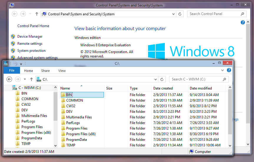
Along with the option provided by Classic Shell for squeezing out some of the vertical spacing in the Navigation pane (left side), it was possible to set up to have an Explorer Window in Windows 8.0 that not only showed more information in the same space (and to have the same vertical density in both the Navigation and Files panes), but also which interacted a bit more agreeably and used a darker font for the Date, etc. None of these things are night and day differences, but they ALL made File Explorer just a little bit easier to work with.
Example from Windows 8.0:

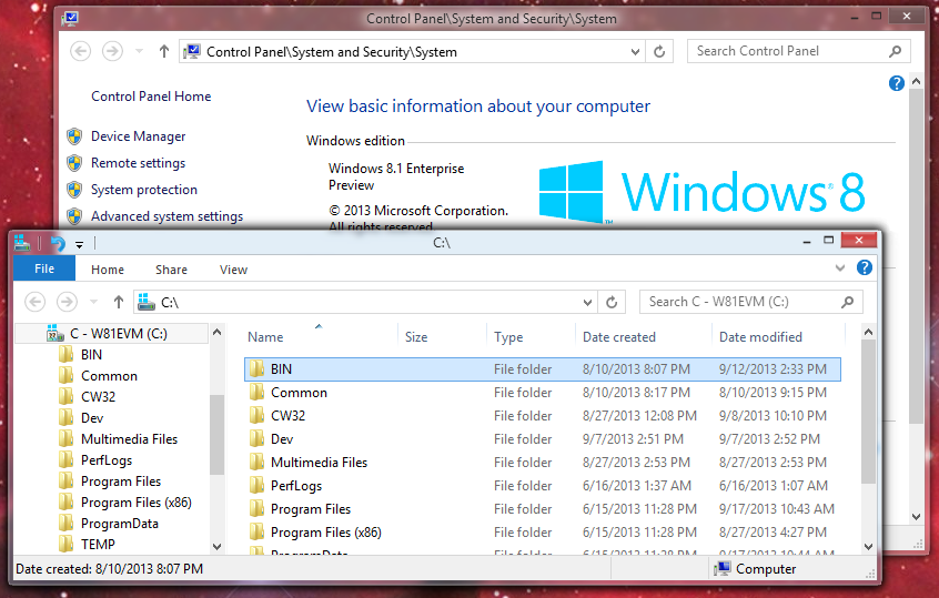
But now with the Windows 8.1 Enterprise Preview (I don't have the RTM set up to test with yet), I've noticed File Explorer can no longer be set as before to use the Tree control in the Files pane. So the entries are spread further apart and a lighter font shows up
Note specifically the items in the Files pane in Windows 8.1:

My question is this: Is there a way ClassicShell could restore the use of the standard tree control, or at least adjust the spacing of the items in the Files pane to facilitate their being squeezed together vertically?
Thanks.
-Noel


