Classic Shell
http://www.classicshell.net/forum/

Experiment Plex Replay (Classic style)
http://www.classicshell.net/forum/viewtopic.php?f=17&t=4544
Page 1 of 1

Author:  juniper7 [ Tue Apr 21, 2015 3:02 pm ]
Post subject:  Experiment Plex Replay (Classic style)

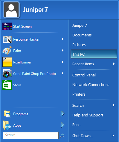
Experiment Plex Replay

Tried with CSM 4.2.1 on Win7/8.1
Not compatible with older versions of CSM. Sorry about that. I used parts of .skin7 file. Has to be 4.2.1
After downloading file, paste in skins folder. Usually C:\Program Files\Classic Shell\Skins
Exit CSM, restart CSM, and go to "Start Menu Style" tab. Pick Classic or Classic two columns.
Pick "Plex Replay" in Skin tab.


Objective.
Be different, slightly.
Did not want to make same plex menu, so this was my incentive. Picture at bottom of web page.

http://windowsitpro.com/systems-managem ... ch-17-2003

Eventually got a Longhorn system on a hard drive to work.
Wanted to get better shots.
Using non usb keyboard & mouse, and adjusting computer date was a breeze after spending 1/2 day scratching head.
Disappointing, the twisty menu not even there, and the buttons, look worse than internet screenshots. :( Anyway used that different caption version in this skin, and used explorer submenu, bars, and buttons from different places.

Pressure washed the dirty grime, and stains off,
and used toned down versions of the twisty corner menu.
The blue/green button was a mixture of many screenshots smoothed together.
Took many, many hours processing it, to be passable. Still not perfect, as it becomes an inny, more than an outy. Had to darken button for dark menus, as contrast effect blows out.
Yes, I made that up. Ok, it makes the button appear too bright inside, with a dark background menu.

Turned the brightness way down on the gemstone arrows, and kept a tiny bit of halo edge.

Used sneaky way of hiding user picture. Replaced the frame, with a screenshot.

The light variation is like a horizon blue sky view. The left pane is same original color of real longhorn menu.
After menu washing, skin came out a bit too bright. I guess ok for people with the monitor brightness turned low.

The dark variation is like looking straight up into space.
I prefer the dark version.
Could not get rid of all the wavy lines in mostly the submenus.

Feel free to change things around, and make them better, and upload for the world to see.
Might be a couple bugs still. No more time. It's either trash it or upload it.

Bye. :D

Attachments:
Plex Replay.skin [1.8 MiB]
Downloaded 919 times
Plex Replay .png
Plex Replay .png [ 31.25 KiB | Viewed 6592 times ]

Author:  juniper7 [ Sat Apr 25, 2015 11:25 am ]
Post subject:  Re: Experiment Plex Replay (Classic style)

I have put a third pastel option in this skin.
It's soft and lighter. :P

The evil darkness has gone. :twisted:
Not sure if it's plex anymore.


Bye.

Attachments:
Plex Replay revB.skin [2.13 MiB]
Downloaded 509 times

Author:  321Gaming [ Sat Nov 26, 2016 10:38 am ]
Post subject:  A Question about customization

Hello again,
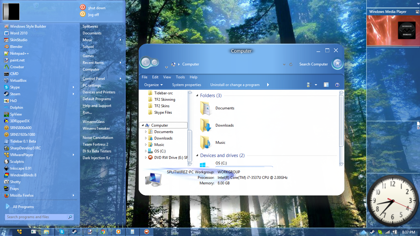
I recently found this skin from another site and I found this image...
http://winaero.com/blog/wp-content/uplo ... ull-UI.png
I like transparent,Windows Aero themed menus,so I got it.
I never found any settings for opacity and I was wondering if there's a way to make the menu transparent..
Do you know anything that may help me here?

Have a good day. C:

Author:  Splitwirez [ Sat Nov 26, 2016 10:58 am ]
Post subject:  Re: A Question about customization

321Gaming wrote:
Hello again,
I recently found this skin from another site and I found this image...
http://winaero.com/blog/wp-content/uplo ... ull-UI.png
I like transparent,Windows Aero themed menus,so I got it.
I never found any settings for opacity and I was wondering if there's a way to make the menu transparent..
Do you know anything that may help me here?

Have a good day. C:


Ahaha...funny thing is, that screenshot has nothing to do with this menu skin. Its inclusion was an error on Winaero's part.

The menu skin is actually an entirely separate one, which accompanies my "Plexcellent" Visual Style, for Windows 8.1 and 10. The latest Beta release can be found here (for Windows 8.1 only, Windows 10 version didn't exist at the time):
http://rob55rod.deviantart.com/art/Plex ... -613190167

and the latest development progress can be found here:

Author:  Weboh [ Sat Nov 26, 2016 6:10 pm ]
Post subject:  Re: Experiment Plex Replay (Classic style)

Splitwirez, do you have any plans to make into a Windows 7 VS? If not, can you provide a PNG of the taskbar and button so I can kind of replicate it using Classic Shell?

And juniper7, great work as always. :) Do you have any plans for adding that kind of transparency into the skin?

Author:  juniper7 [ Sat Nov 26, 2016 6:48 pm ]
Post subject:  Re: Experiment Plex Replay (Classic style)

Nope to the transparency.
I'd rather have someone else go for it.

Author:  Splitwirez [ Sun Nov 27, 2016 10:12 am ]
Post subject:  Re: Experiment Plex Replay (Classic style)

Weboh wrote:
Splitwirez, do you have any plans to make into a Windows 7 VS? If not, can you provide a PNG of the taskbar and button so I can kind of replicate it using Classic Shell?


Maybe someday. But almost definitely not until the 8.1 version is finished.

In the meantime, the button and menu are in the 8.1 package available on DeviantArt, and the Taskbar is already floating around somewhere on this forum :lol:

Page 1 of 1 All times are UTC - 8 hours [ DST ]
Powered by phpBB® Forum Software © phpBB Group
https://www.phpbb.com/