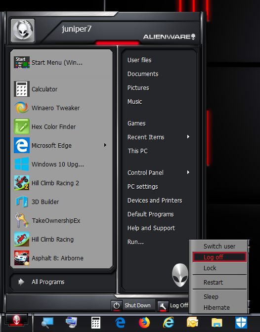
Darkstar Revived [7 style opaque only] for CSM 4.3.0
100%/96dpi, 125%/120dpi, 150%/144dpi menu display size.
Menu skin only, not a theme.
Menu skin is only good as a stand-alone, without using WindowBlinds theme.
See at bottom for more details about the incompatibility of WindowBlinds.
The start button was adjusted for Win 10 taskbar height.
My short essay begins.
I figured I'd take a stab at porting it, knowing it will be difficult to match exactly,
with the shortcomings of Windows 10, and Classic Shell.
I don't think the skinning police will be after me,
as this "The Skins Factory" menu skin is getting really old now.
I used the "XPLuna7 HiDPI revB.skin7" as my base to build up from.
I took out the left column floating user picture, for it hardly ever kept the proper horizontal position.
Instead, what I did was put an option for the user to input their own custom image,
using Ivo's handy "emblem" feature.
They would have to resize the picture to fit exactly: 48x48, 60x60, 72x72 pixels for their respective menu display sizes.
Or, if that is too much of a hassle, use the regular user picture on the right column. That follows Windows 7 style user picture.
This Darkstar Revived skin was very hard to get working without stretching distortion,
due to the angle line at the top. The silver bars do move around.
No guarantee menu won't distort if using non-default English settings.
The left column has so little splices room, because of the 45-degree angle black line,
that if reduced in size too much, the 1st column will fold over onto itself (gets eaten).
I had to modify the programs, and bottom area, to make the new search view work correctly.
At high dot per inch size options, I had to keep some parts to stay small, to avoid overlapping onto other elements.
If you disable search box in CSM settings, 1st column padding is adjusted for that.
The grey selector button on the grey menu looks ok, but when it's in front of a dark menu, it's a bit like lipstick on a pig.
I left the option turned on only for the submenu, not the main menu 1st column.
Shoot, now I just enabled it again. Maybe it's comical looking on certain days, not others.
I wanted to put the XP shutdown icon button further left, but ran into a problem. I had to make menu alpha opacity,
because of the tiny transparent sliver at top of the menu. That opacity left certain text zones that can't be crossed.
So I had to back off as a compromise.
The bad news.
My intentions did not work out so well.
If I try the real Darkstar theme with Start10 start menu, and WindowBlinds on Win10, the original menu half works.
I wanted to make this Classic Shell skin to use with WindowBlinds without their Start10 start menu.
It did not work. WindowBlinds overrides all Classic Shell menu text color and makes it all black and tiny.
The same old problem as other people have.
No adjustment of WindowBlinds settings fixed anything.
After uninstalling the trial WindowBlinds program,
it had permanently altered the blue system highlight color. Had to go into the registry to put back the correct color.
Stardock's software isn't as bad from some years ago, where it permanently changed folder icons, shortcut arrows.
Now that took a restore with thumbnail cache delete to get back to normal.
With Classic Shell, I have never had any problem with system files permanently changed.
So all in all, it was a waste of time porting it for what I wanted it for.
This menu skin is only good as a stand-alone, without WindowBlinds, unless somebody knows something?
I have included taskbar parts to help bring out the feel of Darkstar.
I have to give a lot of credit to The Skins Factory, for making such a superb theme menu.
It has so many interesting parts to it.
Other
About High dots per inch mode.
For the enlarged menu bitmaps, I initially used exact borders and the blank menu areas got bigger.
It looked unnatural.
So I used the magnifier application on Win 10 Creators update, that has bitmap smoothing feature.
If I just enlarged menu bitmap in old graphics software with bicubic function, it would come out all fuzzy.
What the magnifier does is enlarge a 1-pixel line into either 1 pixel, or two-pixel thick line,
without making an extra shade pixel in between. The good news is final image looks sharper.
The drawback is rounding of sharp corners, and switching back'n forth between 1/2 pixel lines.
I edited out those bad effects that I could see. Some parts will be 1 to 2 pixels bigger than the others,
which alters their size ratios, but I still like it better than my first bicubic attempt.
Making more original look.
Extra CSM settings for skinny (less wide) original look.
This is a stretching type menu, whereas the original is locked.
Go to CSM "Main Menu" tab, adjust "Programs pane width" to 36, "Jumplist pane width" to 30
Original never had internal programs tree, so go back to CSM "Main Menu" tab,
switch "All programs style" to "Cascading sub-menu".
To turn off search box, go to "Search Box" tab, and click "No search box".
In skin options, switch "Font size" to "XP small".
That's about all I can do. It's a 7 style menu, so no icons on the second column.
I did put some other options in from buttons and such that I found in the theme file.
Yay, my chicken scratchings have finished. Bye
EDIT: Added the buttons and skin in zip
EDIT: Fixed issue with missing arrow on regular shutdown button.
Was just a big nothing button
| Attachments: |
|
Downloaded 122 times |
 Darkstar Revived with search box off.png [ 106.5 KiB | Viewed 2483 times ] |
