Classic Shell
http://www.classicshell.net/forum/

Request: someone to do the "hard work"...
http://www.classicshell.net/forum/viewtopic.php?f=17&t=7115
Page 1 of 1

Author:  fonpaolo [ Thu Nov 24, 2016 1:31 pm ]
Post subject:  Request: someone to do the "hard work"...

Hi, first post here, but a very loooong Classic Shell user, on all my PCs and laptops, I can't live without it. :D

Ok, I've lurked in the forums here for a very long time, until now.
I've registered to say thank you for such a great software, and to ask for something...

I'm a Rainmeter skinner, I don't know if it's even possible to ask such a kind of request, so, if not, please forgive me, however, searching in this forum I haven't found anything related to what I'm asking, maybe I searched in the wrong way...:?

I wish to create a Start Menu and Taskbar matching my current skin suite.
Given my lack of free time, start building from scratch something a "little more complicated" than a Rainmeter skin, at the moment isn't really possible, even keeping it for my personal use only (as the last build of my suite, at the moment).

After read the documentation, downloaded ResHack... and... help, I'm lost! :shock:
...too many ways to break everything, more than build something, hoping that it will work, somehow, maybe..

So, if it's possible, as the title says:
there's someone who could "help" me (let's say so...:)) to build a Start Menu and a Taskbar?


I can create all the textures/images needed, it's easy, but with the coding, "a lot" more than an help is needed, so better if someone could code it for me, since everyone here is more capable than me...

Thanks
Author:  Splitwirez [ Thu Nov 24, 2016 2:18 pm ]
Post subject:  Re: Request: someone to do the "hard work"...

You know, it might be a bit easier if we could see some samples of what you have in mind, be it the Rainmeter skins themselves or a mockup of the matching menu you have in mind... :lol:

Author:  fonpaolo [ Thu Nov 24, 2016 2:44 pm ]
Post subject:  Re: Request: someone to do the "hard work"...

Hi Splitwirez. :D

Since it's my first post, I thought to not add links, not to seem here to promote or add spam for something.

As you asked, here's the link to my skin suite, it's on deviantArt: http://fav.me/d8diqq0 *

*(...no criticism allowed. ;) :lol: )

Author:  juniper7 [ Thu Nov 24, 2016 5:51 pm ]
Post subject:  Re: Request: someone to do the "hard work"...

I don't think you have any room left for a start menu!

I love your digital nature art.
It's like I'm there, walking along the trails.

Author:  Jcee [ Thu Nov 24, 2016 7:53 pm ]
Post subject:  Re: Request: someone to do the "hard work"...

links are just fine, as long as they pertain to classic shell in some way.. (IE requesting something that looks like something)
The only thing we really block is intentional spam (which is usually like 20 links in a single post whose body does not even form a coherent paragraph)

Author:  fonpaolo [ Fri Nov 25, 2016 1:23 pm ]
Post subject:  Re: Request: someone to do the "hard work"...

Thanks juniper7.
2D and 3D graphics is part of my job and until a few years ago also my main hobby.
The images in my gallery are experiments: why not play with something I like?
Searching some new techniques, workflows, inspirations.
Some were good enough to be uploaded, most of them not. :shock:


Going back to the topic, I use Start Menu Classic, and there's still room.;) :lol:
The images you've seen is only a part of my desktop, there are many other skins, some are different, some are more complex.
I prefer not to show it, simply because they're too complicated to share, some are too specific, I can't find sources capable to cover all countries, I don't want to disappoint someone with a no and first of all, I have no time.


Thanks Jcee for the clarification, I was almost sure.

Before to post something, especially if I'm new on a forum, I always read the rules, trying to find what is allowed or not.
It's an experience gained in years of frequentation, more or less constant, in several forums.
Many times I've been at your place.:)

I almost forgot why I'm here...:roll: :lol:
The more I read, the more I'm confused.
Given my very limited free time, I can't build something by trials and errors, at the present rate, it will take a decade!

If here it's allowed* and there's someone who can help me build a Start Menu skin, as I hope, he's welcome.

*for example in the Rainmeter forums you can ask for help, but not ask someone to do it for you.

Author:  juniper7 [ Sat Nov 26, 2016 5:35 pm ]
Post subject:  Re: Request: someone to do the "hard work"...

fonpaolo

Can't you just make a menu with Rainmeter?

http://www.deviantart.com/art/Start-Men ... -424073652

Rainmeter looks more capable of making odd shapes and such, and you are more familiar with it.

Author:  fonpaolo [ Sun Nov 27, 2016 5:01 am ]
Post subject:  Re: Request: someone to do the "hard work"...

juniper7

If I would have only something purely aesthetic without (almost) no functions given by Classic Start Menu or the original Taskbar, I would already done it...

I know very well Rainmeter and what it can and can't do: this is probably his only limit, even using third party plugins and addons, it would be barely usable.
That's the reason why I'm asking for an help here.

On the other side, as you said, I really don't know how much I can push the limits with Classic Shell... :roll:

...for example, let's talk about the Taskbar. (only because I can already do something... using Classic Shell)
Aesthetically, I already have what I want, however, for all I know, I can't dynamically change the notification area width, but this I think is more related to Windows and his way to "simplify" things in every new version.

If only I could add some Rainmeter "power" to it... ;) :lol:

Author:  fonpaolo [ Tue Dec 27, 2016 5:43 am ]
Post subject:  Re: Request: someone to do the "hard work"...

Given the large number of volunteers, all ready to help me and since i don't want to offend anyone... :roll: ;) :lol:
I decided that I'll try to make the start menu by myself. :shock:

...and to prove what i'm able to do, here's the Start Button: viewtopic.php?f=18&t=7206#p30932
Here the taskbar: viewtopic.php?f=21&t=7207#p30934

And also, just to scare you a little, be prepared to be flooded with a lot of questions about how and if I can do something. :evil: ;)

Author:  juniper7 [ Wed Dec 28, 2016 11:13 pm ]
Post subject:  Re: Request: someone to do the "hard work"...

Give me 1,000, and I'll make a start menu for you.
That's hours, not dollars.
A pro like you could do it in a couple of days. :)

I could be wrong on this. Just letting you know almost all of us don't know all the ins and outs of skinning here.
I joined in 2013, and I'm still puzzled by Win 7 stuff like List_separator_split/ List_separator_split_text_color/ search arrows, and on and on.
I probably know 70 to 80%. If I am not too busy and know the answer to one of your questions, I will respond back.
Ivo is the best bet to get exact answers.

Author:  fonpaolo [ Thu Dec 29, 2016 4:51 am ]
Post subject:  Re: Request: someone to do the "hard work"...

Well, maybe a pro with Rainmeter, But not so much with Classic Shell...
I don't say that I'm unable to do it, I opened some menu skins and they're all different, so, I can find something in one, maybe there isn't in another.

Just for starting: better to use as a base a .skin or a .skin7 file?

And first of all, do I need to start another thread or continue here?

Anyway, thanks juniper7 for your answers.:)

Be prepared because I like a lot to push the limits.;)

Author:  juniper7 [ Thu Dec 29, 2016 8:07 am ]
Post subject:  Re: Request: someone to do the "hard work"...

Hi fonpaolo.

If one looks at the start menu in the simplest way, it is one or two columns of information.
The rest of it is visual filler.

Looking at your S.H.I.E.L.D. work, there are lots of extra visuals.

The biggest drawback to a shrinking/expanding menu is there are just 4 safe areas on a single column menu,
and six on two column that one can have non stretching images. Ivo added a new emblem feature that can add,
I think up to ten emblems on classic style menu, and around 3 to 10 emblems on 7 style.
Classic has just one main menu, where as 7 style has three.
On 7 style, some emblems won't look good, or get in the way of the search, and jump list menus,
so they need a mask to hide them or show them. I think only 4 can be used with mask.
All the rest of emblems will show up on the other views. No, I take that back. On the last 7 style menu I made,
I did not have to make a mask for search view menu. I had screenshot of xp icons as emblem for main menu on 2nd column.
(can't have real icons 2nd column) I had to make a blocking mask to stop emblem showing on jump list view menu.
I did not need to for the search view menu.

I think it would be best to start with a classic style skin, to learn the ropes. 7 style is more complicated.
Each style has advantages and disadvantages. There is one other thing. Emblems don't work on submenus.
The submenu safe corner spaces are only safe to a certain small submenu size.
I think it works like other shrinking/expanding elements. Once the expanding slices shrink to zero amount, the safe slices start to erode, and shrink down. Sometimes it does, sometimes it doesn't. Could have been updated?
I am absolutely sure a selector will shrink away the safe slices areas.


As stated earlier, I don't know everything. Some of what I've said could be wrong.
Got the facts wrong, or because I do not understand how to use text logic properly. :)

Beats me on the thread question.
I do kind of wish there was a separate non locked thread for questions/answers on skinning.

Till next time.

Author:  fonpaolo [ Thu Dec 29, 2016 8:17 am ]
Post subject:  Re: Request: someone to do the "hard work"...

Again, thanks for your answer, juniper7, maybe this could become a "Basics on how to do..." thread, who knows. ;)

To start with something, here's a... simple example.:lol:
Obviously I'm not sure if all is doable.
I think to add all the needed text directly on the image, so, it will be bigger than all those I found in the menu skins.

Attachments:
Start options.jpg
Start options.jpg [ 68.55 KiB | Viewed 6498 times ]

Author:  Splitwirez [ Thu Dec 29, 2016 8:37 am ]
Post subject:  Re: Request: someone to do the "hard work"...

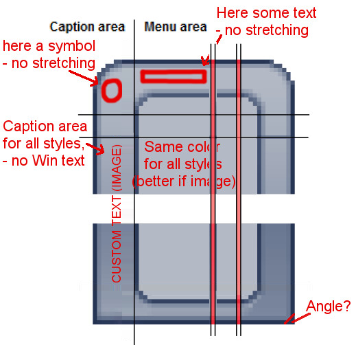
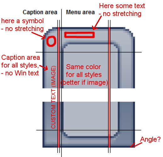
See attached.
Alternatively, you could use emblems...

Attachments:
HowToSlicingCSM.png
HowToSlicingCSM.png [ 141.5 KiB | Viewed 6496 times ]

Author:  fonpaolo [ Thu Dec 29, 2016 8:46 am ]
Post subject:  Re: Request: someone to do the "hard work"...

Thanks Splitwirez, good to know.
Now I have to find the time to start to play... :lol:

Author:  juniper7 [ Thu Dec 29, 2016 9:10 am ]
Post subject:  Re: Request: someone to do the "hard work"...

If the pink areas are the stretching slice zones, it should work.
I gather the vertical stretching area is not colored in for clarity?
I still see it start just below the inner round corners to most of menu.

Edit

On Splitwirez mod picture, guess it can work too.
That changed vertical stretching area would be good to protect image in caption space.


See, I'm wrong. :oops:
There can be 6 safe areas, not 4 on single column, with a modified caption area.
R.O.B. is good for hiding the Windows caption text, and having image instead.

Another thing, caption is for classic 1 style only.

Author:  fonpaolo [ Thu Dec 29, 2016 9:37 am ]
Post subject:  Re: Request: someone to do the "hard work"...

juniper7 wrote:
...
Another thing, caption is for classic 1 style only.

Doh! ...another way could be to move the programs/icons to the right of some pixels.:?:

I'm worried that at the end, most of what I want to do isn't really possible.:x

Author:  juniper7 [ Thu Dec 29, 2016 10:05 am ]
Post subject:  Re: Request: someone to do the "hard work"...

Yes, if you are just going to get rid of Windows caption text with an image of text or picture,
then it's easy. A couple of us have actually put a fake caption picture on a classic 2 column menu.

Other. There is a CSM caption setting that allows user to replace Windows caption with different text.

At least try before giving up. :)

From what I remember a while back, someone was super ticked off about not getting the skin the way they wanted.
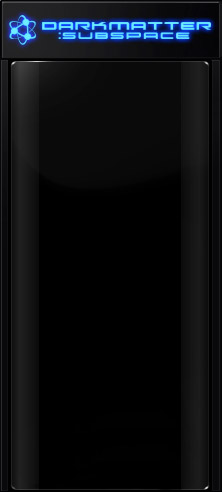
Did not help that skin went corrupt. Dang it, what was name on it blue letters,,dark matter,,dark space,whatever.
I think it had text right in the top middle of classic 1 menu. It will distort.
The persons skin was called something like F@#this F*&% skin. Well now that Ivo introduced emblems,
the text can be a non distorting emblem and look good.
So please try and see how far you can go.

Edit: Ah. It was called Darkmatter Subspace
Maybe someone can take over it and finish it. It's probably still there, way back in the pages.
Looks like it came from The Skins Factory.
The text emblem would need to be a bit smaller to avoid being cut off on sides,
when menu shrinks.

Attachments:
Darkmatter SubSpace.jpg
Darkmatter SubSpace.jpg [ 23.69 KiB | Viewed 6438 times ]

Author:  fonpaolo [ Thu Dec 29, 2016 10:45 am ]
Post subject:  Re: Request: someone to do the "hard work"...

Well, at least if this is doable, i'll try. :D

The most tricky part will be to not think at it as Rainmeter coding! :shock: :lol:

Page 1 of 1 All times are UTC - 8 hours [ DST ]
Powered by phpBB® Forum Software © phpBB Group
https://www.phpbb.com/