Classic Shell http://www.classicshell.net/forum/ |
|
Adobe CS6 Skin http://www.classicshell.net/forum/viewtopic.php?f=17&t=4048 |
Page 1 of 1 |
Author: | Simone73 [ Fri Dec 26, 2014 1:52 pm ] | |||
Post subject: | Adobe CS6 Skin | |||
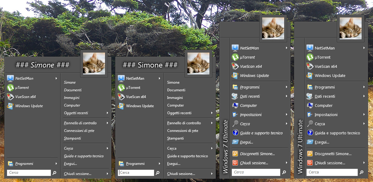
Here is my Adobe Cs6 Skin Version 1 rc1 Skin features:
Tested on Windows 7 If you see any bug or glitch on windows 7 or windows 8 please report it to me and i will try to fix it.
|
Author: | Jcee [ Fri Dec 26, 2014 2:28 pm ] |
Post subject: | Re: Adobe CS6 Skin |
It looks nice; if you want help, just attach the skin file; as a reply and post what you need done. Ill try to Iron out any bugs I find but a list would really help. Then we can update the thread reflecting the revised version |
Author: | Simone73 [ Fri Dec 26, 2014 3:12 pm ] |
Post subject: | Re: Adobe CS6 Skin |
Jcee wrote: It looks nice; if you want help, just attach the skin file; as a reply and post what you need done. Ill try to Iron out any bugs I find but a list would really help. Then we can update the thread reflecting the revised version This is my first beta. Actually what i nedd is: 1. 2. 3. a general clean up |
Author: | Jcee [ Sat Dec 27, 2014 2:26 am ] |
Post subject: | Re: Adobe CS6 Skin |
[USER_NAME] User_text_color=#FFFFFF User_glow_color=#000000 User_glow_size=10 User_name_position=10,32,-10,75 User_name_align=Right [USER_NAME AND USER_IMAGE] User_name_position=10,32,-110,75 User_name_align=Right [CENTER_NAME] User_name_align=Center This is the changes that should be made to the skin to fix username alignment. The first bold part should be changed from -110 to -10. The other bold part should be added to the skin. @ customizing submenu_seperatorV It should be bitmap #7 that needs replacing? Im not sure exactly what you need done or can't do here? It seems pretty well optimized already, though a few options could stand to be removed or adjusted (I cant see a physical difference from the 'reduce vertical text padding' option, and the large font option is barely larger) |
Author: | Simone73 [ Sat Dec 27, 2014 4:01 am ] |
Post subject: | Re: Adobe CS6 Skin |
Jcee wrote: [USER_NAME] User_text_color=#FFFFFF User_glow_color=#000000 User_glow_size=10 User_name_position=10,32,-10,75 User_name_align=Right [USER_NAME AND USER_IMAGE] User_name_position=10,32,-110,75 User_name_align=Right [CENTER_NAME] User_name_align=Center This is the changes that should be made to the skin to fix username alignment. The first bold part should be changed from -110 to -10. The other bold part should be added to the skin. The fix its ok, tnks! Jcee wrote: [USER_NAME] @ customizing submenu_seperatorV It should be bitmap #7 that needs replacing? Im not sure exactly what you need done or can't do here? It seems pretty well optimized already, though a few options could stand to be removed or adjusted (I cant see a physical difference from the 'reduce vertical text padding' option, and the large font option is barely larger) Actually, if i try to replace the bitmap #7 i obtain always the same result (no separator=flat background) regardless of options/image used. It would be nice if you could give me an example with whatever separator. |
Author: | Pipalou50 [ Sat Dec 27, 2014 4:08 am ] |
Post subject: | Re: Adobe CS6 Skin |
j'aime beaucoup, joli travail ! il serait intéressant de faire une peau avec le choix de transparence ou pas, de couleur ou pas. je vais tenter avec votre aide, de faire quelque chose comme je l'indique plus haut, mais c'est pas gagné, mais la transparence et moi ne sommes pas amis !!!! amicalement traduction aléatoire : |
Author: | Jcee [ Sat Dec 27, 2014 6:58 am ] |
Post subject: | Re: Adobe CS6 Skin |
Do you have an image you would like me to try and import for it? or did you get the problem sorted out, as indicated in your other thread? |
Author: | Simone73 [ Sat Dec 27, 2014 9:47 am ] |
Post subject: | Re: Adobe CS6 Skin |
Jcee wrote: Do you have an image you would like me to try and import for it? or did you get the problem sorted out, as indicated in your other thread? |
Author: | Simone73 [ Sat Dec 27, 2014 12:25 pm ] |
Post subject: | Re: Adobe CS6 Skin |
New beta2 released. Finally fixed the Submenu_separatorV! |
Author: | Simone73 [ Sun Dec 28, 2014 1:31 pm ] |
Post subject: | Re: Adobe CS6 Skin |
Beta 3 released, please report any bug or suggestion. Also comments are welcome. |
Author: | juniper7 [ Thu Jan 01, 2015 10:25 pm ] |
Post subject: | Re: Adobe CS6 Skin |
Hello Simone73, Pipalou50, Jcee , Gaurav Kale, and Ivo. Happy New year. Simone73 Glad to see more skinners. The oversized frame gives a unique asymmetrical character. Nice shade of grey in the picture, better than my grey skins:) |
Author: | Jcee [ Fri Jan 02, 2015 2:27 am ] |
Post subject: | Re: Adobe CS6 Skin |
Ok after having some time to check the skin out further i've noted a few things: The only ones that show any glass color are 'Gray reduced color' and "Dark gray reduced color" I would probably put the font variations near the bottom of the skin file as they are a slightly less important than the color variation. Also, dunno if you've seen but I made a skin a while ago, based on the same skin yours is: viewtopic.php?f=17&t=25 You might be interested in drawing inspiration, or ripping chunks out of it for your own |
Author: | Simone73 [ Fri Jan 02, 2015 11:16 am ] |
Post subject: | Re: Adobe CS6 Skin |
Jcee wrote: Ok after having some time to check the skin out further i've noted a few things: The only ones that show any glass color are 'Gray reduced color' and "Dark gray reduced color" To correctly display the glass variations you should have a theme that support that and transparency enabled in your current windows theme. Actually i can see all variations correctly. Jcee wrote: I would probably put the font variations near the bottom of the skin file as they are a slightly less important than the color variation. There is a way to move on another position main variations options (those that are defined as Variation1=, Variation2= etc.) ? I'm using that to define font variations. Jcee wrote: Also, dunno if you've seen but I made a skin a while ago, based on the same skin yours is: viewtopic.php?f=17&t=25 You might be interested in drawing inspiration, or ripping chunks out of it for your own That was my start point I've loved your skin but i wanted to create one that match the "ADOBULATED THEME". My first beta was just that, then I wanted to make it more customizable and I took the opportunity to learn something more about skinning for classic start menu. |
Author: | Jcee [ Fri Jan 02, 2015 1:18 pm ] |
Post subject: | Re: Adobe CS6 Skin |
Oh your probably On windows 7; I had to make several adjustments with my skin when I switched to w8 to make it display correctly (though I forget what they were) @ changing the order: Search "OPTION RADIOGROUP=#3230" in your skin you could implement the font in a similar fashion. but its probably too much work to bother with (I just like to nitpick) @ myskin I had a feeling you did ^.^ Though I wasn't sure because of how different the options were. If you used the actual file, rather than as reference or for resources. then I should note that it hasnt been updated since 3.55 i believe? and that there have been several changes to skins since, and it is recommended by IVO to use the included skins as a baseline for that reason. (this is why mine still had the 'two column' option) Though it should still work fine if you did use it (its not like there are many changes to how previous settings render, just a few new ones to look out for) |
Author: | Simone73 [ Sat Jan 03, 2015 2:59 am ] |
Post subject: | Re: Adobe CS6 Skin |
Beta 4 released with more options and some glitch fixed. |
Author: | Simone73 [ Sat Jan 03, 2015 3:15 am ] |
Post subject: | Re: Adobe CS6 Skin |
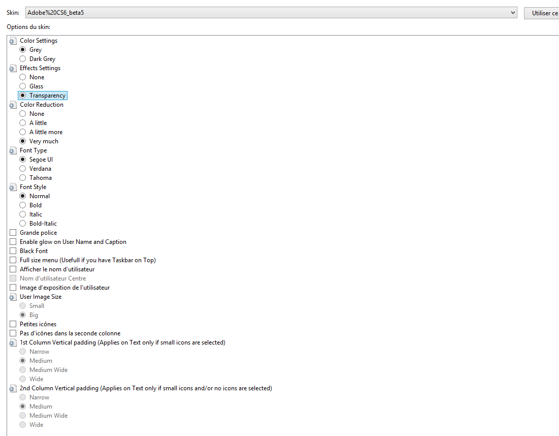
Jcee wrote: Oh your probably On windows 7; I had to make several adjustments with my skin when I switched to w8 to make it display correctly (though I forget what they were) Yes, I'm on Windows 7, any suggestion to make it more compatible with Windows 8 are welcome even if I do not switch to it shortly. Jcee wrote: @ changing the order: Search "OPTION RADIOGROUP=#3230" in your skin you could implement the font in a similar fashion. but its probably too much work to bother with (I just like to nitpick) Just done, please tell me your impression and be more nitpick, i like that! Jcee wrote: @ myskin I had a feeling you did ^.^ Though I wasn't sure because of how different the options were. If you used the actual file, rather than as reference or for resources. then I should note that it hasnt been updated since 3.55 i believe? and that there have been several changes to skins since, and it is recommended by IVO to use the included skins as a baseline for that reason. (this is why mine still had the 'two column' option) Though it should still work fine if you did use it (its not like there are many changes to how previous settings render, just a few new ones to look out for) I'm started by hacking your skin but actually it is totally rewritten and based on "Classic Skin" by Ivo. Please, tell me all the changes that you would do to make the skin "perfect". |
Author: | Jcee [ Sat Jan 03, 2015 9:28 am ] |
Post subject: | Re: Adobe CS6 Skin |
@use small image size: If your up for it, one of the people in my thread requested i make it more compatible with taskbars that are on top of the screen. I did this by filling in the clear part on top of the skin (though having known the number of downloads it would eventually receive I should have done it 'right' which would be to move the user picture down or shrink it like you did (note it still does not 'fit' for taskbars on top of the screen (because you would need to import a custom resource for this, without the clear pixels on top) The difference between having 'Large font' checked is miniscule, which is why I removed it in the first place. Though if you like the feature you could adjust it to actually work (add a few points to font size) You could cut back on font choices for the user by offering bold, normal and italic radio buttons You could mention in the ()'s that vertical padding also applies to small icons (as well as no icons) I was under the impression that the first one simply wasn't adjustable Given your affection towards font; I would recommend an option for black font (it goes well with light themes) Maybe separate the transparency, glass, etc into its own set of radio buttons (separate them from your first option) then make checkbox for reduced color (or maybe a radio button with a few levels of reduction if you wish) Also ill be leaving town for the next few days(in a few hours) so I should be back monday or tuesday |
Author: | Simone73 [ Sat Jan 03, 2015 2:23 pm ] |
Post subject: | Re: Adobe CS6 Skin |
Jcee wrote: @use small image size: If your up for it, one of the people in my thread requested i make it more compatible with taskbars that are on top of the screen. I did this by filling in the clear part on top of the skin (though having known the number of downloads it would eventually receive I should have done it 'right' which would be to move the user picture down or shrink it like you did (note it still does not 'fit' for taskbars on top of the screen (because you would need to import a custom resource for this, without the clear pixels on top) For that i need your help. Jcee wrote: The difference between having 'Large font' checked is miniscule, which is why I removed it in the first place. Though if you like the feature you could adjust it to actually work (add a few points to font size) You could cut back on font choices for the user by offering bold, normal and italic radio buttons You could mention in the ()'s that vertical padding also applies to small icons (as well as no icons) I was under the impression that the first one simply wasn't adjustable Given your affection towards font; I would recommend an option for black font (it goes well with light themes) Maybe separate the transparency, glass, etc into its own set of radio buttons (separate them from your first option) then make checkbox for reduced color (or maybe a radio button with a few levels of reduction if you wish) Tnks for all your suggestion. I will work on them shortly. Jcee wrote: Also ill be leaving town for the next few days(in a few hours) so I should be back monday or tuesday Have a nice journey |
Author: | juniper7 [ Sat Jan 03, 2015 5:04 pm ] | ||
Post subject: | Re: Adobe CS6 Skin | ||
Hello Simone73. I have started using your skin.beta4 I like using the grey and grey with glass. The separators look nice and soft. Just letting you know of a possible glitch. My real name has a y at the end. It displays oddly at the bottom part of letter. Looking at picture, even the right side gets a darker clip. Went zebra on me. If it isn't a bug, how would one make the dark part go higher, like half way up? Could be good effect?
|
Author: | Simone73 [ Sat Jan 03, 2015 5:46 pm ] |
Post subject: | Re: Adobe CS6 Skin |
juniper7 wrote: Hello Simone73. I have started using your skin.beta4 I like using the grey and grey with glass. The separators look nice and soft. Just letting you know of a possible glitch. My real name has a y at the end. It displays oddly at the bottom part of letter. Looking at picture, even the right side gets a darker clip. Went zebra on me. If it isn't a bug, how would one make the dark part go higher, like half way up? Could be good effect? Can you send me a picture of your settings to be able to reproduce the bug ? Probably its windows 8 related, i'm on windows 7 and probably i cannot see this beaviour but i can test it in a virtual machine |
Author: | juniper7 [ Sat Jan 03, 2015 6:16 pm ] |
Post subject: | Re: Adobe CS6 Skin |
It's Windows 8 related. I just disabled "User glow size". It goes away. I make size 30- text is all black. Yes. Win7 has glow. Win8 does not. Too bad there isn't a text word that enables it in Win7, and disables fully in Win8, auto. One other thing. I notice the large font makes the submenu bigger, but not the main menu. Works ok for me, as I'm half blind. For others maybe too big. Good job so far:) |
Author: | juniper7 [ Sat Jan 03, 2015 6:21 pm ] |
Post subject: | Re: Adobe CS6 Skin |
I double checked the main font. It does change size. Just different ratio than submenu. Gotta go Bye. |
Author: | Simone73 [ Sat Jan 03, 2015 6:29 pm ] |
Post subject: | Re: Adobe CS6 Skin |
juniper7 wrote: It's Windows 8 related. I just disabled "User glow size". It goes away. I make size 30- text is all black. Yes. Win7 has glow. Win8 does not. Too bad there isn't a text word that enables it in Win7, and disables fully in Win8, auto. One other thing. I notice the large font makes the submenu bigger, but not the main menu. Works ok for me, as I'm half blind. For others maybe too big. Good job so far:) I can add an option to disable glow on text. Do you use a particular theme on windows 8 to match my skin ? Be ready to test my beta5 |
Author: | juniper7 [ Sun Jan 04, 2015 3:06 pm ] | |||
Post subject: | Re: Adobe CS6 Skin | |||
Hi. I only have one computer now, to test it on. Gave everything else away. I could only put trial Win8, Win7 on other swapped hard drive. Not running any theme modification. The Win8, and Win7 are fresh install images. Processor AMD A8-3850 APU with Radeon(tm) HD Graphics, 2900 Mhz, 4 Core(s), 4 Logical Processor(s) Hmm. So the black at bottom of name text shows on Win7 , Win8, and my Win8.1 I appear to be unlucky. Baffled. Other. The oversized font only happens on the Segoe Normal
|
Author: | Simone73 [ Sun Jan 04, 2015 5:06 pm ] |
Post subject: | Re: Adobe CS6 Skin |
juniper7 wrote: So the black at bottom of name text shows on Win7 , Win8, and my Win8.1 I've uploaded a beta5 with an added option "Enable glow...", try to keep it disabled and see if that solve the problem.I appear to be unlucky. Baffled. juniper7 wrote: The oversized font only happens on the Segoe Normal In beta 5 the selection of the font and style are changed, please try it an let me know.N.B. Remember to "Reset Skin" setting as first thing. |
Author: | Jcee [ Sun Jan 04, 2015 7:09 pm ] |
Post subject: | Re: Adobe CS6 Skin |
the font issue is a bug(I had it in my skin originally to); if you change the font size, you have to change the extents of the user text (there is a vertical min/max just as there is a horizontal one.. fonts that are to big get clipped |
Author: | Pipalou50 [ Mon Jan 05, 2015 2:19 am ] |
Post subject: | Re: Adobe CS6 Skin |
avec les réglages ci dessous, je parviens à donner un peu de couleur (voir ci dessous) mais le sous menu, reste gris ( et je trouve ce gris tellement triste.... )et je n'ai pas assez de connaissance pour le rendre coloré ! With the regulations this below, I succeed in giving a little color (see this below) but under menu, grey rest (and I find this so sad grey) and I have enough knowledge to make him(it) colored! mais le sous menu, reste gris ( et je trouve ce gris tellement triste.... )et je n'ai pas assez de connaissance pour le rendre coloré ! But under menu, grey rest (and I find this so sad grey) and I has enough knowledge to make him(it) colored! je sais : ce n'est qu'un détail ....!!! je suis avec passion vos progrès !
|
Author: | Simone73 [ Mon Jan 05, 2015 5:59 am ] |
Post subject: | Re: Adobe CS6 Skin |
Pipalou50 wrote: avec les réglages ci dessous, je parviens à donner un peu de couleur (voir ci dessous) mais le sous menu, reste gris ( et je trouve ce gris tellement triste.... )et je n'ai pas assez de connaissance pour le rendre coloré ! With the regulations this below, I succeed in giving a little color (see this below) but under menu, grey rest (and I find this so sad grey) and I have enough knowledge to make him(it) colored! mais le sous menu, reste gris ( et je trouve ce gris tellement triste.... )et je n'ai pas assez de connaissance pour le rendre coloré ! But under menu, grey rest (and I find this so sad grey) and I has enough knowledge to make him(it) colored! je sais : ce n'est qu'un détail ....!!! je suis avec passion vos progrès !
This skin had to be gray and grey only at the first. Btw, if you have any code suggestion to meke it better please share it with me. |
Author: | Pipalou50 [ Mon Jan 05, 2015 6:27 am ] |
Post subject: | Re: Adobe CS6 Skin |
désolée, je ne faisais qu'une simple suggestion, veuillez ne pas m'en vouloir. si j'avais des suggestions de code, je vous en ferais part avec grand plaisir, mais je n'ai jamais pu complétement comprendre le moyen de faire un thème avec un tutoriel (déjà difficile en anglais) qui n'est pas dans ma langue maternelle. je vais donc arrêter là mes élucubrations. bonne continuation
|
Author: | Simone73 [ Mon Jan 05, 2015 7:02 am ] |
Post subject: | Re: Adobe CS6 Skin |
Any code hint can be usefull, tutorial or not |
Author: | Simone73 [ Mon Jan 05, 2015 7:44 am ] |
Post subject: | Re: Adobe CS6 Skin |
Adobe CS6 skin rc1 released. what changed: Removed color reduction settings becouse of no sense in this skin. Fixed the bug of the black line at the bottom of the text in windows 8 (need confirmation) some other fixes @juniper7: can you confirm that the bug is fixed? @jcee: if not too much, can you revise my skin? I want to release a final release, except for bugs. |
Author: | Jcee [ Mon Jan 05, 2015 5:07 pm ] |
Post subject: | Re: Adobe CS6 Skin |
what do you need done with it? I've ran through the options and don't see any bugs. though I would maybe like to see the option to use taskbar color. the skin is definitely pretty polished as is (better than mine in most respects |
Author: | juniper7 [ Mon Jan 05, 2015 5:34 pm ] |
Post subject: | Re: Adobe CS6 Skin |
Hi Simone73. A okay- I don't see black with glow enabled on win8.1, with large font. Assume good on other op.systems. I still like the grey. The dark grey, with no glass/transparency, is harder for me to see the selector. I can see what you did though, by making selector a pinch darker. This only me saying this. Other people will love it. Bye. |
Author: | Simone73 [ Tue Jan 06, 2015 9:56 am ] |
Post subject: | Re: Adobe CS6 Skin |
Jcee wrote: what do you need done with it? I've ran through the options and don't see any bugs. though I would maybe like to see the option to use taskbar color. the skin is definitely pretty polished as is (better than mine in most respects If there are no bugs would release this version as final.Btw, i'm interested in the option to use taskbar color but there i need help because I would not know where to start. |
Author: | Simone73 [ Tue Jan 06, 2015 10:00 am ] |
Post subject: | Re: Adobe CS6 Skin |
juniper7 wrote: Hi Simone73. Nice.A okay- I don't see black with glow enabled on win8.1, with large font. Assume good on other op.systems. juniper7 wrote: I still like the grey. You are right, i need to make the selector more visible.
The dark grey, with no glass/transparency, is harder for me to see the selector. I can see what you did though, by making selector a pinch darker. This only me saying this. Other people will love it. Bye. |
Author: | juniper7 [ Tue Jan 06, 2015 6:56 pm ] |
Post subject: | Re: Adobe CS6 Skin |
Hi Simone73 If you don't mind me interrupting Jcee, that's a good question about the taskbar color. What if there was some kind of table made up that shows for each grey menu bitmap brightness 0 to 128, matched up to the red color mask hex number/bit amount , to roughly match with the taskbar color. One for Win8 default without autocolor on, the other for Win7 default. It will never be perfect, but a ball park figure would be nice to start with. Like: Win8 Taskbar match Grey main/ submenu bitmap value. Red bitmap mask value 0/255 ------------------------------ ? or ? 32/255 ----------------------------- ? or ? 48/255 ----------------------------- ? or ? 64/255 #404040------------------- #B50000 or 181/255 80/255 ----------------------------- ? or ? 96/255 ----------------------------- ? or ? 128/255 ---------------------------- ? or ? example: Main_bitmap_mask=#B50000 Submenu_bitmap_mask=#B50000 or use a real bitmap mask defining which parts get masked in black, and which parts get the system color, in red. |
Author: | juniper7 [ Tue Jan 06, 2015 7:01 pm ] |
Post subject: | Re: Adobe CS6 Skin |
It is hard to figure out what Pipalou50 is saying. It looks like the color is very weak and sad looking, in the previous version, and he can make it better for you. |
Author: | juniper7 [ Tue Jan 06, 2015 7:16 pm ] |
Post subject: | Re: Adobe CS6 Skin |
Out of curiosity on my Win8.1, I just used a color hex finder on the taskbar, that is solid, without transparency. Picked grey. Measured 117/255 at bottom, and 123/255 just below the top. So, even that has a small 6 bit gradient. One would never be able to match perfectly, no matter how much they tried. |
Author: | Pipalou50 [ Wed Jan 07, 2015 12:52 am ] |
Post subject: | Re: Adobe CS6 Skin |
juniper7 wrote: It is hard to figure out what Pipalou50 is saying. It looks like the color is very weak and sad looking, in the previous version, and he can make it better for you. I believe that Pipalou50 is going to stop playing the sorcerer's apprentices in English! |
Author: | Simone73 [ Wed Jan 07, 2015 11:20 am ] |
Post subject: | Re: Adobe CS6 Skin |
juniper7 wrote: Hi Simone73 If you don't mind me interrupting Jcee, that's a good question about the taskbar color. What if there was some kind of table made up that shows for each grey menu bitmap brightness 0 to 128, matched up to the red color mask hex number/bit amount , to roughly match with the taskbar color. One for Win8 default without autocolor on, the other for Win7 default. It will never be perfect, but a ball park figure would be nice to start with. Like: Win8 Taskbar match Grey main/ submenu bitmap value. Red bitmap mask value 0/255 ------------------------------ ? or ? 32/255 ----------------------------- ? or ? 48/255 ----------------------------- ? or ? 64/255 #404040------------------- #B50000 or 181/255 80/255 ----------------------------- ? or ? 96/255 ----------------------------- ? or ? 128/255 ---------------------------- ? or ? example: Main_bitmap_mask=#B50000 Submenu_bitmap_mask=#B50000 or use a real bitmap mask defining which parts get masked in black, and which parts get the system color, in red. I can understand what you are explaining here. I wonder if there is some mathematical formula used to calculate values. However here also does the level of alpha of the bitmap ? |
Author: | juniper7 [ Wed Jan 07, 2015 8:06 pm ] |
Post subject: | Re: Adobe CS6 Skin |
I believe that Pipalou50 is going to stop playing the sorcerer's apprentices in English! [/quote] Hello Pipalou50 Sorry, my bad English grammar messed up something there. No no. Don't stop. We are all apprentices here. Can you recommend the most accurate free translation web site? Hello Pipalou50 désolé, mon mauvais anglais grammaire foiré quelque chose. Pas de n° Ne vous arrêtez pas. Nous sommes tous les apprentis ici. Pouvez-vous me recommander le plus précis de traduction libre site web? |
Author: | juniper7 [ Wed Jan 07, 2015 8:10 pm ] |
Post subject: | Re: Adobe CS6 Skin |
[However here also does the level of alpha of the bitmap ?/quote] Yes. Alpha transparency is another complication, to the answer. I think the Windows masters, Ivo, Gaurav, and possibly Jcee know the exact values in Windows, that we could use. All we can do is blindly try different values, much like being a sorcerer's apprentice. (thanks Pipalou50) A little knowledge could end up opposite of what we wanted, or a lot of dancing broomsticks. Can always study the text and a couple of the red bitmap masks from default skins. |
Author: | Jcee [ Thu Jan 08, 2015 4:02 am ] |
Post subject: | Re: Adobe CS6 Skin |
I dont know the value stored in windows, I do know that classic shell can access this value, and the 'red bitmap' you speak of is how a skin determines how much of it to mix in with the default color (the more red, the more taskbar color is added) |
Author: | Nimbi [ Thu Oct 15, 2015 3:40 pm ] |
Post subject: | Re: Adobe CS6 Skin |
Awesome skin! I'm loving this one. It goes great on Windows 10. |
Author: | Simone73 [ Mon Apr 11, 2016 12:34 pm ] |
Post subject: | Re: Adobe CS6 Skin |
JoshuaL2 wrote: Awesome skin! I'm loving this one. It goes great on Windows 10. tnks! |
Page 1 of 1 | All times are UTC - 8 hours [ DST ] |
Powered by phpBB® Forum Software © phpBB Group https://www.phpbb.com/ |