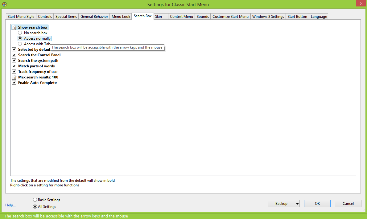
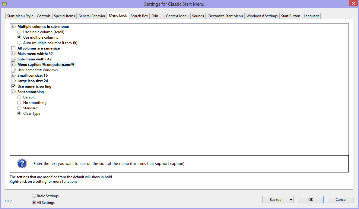
I would like to see all data item values placed to the left. Currently those values are to the right of text. I find the left placed check-boxes and radio-buttons, as seen on the Special-Items page, much easier to read.
The General-Behavior page is an example of visually difficult appearance. The check-boxes are easy to perceive and radio-buttons, they are on the left or are an indented list. The Menu-delay, for example, needs a numeric value. Seeing that requires I move my eyes to that right set number.
I'm not able to quickly scan up or down the column of settings quickly gathering the configuration data. Next I need to switch attention and my eyes to the right to perceive the number then back to read the labeling text.
Further settings that need to fill-in text such as the name of a program, need a bordered text-box to emphasize the entry can be changed. An example could be General-Behavior > User picture command. One way to improve reading perception is to place the text-box indented on the next line as some radio-button menus are designed.
The settings mouse-over bubble help text is useful but for a longer message disappears too quickly. I was thinking that since there is sufficient white space to the right of most settings. it would be helpful to place that bubble help into that white-space. The need for active mouse-over would be reduced.
A different way of handling settings help information would be to click the label text to drop-down a more complete explanation. This would allow some very complete built-in help and documentation. Depending on how that was done, it could reduce the need for a separate Windows help file.
The Microsoft .chm files, Compiled HTML files, production tools may be more than enough. I want to mention epub tools for production. I'd speculate that could even be used to embed documentation into the settings and supply in-program documentation. The format is not tied to just Windows.
Two Open Source editors for epub and one chm viewer. The tag formatting looks like HTML, CSS, and Javascript. These also have some format translation capabilities and features to create complete interactive books.
Calibre editor/viewer: http://calibre-ebook.com/
Sigil editor/viewer: https://github.com/Sigil-Ebook/Sigil
KchmViewer CHM viewer: http://sourceforge.net/projects/kchmviewer/
Each of the above have portable versions either directly or through protableapps.com
|

