It is currently Thu Jun 07, 2018 6:20 pm

All times are UTC - 8 hours [ DST ]


Forum rules


Please, keep discussions on topic and in the right forum. The start menu topics go into the Classic Start Menu forum, etc. This makes it easier for people to locate topics they are looking for.
If you get a satisfactory response to your question, please mark the topic as "solved". Click the green √ button in the bottom-right of the post.


Post new topic Reply to topic  [ 15 posts ] 
Author Message
PostPosted: Thu Jan 19, 2017 10:14 am 
Offline

Joined: Thu Jan 19, 2017 10:05 am
Posts: 5
I just started to use Classic Shell on my clean install of Windows 10. Classic Shell is terrific! Thanks for creating it. :D

In the Windows 7-style Start menu with the Windows 8 skin, I don't know the correct name for the right side of the Start menu, where one normally sees Documents, Music, Pictures, etc. For now I'm going to call it "the right side."

The right side of my Start menu is quite narrow - just wide enough to fit the labels. Is it possible to make it wider? I found the setting for making the left side wider or narrower, but I can't seem to do this for the right side.


Top
 Profile  
Reply with quote  
PostPosted: Thu Jan 19, 2017 11:02 am 
Offline
Site Admin
User avatar

Joined: Wed Jan 02, 2013 11:38 pm
Posts: 5331
The right side is intended to be just wide enough to fit the labels. That's how it works in Windows 7.


Top
 Profile  
Reply with quote  
PostPosted: Thu Jan 19, 2017 5:04 pm 
Offline

Joined: Thu Jan 19, 2017 10:05 am
Posts: 5
Here is the Start menu on the Classic Shell website:


Do you see how much space there is to the right of "Devices and Printers" or "Help and Support"? And do you notice how much space there is between the lines? According to the tooltip, that's a 'Windows 7 style sporting a modern Windows 8 skin.' That's the same type of Start menu I have, but look at mine:


Do you see how narrow the right side is, and how little space there is between the lines?

How can I make my Start menu look like the one on Classic Shell's home page?


Top
 Profile  
Reply with quote  
PostPosted: Thu Jan 19, 2017 5:53 pm 
Offline
Site Admin
User avatar

Joined: Wed Jan 02, 2013 11:38 pm
Posts: 5331
The spacing depends on the selected skin and other factors - like the DPI you use or if you have a touch screen.
If you want to customize that you may have to edit the skin file and increase the padding.


Top
 Profile  
Reply with quote  
PostPosted: Thu Jan 19, 2017 6:02 pm 
Offline

Joined: Thu Jan 19, 2017 10:05 am
Posts: 5
Oooh, I love to tinker. And I see that I can backup and restore my settings, so if I tinker a little too much I can always go back to the way it was. Thanks for your help.


Top
 Profile  
Reply with quote  
PostPosted: Thu Jan 19, 2017 8:20 pm 
Offline
User avatar

Joined: Thu Jan 03, 2013 12:38 am
Posts: 5341
Determine the skin you are using: e.g. Windows 8.skin7.

Download and install the freeware app Resource Hacker. Open Resource Hacker as administrator.

In Resource Hacker, open the skin you are using by going to C:\Program Files\Classic Shell\Skins and opening Windows 8.skin7. Press Ctrl+F and find the term "Main2_text_padding" in the Skin resource. The 4 values of the Main2_text_padding parameter determine its padding from left/top/right/bottom of the right side column. You can adjust the padding to increase the spacing vertically or increase the space on the right or left.

Save the skin using File menu -> Save as under a different name in C:\Program Files\Classic Shell\Skins. e.g. Windows 8 mod.skin7

_________________
Links to some general topics:

Compare Start Menus

Read the Search box usage guide.

I am a Windows enthusiast and did Classic Shell's testing and usability/UX feedback.


Top
 Profile  
Reply with quote  
PostPosted: Thu Jan 19, 2017 8:44 pm 
Offline

Joined: Thu Jan 19, 2017 8:28 pm
Posts: 4
First off, thank you Ivo for making this absolutely wonderful resource! Can't believe I only learned of it today. One of my biggest UX gripes about moving from XP to 7 a few years ago was the fact that the windows key automatically prompted search, killing my Windows key, E workflow to open up email (and similar quick launches for other programs). Turning off the search bar required some serious tinkering (with registry, if I remember correctly) to turn off all Windows search functionality entirely, so that was a terrible option. Brilliant solution to trigger search upon tab! Nicely done - I can't praise this enough!

Thanks also Classique for asking this question - funny that my immediate, first concern about Classic Shell also happened to be the most recently asked topic.

To make the situation more clear to you, Ivo, here is an image of what Classique and I are struggling with:
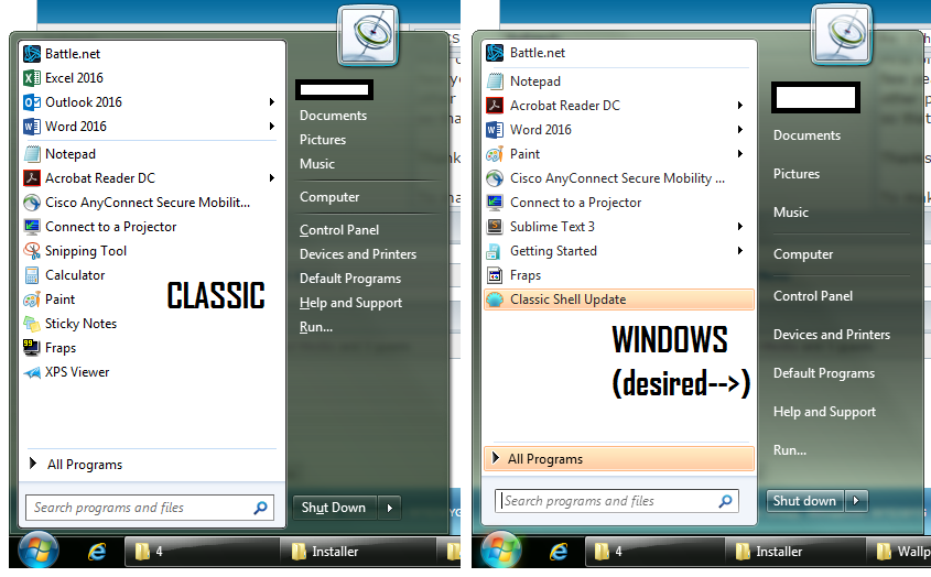


The right-side image shows the original, Windows Start Menu, which is how I'd like the folder links to look. The left-side image shows the Classic Start Menu, where the folder links are condensed into small text along with the program links at left.

The issue comes about from checking the "Small icons" setting under the default Windows Aero skin. The folder links get shrunk along with the program links instead of keeping their larger, relaxed shape. The folder link spacing when "Small icons" is unchecked is correct, but then the program icons at left blow up in size.

I'll try to mess around with the skin file and try what Gaurav suggested above.


Top
 Profile  
Reply with quote  
PostPosted: Thu Jan 19, 2017 9:37 pm 
Offline

Joined: Thu Jan 19, 2017 8:28 pm
Posts: 4
Update: Increasing the Main2_text_padding from 1,7,8,7,100% to 1,20,8,20,100% seemed to have no effect on the spacing at all.

Awaiting further help as I am completely unfamiliar with Resource Hacker and editing skin files. I edited the Windows Aero.skin7 file (I'm on Win7, using the Aero theme/Classic's Aero skin), renamed it Windows Aeromod.skin7 when I saved it, selected it from the settings menu, and it still looks exactly the same. Hope someone can figure this out!


Top
 Profile  
Reply with quote  
PostPosted: Thu Jan 19, 2017 9:40 pm 
Offline
User avatar

Joined: Thu Jan 03, 2013 12:38 am
Posts: 5341
If you are using Small icons (if that option is checked in Skin Settings), you must modify Main2_text_padding values under the [SMALL_ICONS] section in the skin.

_________________
Links to some general topics:

Compare Start Menus

Read the Search box usage guide.

I am a Windows enthusiast and did Classic Shell's testing and usability/UX feedback.


Top
 Profile  
Reply with quote  
PostPosted: Fri Jan 20, 2017 10:17 am 
Offline

Joined: Thu Jan 19, 2017 8:28 pm
Posts: 4
Gaurav wrote:
If you are using Small icons (if that option is checked in Skin Settings), you must modify Main2_text_padding values under the [SMALL_ICONS] section in the skin.


Thank you - that worked like a charm! It was 1/3/8/4 or something like that, changed to the original 1/7/8/7 of the other Main2_text_padding value I modified by mistake, and voila, looks beautiful. (EDIT: I noticed looking back at the thread that it still doesn't fill out the right side nicely. Increasing the top and bottom padding each to 10 (1/10/8/10) makes it look exactly like the Windows Start menu screenshot a few posts above.)

Thank you so much for your help!

On a side note, I also discovered today that Quick Launch still exists in Win7 (and 10), albeit hidden from plain view. Finally brought it back after 3.5 years without on Windows 7, and now I can once again launch a new Explorer window or Word doc with a single click. Between this and the start menu, I feel like I am finally in full control over/comfort with 7 as I was with XP for so many years. Thank you!!

Classique wrote:


Just quoting you to make sure you see Gaurav's tip.


Last edited by Lanturn on Fri Jan 20, 2017 11:24 am, edited 2 times in total.

Top
 Profile  
Reply with quote  
PostPosted: Fri Jan 20, 2017 10:24 am 
Offline
User avatar

Joined: Thu Jan 03, 2013 12:38 am
Posts: 5341
Lanturn wrote:
Thank you - that worked like a charm!


You might also like the freeware app 7+ Taskbar Tweaker: http://rammichael.com/7-taskbar-tweaker

It can be used to bring back Windows XP-like Taskbar behavior.

- Get a classic taskbar in Windows 8 and Windows 7 that works like XP: http://winaero.com/blog/get-a-classic-t ... s-like-xp/

- Customization for power users with 7+ Taskbar Tweaker: http://winaero.com/blog/customization-f ... r-tweaker/

- Reduce extra space between icons on the taskbar and tray notification area: http://winaero.com/blog/reduce-extra-sp ... tion-area/

- How to make taskbar icons bigger in Windows 10: http://winaero.com/blog/how-to-make-tas ... indows-10/

_________________
Links to some general topics:

Compare Start Menus

Read the Search box usage guide.

I am a Windows enthusiast and did Classic Shell's testing and usability/UX feedback.


Top
 Profile  
Reply with quote  
PostPosted: Fri Jan 20, 2017 11:16 am 
Offline

Joined: Thu Jan 19, 2017 8:28 pm
Posts: 4
Gaurav wrote:
You might also like the freeware app 7+ Taskbar Tweaker: http://rammichael.com/7-taskbar-tweaker


Thanks for the resource, but I think I'm all set. I pretty much only used the taskbar to open programs, but now that I have Quick Launch I'm not terribly concerned with customizing it further. The appearance (small icon, window name, never combine) looks good enough to me as is and I use alt-tab for all my switching anyway.

Really appreciate your help!


Top
 Profile  
Reply with quote  
PostPosted: Sat Jan 21, 2017 12:55 am 
Offline

Joined: Thu Jan 19, 2017 10:05 am
Posts: 5
Oh oh ... changes have been made to this script. Do I wish to compile it?

EDIT: Yes, I do. I also want to modify the resource.

That change succeeded in increasing the padding between the labels. However, the right side of the menu is still narrower than I would like. Which parameter increases the overall width of the right side?


Top
 Profile  
Reply with quote  
PostPosted: Sat Jan 21, 2017 5:02 am 
Offline
User avatar

Joined: Thu Jan 03, 2013 12:38 am
Posts: 5341
There's Main2_padding, Main2_text_padding, Main2_icon_padding and Main2_arrow_padding.

_________________
Links to some general topics:

Compare Start Menus

Read the Search box usage guide.

I am a Windows enthusiast and did Classic Shell's testing and usability/UX feedback.


Top
 Profile  
Reply with quote  
PostPosted: Sat Jan 21, 2017 7:58 am 
Offline

Joined: Thu Jan 19, 2017 10:05 am
Posts: 5
Yes! And as the very helpful comment section of the skin file describes it, the right side of the Start menu is called the "Second column."

Changing Main2_padding from the default 3,10,5,9 to 3,10,9,9 widened the second column to just where I like it.

Thank again.

Now that I've entered the world of resource hacking, who knows what mischief I'll get myself into?


Top
 Profile  
Reply with quote  
Display posts from previous:  Sort by  
Post new topic Reply to topic  [ 15 posts ] 

All times are UTC - 8 hours [ DST ]


Who is online

Users browsing this forum: No registered users and 11 guests


You cannot post new topics in this forum
You cannot reply to topics in this forum
You cannot edit your posts in this forum
You cannot delete your posts in this forum
You cannot post attachments in this forum

Search for:
Jump to:  
Powered by phpBB® Forum Software © phpBB Group, Almsamim WYSIWYG Classic Shell © 2010-2016, Ivo Beltchev.
All right reserved.